


In modern software architecture, Application Programming Interfaces (APIs) serve as the connective tissue between services. When these connections falter, the entire system can grind to a halt. Identifying the source of performance degradation requires more than just monitoring metrics; it demands a structural understanding of how data flows through the system. Communication diagrams offer a precise method for visualizing this flow, allowing engineers to pinpoint exactly where bottlenecks occur.
This guide explores the mechanics of diagnosing API chokepoints through the lens of communication diagrams. We will examine the visual representation of object interactions, analyze message patterns that indicate stress, and outline a systematic approach to resolving latency and throughput issues without relying on proprietary tools.
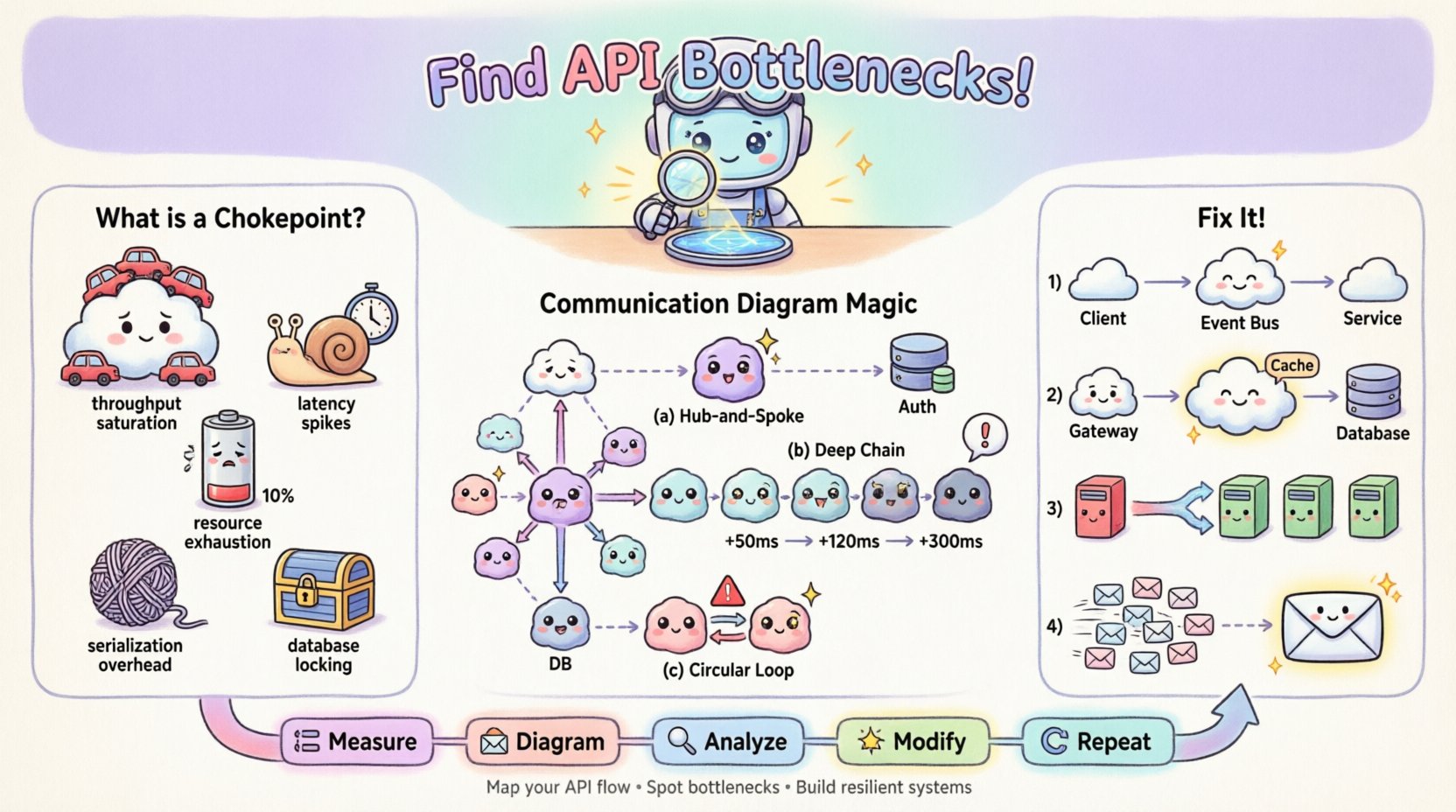
🚦 Understanding API Chokepoints
An API chokepoint is a specific point within the request-response cycle where processing slows down or fails, causing a backlog. Unlike general network latency, which affects the entire transmission, a chokepoint is often localized to a specific service, database query, or synchronization mechanism. Recognizing the type of chokepoint is the first step toward effective remediation.
Common types of chokepoints include:
- Throughput Saturation: The receiving service cannot process incoming requests fast enough, leading to queue buildup.
- Latency Spikes: A specific call takes significantly longer than the average, delaying downstream processes.
- Resource Exhaustion: CPU, memory, or connection pool limits are reached, causing timeouts or rejection errors.
- Serialization Overhead: Data transformation costs (e.g., JSON parsing) become excessive due to payload size.
- Database Locking: Concurrent writes block reads or other writes, stalling the transaction flow.
When these issues occur, they often manifest as cascading failures. A delay in one microservice can trigger timeouts in the calling service, which then propagates up the chain. Visualizing this chain is critical.
📐 The Role of Communication Diagrams in Debugging
Communication diagrams, a type of UML (Unified Modeling Language) interaction diagram, focus on the structural organization of objects and the messages exchanged between them. Unlike sequence diagrams, which prioritize the chronological order of messages, communication diagrams emphasize the relationships and links between objects. This structural focus makes them particularly effective for identifying architectural bottlenecks.
Why use this specific diagram type for troubleshooting?
- Focus on Structure: It reveals which objects are central hubs. A single object receiving messages from ten others is a prime candidate for a chokepoint.
- Message Counting: You can visually count the number of messages exchanged in a single transaction. High fan-out indicates potential parallel processing issues.
- Path Analysis: It highlights the longest path of execution. Long chains of synchronous calls are prone to latency accumulation.
- Context Clarity: It shows the context in which objects exist, helping identify if a service is overloaded due to its role rather than its code.
By mapping the API interactions onto a communication diagram, you transform abstract logs into a tangible map. This map allows you to trace the exact route a request takes and measure the effort required at each node.
🛠️ Building the Diagnostic Diagram
To use a communication diagram for troubleshooting, you must first construct an accurate representation of the current system state. This process requires gathering data from logs, tracing tools, and architectural documentation. The goal is to create a model that reflects reality, not an idealized design.
Step 1: Identify the Actors and Objects
Start by defining the external clients and internal services involved in the problematic transaction. In the context of an API, these are often:
- Client: The mobile app, web browser, or third-party service initiating the request.
- Gateway: The entry point that handles authentication, rate limiting, and routing.
- Orchestrator: The service that coordinates the business logic flow.
- Dependencies: Databases, external APIs, caching layers, and background workers.
Step 2: Map the Message Flows
Draw the connections between these objects. Each line represents a message. Use arrows to indicate the direction of data flow. Label each arrow with the method name or action being performed (e.g., GET /orders, processPayment).
For troubleshooting, it is crucial to annotate the diagram with performance data. If you have access to timing metrics, add them to the message labels. For example:
- Gateway ➔ Orchestrator: 50ms
- Orchestrator ➔ Database: 450ms (Warning)
- Database ➔ Orchestrator: 450ms
Step 3: Define Interaction Lifelines
Although communication diagrams do not always show vertical lifelines explicitly like sequence diagrams, you must mentally track the duration of each object’s involvement. An object that remains active for a long duration while waiting for a response is holding resources unnecessarily.
🔎 Identifying Bottlenecks in the Diagram
Once the diagram is populated with data, you can begin the analysis. The visual layout often reveals issues that raw logs hide. Look for specific patterns that indicate a chokepoint.
Pattern 1: The Hub-and-Spoke Star
If you see a single object connected to many others in a star pattern, that central object is likely a bottleneck. Every request must pass through it. If that object is synchronous, it becomes a serial processing point.
| Visual Indicator | Implication | Common Cause |
|---|---|---|
| One object with 10+ incoming arrows | High Concurrency Load | Aggregation Service |
| Multiple long horizontal arrows converging | Wait Time Accumulation | Synchronous Fan-Out |
| Object labeled with high CPU % | Processing Saturation | Complex Logic |
Pattern 2: Deep Call Chains
Trace the longest path from the entry point to the final data retrieval. If the path involves five or more hops, the latency will compound. Each hop adds network overhead and processing time.
- Impact: Total latency = Sum of all hop latencies + Network overhead.
- Fix: Reduce the depth of the call chain by co-locating data or using a single aggregate endpoint.
Pattern 3: Circular Dependencies
While less common in well-structured systems, circular messages (A calls B, B calls A) can cause deadlock or infinite loops. In a performance context, they indicate inefficient state management.
🛠️ Remediation Strategies Based on Visual Analysis
Once the chokepoint is located on the diagram, specific architectural changes can be applied. The diagram serves as the blueprint for these changes.
1. Decoupling Synchronous Calls
If the diagram shows a long chain of synchronous calls, convert the tail of the chain to an asynchronous event. Instead of waiting for the response, the orchestrator can fire an event and return immediately.
- Before: User ➔ API ➔ Service A ➔ Service B ➔ Database (Wait)
- After: User ➔ API ➔ Service A ➔ Event Bus ➔ Service B (Fire and Forget)
2. Caching at the Edge
If the diagram shows repeated requests to the same object for the same data, introduce a caching layer. Place this object between the caller and the heavy resource.
- Diagram Change: Insert a “Cache” object between the Gateway and the Database.
- Label Update: Update the message label to show “Cache Hit: 1ms” vs “Cache Miss: 200ms”.
3. Load Balancing and Sharding
If a single object has too many connections (the Hub-and-Spoke pattern), distribute the load. This might involve sharding data or introducing a load balancer to rotate traffic across multiple instances of that service.
4. Request Coalescing
If the diagram shows multiple small messages sent to the same object in quick succession, combine them into a single bulk request. This reduces the overhead of connection establishment and context switching.
📊 Analyzing Throughput vs. Latency
Communication diagrams can also help distinguish between throughput issues and latency issues. This distinction is vital for choosing the right fix.
- High Latency, Low Throughput: The system is slow but handles few requests. This usually points to a single heavy operation (e.g., a complex report generation).
- Low Latency, Low Throughput: The system is fast but rejects many requests. This points to resource limits (e.g., connection pool exhaustion).
- High Latency, High Throughput: The system is slow and handling many requests. This is the classic chokepoint scenario where capacity is overwhelmed.
By annotating your diagram with these metrics, you can visualize the capacity curve. Annotate the “Heavy Load” scenario on your diagram to see which node breaks first.
⚠️ Common Pitfalls in Diagramming for Debugging
Even with the best intentions, creating a diagram for troubleshooting can lead to confusion if certain pitfalls are not avoided.
- Over-Abstraction: Do not group too many services into a single box. If you hide the internal complexity of a service, you cannot see where the internal chokepoint lies. Keep services atomic.
- Ignoring Asynchronous Flows: If your diagram only shows synchronous requests, it will not reflect the true load. Include background jobs and event listeners in the diagram.
- Static vs. Dynamic: A static diagram shows the design; a dynamic diagram shows the runtime. For troubleshooting, ensure you are using runtime data (actual paths taken).
- Missing Error Paths: Most diagrams show the happy path. A chokepoint often occurs during error handling (e.g., retries, fallbacks). Include the retry loops in the diagram.
🔄 Iterative Refinement of the Diagram
Architecture is not static. As you apply fixes, the diagram must evolve. After implementing a caching layer, the diagram changes. The message from the Gateway to the Database is replaced by a message to the Cache.
This iterative process creates a feedback loop:
- Measure: Capture current performance metrics.
- Diagram: Map the flow with metrics.
- Analyze: Identify the bottleneck.
- Modify: Apply architectural change.
- Repeat: Re-measure and update the diagram.
This loop ensures that optimization efforts are data-driven rather than guesswork.
📈 Integrating with Monitoring Systems
While communication diagrams are visual tools, they must be grounded in data from monitoring systems. You should correlate the diagram nodes with specific log streams or telemetry IDs.
- Trace IDs: Ensure every message in the diagram corresponds to a unique Trace ID in your logging system.
- Heatmaps: If your monitoring tool supports it, visualize the call frequency as a heatmap on the diagram. Hotter colors indicate higher traffic volume.
- Alerting: Set alerts for the specific nodes identified as chokepoints. If the “Database” node spikes, trigger a notification.
🧠 Case Study: The Order Processing Chain
Consider a scenario where an e-commerce checkout process is slow. The initial request shows a 5-second delay.
Initial Diagram Analysis:
- Client ➔ API Gateway (10ms)
- Gateway ➔ Order Service (50ms)
- Order Service ➔ Inventory Service (200ms)
- Order Service ➔ Payment Service (4000ms)
- Order Service ➔ Notification Service (50ms)
Observation:
The diagram reveals that the Payment Service is the outlier. It consumes 80% of the total time. The Order Service waits synchronously for the Payment Service to complete before proceeding.
Intervention:
1. Move Payment to an asynchronous flow. Order Service sends the request and marks the order as “Processing”. 2. A background worker handles the payment confirmation. 3. Update the diagram to show a “Payment Worker” object instead of a direct call.
Result:
The user sees the “Processing” status immediately. The total latency for the user experience drops from 5 seconds to 50 milliseconds. The backend handles the heavy lifting asynchronously. The diagram now reflects a more resilient architecture.
🎯 Best Practices for Maintenance
To keep these diagrams useful over time, adhere to the following maintenance practices.
- Version Control: Store diagram files in the same repository as the codebase. When code changes, the diagram should change.
- Review Cycles: Include diagram reviews in architecture decision records. Ensure new services are added to the map before deployment.
- Standardization: Use consistent notation for message types (e.g., request, response, event) to make diagrams readable by all team members.
- Documentation: Annotate the diagram with notes explaining *why* a specific path exists. This prevents future engineers from removing necessary logic.
🔗 Conclusion
Troubleshooting API performance is a blend of data analysis and structural visualization. Communication diagrams provide the necessary structure to understand complex interactions. By mapping message flows, annotating timing data, and analyzing connection patterns, you can identify chokepoints with precision. This approach moves beyond guessing and allows for targeted architectural improvements that enhance system stability and speed.
Remember that the diagram is a living document. It must evolve as the system grows. Regularly revisiting the map ensures that new features do not introduce new bottlenecks. With a clear view of the flow, you can maintain a healthy, high-performance system.