


Distributed systems are inherently complex. They involve multiple independent components that must coordinate to achieve a unified goal. Visualizing this coordination is critical for architects and developers alike. Communication diagrams serve as a powerful tool to map these interactions. Unlike sequence diagrams that focus on time, communication diagrams emphasize the structural relationships between objects and the messages passing between them. This distinction is vital when dealing with microservices, event-driven architectures, or complex backend networks.
Creating a diagram that is both accurate and readable requires discipline. It is not enough to simply connect boxes and arrows. The diagram must convey intent, constraints, and failure modes. This guide outlines the essential practices for producing high-fidelity communication diagrams that stand the test of time and scale.
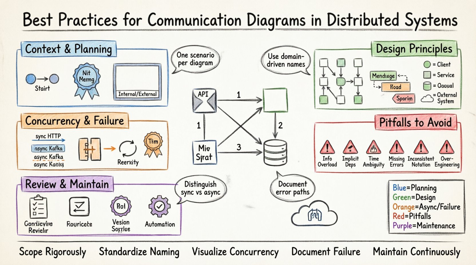
🧩 Understanding the Communication Diagram Context
Before drawing a single line, it is necessary to understand the specific utility of a communication diagram. In the context of distributed systems, these diagrams represent the logical flow of control and data across service boundaries. They are particularly useful for understanding how a client request propagates through the system.
- Structural Focus: The diagram shows the static structure of the system (objects, services, nodes) and how they are linked.
- Interaction Focus: It highlights the dynamic behavior (messages, calls, events) without the strict linear timeline of a sequence diagram.
- Network Boundaries: It explicitly depicts network hops, which are critical in distributed environments.
When you draw a communication diagram for a distributed system, you are documenting the contract between services. This documentation becomes a source of truth for integration testing and capacity planning.
🏗️ Pre-Planning and Context Definition
Clarity begins before the drawing tool is opened. You must define the scope of the diagram. A diagram attempting to show the entire enterprise architecture will be unreadable. Focus on a specific use case or transaction flow.
1. Define the Scope
Identify the starting point and the end point of the interaction. Are you mapping a user login flow? A data synchronization process? A payment settlement? Stick to one scenario per diagram.
- Start Node: Clearly mark the entry point, such as an API Gateway or a User Interface.
- End Node: Define the termination state, such as a database commit or a response sent to the client.
- Boundary: Decide what is internal to the system and what is external. External entities like third-party APIs should be clearly distinguished from internal microservices.
2. Establish Naming Conventions
Consistency is key to readability. If you label a service as OrderService in one diagram, it should not be OrderManager in another. Adopt a standard naming convention for all nodes.
- Service Names: Use domain-driven names (e.g.,
InventoryService) rather than technical names (e.g.,API-01). - Message Names: Use action-oriented verbs for messages (e.g.,
reserveInventory,notifyPayment). - Return Labels: Clearly indicate success or failure states on return paths.
🎨 Design Principles for Clarity
The visual layout of the diagram directly impacts how quickly a stakeholder can understand the system. A cluttered diagram leads to misinterpretation. Follow these design principles to maintain visual integrity.
1. Minimize Crossing Lines
Crossing lines create cognitive load. They force the eye to jump over other elements to trace a connection. Arrange nodes so that connections flow logically, ideally left-to-right or top-to-bottom.
- Group Related Nodes: Place services that interact frequently close to each other.
- Use Orthogonal Routing: If the tool allows, route lines at 90-degree angles rather than diagonal lines to reduce visual noise.
- Layering: Place client layers at the top or left, and data layers at the bottom or right.
2. Use Distinct Shapes and Colors
Visual cues help differentiate types of nodes without reading labels. While color should not be the only differentiator, it aids speed.
- Client Nodes: Use a specific shape or border style to denote external clients.
- Internal Services: Use a standard box shape.
- External Systems: Use a different icon or shape to indicate third-party dependencies (e.g., a database or legacy system).
- Asynchronous Queues: Represent message queues with a distinct cylinder or queue shape.
3. Labeling Messages Effectively
A message label should contain enough information to understand the data exchange without needing to check the code.
- Method Name: Include the API endpoint or function name.
- Data Payload: Briefly mention the key data object (e.g.,
OrderDTO). - Timing Constraints: Indicate timeouts if they are critical (e.g.,
timeout: 5s). - Idempotency: Note if the call is idempotent, as this affects retry logic design.
⚡ Handling Concurrency and Distribution
Distributed systems introduce latency and failure points that do not exist in monolithic applications. Your diagrams must reflect these realities. Ignoring them creates a false sense of security.
1. Represent Asynchronous Calls Clearly
Not all communication is synchronous. Many distributed systems rely on asynchronous messaging to decouple services. Distinguish these from direct calls.
- Synchronous: Use solid lines with open arrowheads to represent blocking calls (e.g., HTTP/REST).
- Asynchronous: Use dashed lines or distinct arrowheads to represent fire-and-forget messages (e.g., Kafka events, RabbitMQ messages).
- Return Paths: Asynchronous calls often do not have immediate return paths. Do not draw a return arrow unless a callback is involved.
2. Visualize Failure Modes
A diagram showing only happy paths is incomplete. It should indicate where things can go wrong.
- Error Propagation: Show how errors bubble up from a downstream service to the client.
- Timeouts: Mark lines that involve network latency where timeouts are likely.
- Circuit Breakers: If a circuit breaker is in place, label the connection to indicate this protection mechanism.
- Retry Logic: Indicate if a node will retry a failed connection.
3. Manage Complexity with Abstraction
As systems grow, a single diagram becomes too large. Use abstraction to manage complexity.
- Zoom Levels: Create a high-level overview diagram and detailed sub-diagrams for complex services.
- Black Boxing: If a service performs complex logic, represent it as a single node in the high-level diagram.
- References: Link to external documentation for detailed internal logic of a specific service.
🚫 Common Pitfalls and Anti-Patterns
Avoiding mistakes is just as important as following best practices. The following table outlines common errors in communication diagramming and how to correct them.
| Anti-Pattern | Why It Fails | Correction Strategy |
|---|---|---|
| Information Overload | Too many messages crowd the diagram, making it unreadable. | Focus on the primary flow. Move secondary flows to sub-diagrams. |
| Implicit Dependencies | Assumes the reader knows a service exists without showing it. | Make every node explicit. If a service is involved, it must be drawn. |
| Time Ambiguity | Communication diagrams do not show time well, leading to confusion about ordering. | Use numbered messages (1, 2, 3) to indicate strict ordering where necessary. |
| Missing Error Paths | Only shows success, ignoring failure scenarios critical to reliability. | Include dashed lines for error handling and fallback mechanisms. |
| Inconsistent Notation | Using different symbols for the same type of node causes confusion. | Establish a style guide and adhere to it across all diagrams. |
| Over-Engineering | Trying to diagram every possible edge case in one view. | Diagram the happy path primarily. Document exceptions separately. |
🔍 Review and Validation
Once the diagram is drafted, it must undergo a review process. A diagram is a contract between teams. If it is wrong, the implementation will be wrong.
- Peer Review: Have a colleague who is not involved in the design review the diagram. If they cannot understand the flow, the diagram needs simplification.
- Code Walkthrough: Compare the diagram against the actual code or configuration. Ensure the diagram matches the reality of the deployment.
- Stakeholder Sign-off: Ensure business stakeholders understand the data flow depicted. They may not care about the technical implementation but need to understand the business process.
🔄 Maintenance and Evolution
Software is never static. Distributed systems evolve frequently. A diagram that is accurate today may be obsolete tomorrow. Treat diagrams as living documents.
1. Version Control Diagrams
Just like code, diagrams should be versioned. Store them in the same repository as the source code if possible. This ensures that the documentation matches the codebase version.
- Commit Messages: When updating a diagram, use clear commit messages explaining the change.
- Change Logs: Maintain a log of significant architectural changes reflected in the diagrams.
2. Automate Where Possible
Manual drawing is prone to human error and becomes outdated quickly. If your organization uses code generation or infrastructure-as-code, consider generating diagrams from the code.
- Static Analysis: Use tools that parse the codebase to generate interaction graphs automatically.
- API Specifications: Generate diagrams from OpenAPI or gRPC definitions to ensure accuracy with API contracts.
- Configuration Files: Map service mesh configurations directly to visual nodes.
📝 Summary of Key Takeaways
Creating clear communication diagrams for distributed systems is a skill that blends technical accuracy with visual design. By following structured practices, you reduce ambiguity and improve team alignment.
- Scope Rigorously: Limit the diagram to a specific transaction or flow.
- Standardize Naming: Ensure consistency across all nodes and messages.
- Visualize Concurrency: Clearly distinguish between synchronous and asynchronous flows.
- Document Failure: Include error paths and retry mechanisms in the design.
- Maintain Continuously: Treat diagrams as living documentation tied to the codebase.
When these practices are applied consistently, the diagrams become valuable assets. They serve as a reference for onboarding new developers, a guide for troubleshooting production issues, and a blueprint for future architecture changes. The effort invested in drawing clear diagrams pays dividends in reduced cognitive load and fewer integration errors.
🛠️ Practical Implementation Checklist
Before finalizing a diagram, run through this checklist to ensure quality.
- [ ] Are all external dependencies clearly marked?
- [ ] Is the entry point obvious?
- [ ] Are return values labeled?
- [ ] Are asynchronous messages distinct from synchronous calls?
- [ ] Is the diagram readable at a glance without zooming?
- [ ] Are all acronyms defined or self-explanatory?
- [ ] Does the diagram match the current version of the code?
- [ ] Have error scenarios been considered?
Adopting this checklist ensures that every diagram meets a high standard of quality. It shifts the focus from simply creating a drawing to creating a precise model of system behavior. This precision is what enables distributed systems to function reliably at scale.