


Creating digital experiences that resonate with users requires more than just aesthetic appeal. It demands a structured approach grounded in psychology, logic, and empathy. User Experience (UX) design is the backbone of any successful digital product. Whether you are building a website, a mobile application, or a complex dashboard, the principles remain consistent. This guide outlines the foundational best practices for UX design, providing a clear path for those entering the field.
The goal is to create interfaces that are intuitive, accessible, and efficient. By adhering to established guidelines, designers can reduce friction and enhance satisfaction. This overview covers research, architecture, visual hierarchy, accessibility, and testing methodologies.
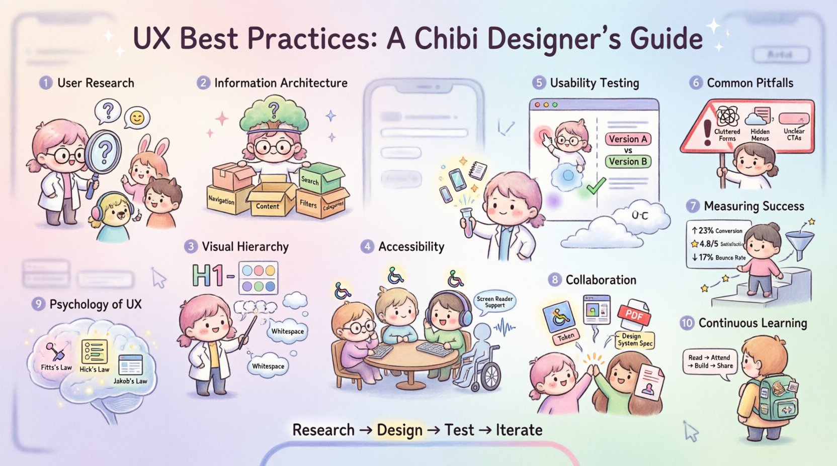
1. Understanding User Needs Through Research 🧠
Designing without understanding the audience is akin to navigating without a map. Research forms the bedrock of effective UX. It moves the process from assumption to evidence-based decision-making.
Key Research Methods
- User Interviews: Direct conversations provide qualitative data. Listen for pain points, motivations, and behaviors.
- Surveys: Quantitative data collection allows you to gather feedback from a larger audience quickly.
- Competitive Analysis: Reviewing similar products reveals industry standards and gaps in the market.
- Contextual Inquiry: Observing users in their natural environment offers insights into how they interact with technology daily.
Creating user personas helps team members visualize the target audience. These semi-fictional characters represent distinct user types. They should include demographics, goals, and frustrations. This ensures design decisions align with real human needs rather than personal preferences.
2. Information Architecture and Navigation 🗺️
How users find information determines their success. Information Architecture (IA) organizes content logically. A clear structure reduces cognitive load. Users should not have to guess where to click next.
Core IA Principles
- Card Sorting: A technique where users organize topics into groups. This helps determine the most intuitive labeling and structure.
- Sitemaps: Visual diagrams showing the hierarchy of pages. They ensure all necessary content is accounted for.
- Navigation Patterns: Standard patterns like the hamburger menu or bottom navigation bars are familiar. Deviating from these requires strong justification.
- Search Functionality: A robust search bar is essential for content-heavy sites. It must handle typos and synonyms effectively.
Consistency is vital. If a link looks like a button, it should behave like a button. If a menu is located on the top right on one page, it should remain there across the site. Predictability builds trust.
3. Visual Hierarchy and Layout 🎨
Visual hierarchy guides the user’s eye. It establishes the order of importance for content elements. Effective layout directs attention to the most critical actions first.
Design Elements
- Typography: Font size, weight, and color create contrast. Headlines should be distinct from body text.
- Whitespace: Empty space around elements improves readability. It prevents the interface from feeling cluttered.
- Color Theory: Use color to indicate status or importance. However, do not rely solely on color to convey meaning.
- Grid Systems: Aligning elements to a grid creates rhythm and balance. It ensures visual consistency across the screen.
When designing for mobile, consider the thumb zone. Primary actions should be placed within easy reach. Screen real estate is limited, so prioritize content. Remove unnecessary elements to focus on the core task.
4. Accessibility and Inclusivity ♿
Designing for everyone is not optional; it is a standard of quality. Accessibility ensures that people with disabilities can use the product. This includes users with visual, auditory, motor, and cognitive impairments.
Accessibility Standards
- Contrast Ratios: Text must have sufficient contrast against the background. This aids users with low vision.
- Keyboard Navigation: All functions must be operable without a mouse. Users rely on the Tab key to move through interactive elements.
- Screen Readers: Content must be readable by assistive technology. This involves using proper semantic HTML and ARIA labels.
- Alt Text: Images should have descriptive text alternatives. This conveys meaning to users who cannot see the image.
Following guidelines such as the Web Content Accessibility Guidelines (WCAG) ensures compliance. Testing with real users who have disabilities provides the most valuable feedback. Inclusivity expands your market reach and improves the experience for all users.
5. Usability Testing and Validation 🧪
Assumptions must be tested. Usability testing involves observing users as they complete specific tasks. It reveals where the design succeeds and where it fails.
Testing Methods Comparison
| Method | Description | Best Used For |
|---|---|---|
| Moderated Testing | A facilitator guides the user through tasks. | Complex workflows requiring deep insight. |
| Unmoderated Testing | Users complete tasks remotely on their own time. | Quick feedback on specific features. |
| A/B Testing | Comparing two versions of a page to see which performs better. | Optimizing conversion rates and metrics. |
| Heatmaps | Visualizing where users click and scroll. | Understanding engagement patterns. |
During testing, ask users to think aloud. This reveals their thought process. Do not lead them to the correct answer. If they struggle, note it as a design flaw. Collect both qualitative feedback and quantitative data.
Iterate based on findings. Design is not a linear process. It is cyclical. You design, test, learn, and refine. This loop continues throughout the product lifecycle.
6. Common Pitfalls and How to Avoid Them ⚠️
Even experienced designers make mistakes. Recognizing common traps helps you avoid them. Awareness of these pitfalls leads to more robust solutions.
- Designing for Yourself: Personal preferences do not match user needs. Rely on data, not intuition.
- Ignoring Loading States: Users need feedback when content is being fetched. Spinners or skeletons indicate progress.
- Hidden Navigation: Do not hide essential links behind icons or menus without clear indicators.
- Inconsistent Interactions: Buttons should look clickable. Icons should have consistent meanings.
- Overloading Forms: Ask only for necessary information. Every field increases the effort required to submit.
- Ignoring Error States: What happens when a user makes a mistake? Messages should be clear and helpful.
Documentation helps maintain consistency. Style guides and component libraries ensure that all team members use the same standards. This reduces technical debt and improves collaboration.
7. Measuring Success and Iteration 📈
Once a product is live, the work continues. Analytics provide insights into user behavior. They show how real people interact with the design.
Key Performance Indicators
- Conversion Rate: The percentage of users who complete a desired action.
- Bounce Rate: The percentage of users who leave after viewing only one page.
- Time on Task: How long it takes to complete a specific goal.
- Error Rate: How often users make mistakes during interaction.
- Customer Satisfaction: Direct feedback through surveys or ratings.
Regular audits keep the design fresh. Technology changes, and user expectations evolve. What worked two years ago might not work today. Stay updated with industry trends and user feedback.
8. Collaboration and Handoff 🤝
UX design does not happen in a vacuum. It requires collaboration with developers, product managers, and stakeholders. Clear communication ensures the vision is preserved.
- Clear Specifications: Provide detailed notes on interactions and states.
- Prototypes: Interactive mockups demonstrate flow better than static images.
- Design Tokens: Define colors, typography, and spacing variables for consistency.
- Feedback Loops: Encourage developers to question design choices during implementation.
Respect the technical constraints. A design that cannot be built is a failed design. Work with engineering teams early to ensure feasibility.
9. The Psychology of UX 🧠
Understanding human behavior is crucial. Cognitive biases influence how users perceive information. Leveraging these principles can improve usability.
- Fitts’s Law: The time to acquire a target is a function of the distance to and size of the target. Make important buttons large and accessible.
- Hick’s Law: The time it takes to make a decision increases with the number and complexity of choices. Simplify menus and options.
- Jakob’s Law: Users spend most of their time on other sites. Design patterns should be familiar and intuitive.
- Peak-End Rule: Users judge an experience based on how they felt at its peak and at its end. Ensure the final interaction is positive.
These principles help create interfaces that feel natural. They reduce friction and make the digital experience smoother.
10. Continuous Learning and Adaptation 📚
The field of UX is dynamic. New technologies emerge, and user behaviors shift. Continuous learning is essential for longevity.
- Read Industry Blogs: Stay informed about case studies and new research.
- Attend Conferences: Networking with peers provides fresh perspectives.
- Experiment: Try new tools and techniques in personal projects.
- Seek Critique: Feedback from others highlights blind spots.
Building a portfolio demonstrates your process, not just the final result. Show the problem, the research, the iterations, and the solution. This tells the story of your thinking.
Final Thoughts on Design Integrity 🌟
Great UX design is invisible. Users do not notice it when it works perfectly. They only notice it when it fails. The objective is to remove obstacles between the user and their goal.
By focusing on research, accessibility, and testing, you create products that serve people effectively. This approach builds trust and loyalty. It transforms casual visitors into loyal users.
Remember that design is a service. You are serving the user. Keep their needs at the center of every decision. Maintain humility and be ready to change your mind when evidence suggests it is necessary.
Start small. Apply these practices to your current projects. Refine your skills over time. The path to expertise is paved with consistent effort and a commitment to quality.