Data forms the backbone of modern applications. While code drives logic, data drives value. Yet, without a clear map of how this information moves, systems become fragile and difficult to maintain. Visualizing database interactions provides the necessary clarity to understand complex relationships. This guide explores the methods and principles for creating effective diagrams that serve developers, architects, and stakeholders.
Why Visualization Matters in Data Architecture 📊
When a system grows, the connections between tables, services, and applications multiply. A developer might understand a specific query, but seeing the entire flow across the infrastructure is a different challenge. Diagrams translate abstract relationships into tangible visuals. They reduce cognitive load by allowing the reader to see the path of data rather than tracing it through lines of code.
Effective visualization supports several critical functions:
- Communication: It bridges the gap between technical teams and business stakeholders. Everyone can see where data originates and where it lands.
- Debugging: When data is missing or corrupted, a map helps pinpoint where the flow broke.
- Onboarding: New team members can grasp the system landscape faster than reading documentation alone.
- Security Audits: It becomes easier to identify which processes touch sensitive information.
Core Components of a Data Flow Diagram 🧩
To create a clear representation, one must understand the standard building blocks. These elements remain consistent regardless of the specific tool used. Consistency ensures that anyone reading the diagram interprets it the same way.
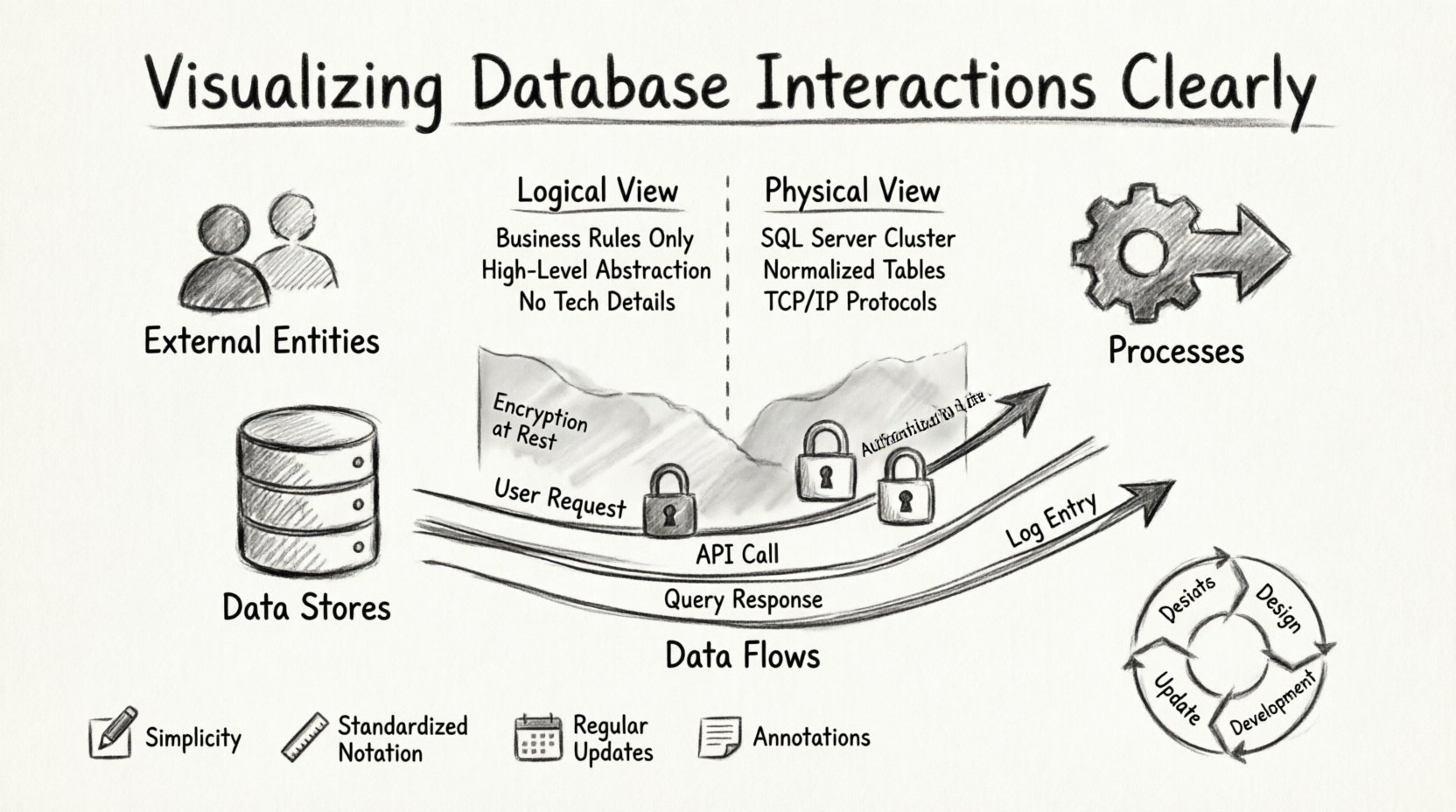
1. External Entities 👥
These represent the sources or destinations of data outside the system boundary. An external entity could be a user, a third-party service, or another application. They initiate the flow or receive the final result. In diagrams, these are typically shown as squares or circles, depending on the notation standard.
2. Processes 🔧
Processes describe the transformation of data. This is where business logic resides. A process takes input, performs an operation, and produces output. Examples include calculating a total, validating a user, or aggregating logs. Each process should have a unique identifier and a clear description of its function.
3. Data Stores 📁
Data stores represent where information is held at rest. This includes database tables, file systems, or message queues. The distinction is crucial: data flows through processes but rests in stores. Labeling these clearly prevents confusion between temporary processing and permanent storage.
4. Data Flows ➡️
Arrows indicate the direction of information movement. Every arrow must have a label describing what data is traveling. An arrow without a label is ambiguous. It should specify the content, such as “User Credentials” or “Transaction Logs,” rather than just “Data.”
Mapping the Flow: Logical vs. Physical Views 🔄
A single diagram rarely suffices for complex systems. It is often necessary to separate the logical intent from the physical implementation. This separation allows for flexibility when underlying technologies change.
| Aspect |
Logical View |
Physical View |
| Focus |
Business rules and data types |
Hardware and specific software |
| Stability |
Changes infrequently |
Changes frequently with infrastructure |
| Audience |
Product Managers, Architects |
DevOps, Engineers |
| Detail Level |
High-level abstraction |
Specific tables, ports, and protocols |
By maintaining both views, teams can update infrastructure without rewriting the business logic documentation. The logical view remains the source of truth regarding what the system does, while the physical view explains how it does it.
Security Considerations in Diagramming 🔒
Visualizing interactions also highlights security boundaries. When mapping data movement, it is vital to note encryption points and access controls. A diagram should indicate where sensitive data is handled differently from public data.
Key security markers to include:
- Encryption: Mark flows where data is encrypted in transit or at rest.
- Authentication: Indicate where user verification occurs before data access.
- Access Control: Show which processes have read-only vs. write access.
Identifying these boundaries early helps prevent unauthorized access. It allows security teams to audit the path of sensitive information, ensuring compliance with regulations.
Best Practices for Clear Documentation 📝
Creating a diagram is an iterative process. To keep it useful over time, follow these guidelines. Documentation that becomes outdated is worse than no documentation at all.
Keep It Simple
Avoid overcrowding a single page. If a system is too large, break it down into subsystems. Use context diagrams for the high-level view and detailed diagrams for specific modules. This hierarchy allows readers to zoom in only when necessary.
Standardize Notation
Choose a notation standard, such as Yourdon & DeMarco or Gane & Sarson, and stick to it. Mixing styles confuses the reader. Ensure that every symbol means the same thing across all diagrams in the project.
Update Regularly
Systems evolve. Code changes, new features launch, and dependencies shift. Diagrams must be reviewed during sprint planning or release cycles. If a diagram does not match the current codebase, update it or flag it as obsolete.
Annotate Assumptions
Not every detail fits on a diagram. Use notes to explain assumptions, such as “Data is cached for 24 hours” or “Retries occur up to 3 times.” These notes provide context that the visual alone cannot convey.
Common Issues to Avoid 🚫
While creating these maps, certain errors frequently occur. Being aware of them helps maintain quality.
- Missing Labels: Arrows must always define what flows through them. Unlabeled lines force the reader to guess.
- Confusing Processes and Stores: Do not draw data flowing into a process and immediately out without transformation. If data is stored, draw it into a store first.
- Over-Engineering: Do not diagram every single field in a database. Focus on the flow of entities, not the schema details.
- Ignoring Asynchronous Flows: Not all data moves in real-time. Indicate queues or batch processes to show where data waits before moving.
The Lifecycle of a Diagram 🔄
A diagram is not a one-time artifact. It follows a lifecycle similar to the software it represents. It starts during the design phase, where it helps define requirements. During development, it serves as a reference for implementation. In operations, it aids in troubleshooting.
When a feature is added, the diagram must be updated. When a service is deprecated, the diagram should reflect the removal. This discipline ensures the documentation remains a reliable asset rather than a historical record.
Tools and Technologies 💻
Many options exist for creating these visuals. The choice depends on the team’s workflow. Some prefer code-based definitions that generate diagrams automatically. Others prefer drag-and-drop interfaces for manual control.
Regardless of the tool, the goal remains the same: clarity. A hand-drawn sketch can be as effective as a polished digital graphic if it communicates the relationships accurately. The medium is secondary to the message.
Final Notes 📌
Visualizing database interactions is a discipline that combines technical knowledge with clear communication. It requires an understanding of data structures, system architecture, and human cognition. By adhering to standard notations, maintaining accurate records, and focusing on the flow of information, teams can build systems that are transparent and robust.
Invest time in these diagrams early. The cost of creating them is low compared to the cost of debugging a system without a map. Clear visualization leads to better decisions, faster onboarding, and more secure architectures. Start mapping your data today to ensure long-term stability.