


Designing robust application programming interfaces (APIs) requires more than just writing code. It demands a clear understanding of how different system components interact. One of the most effective tools for visualizing these interactions is the communication diagram. While often overshadowed by sequence diagrams, communication diagrams offer a unique perspective on object relationships and message flows. This guide provides expert answers to common questions regarding the use of communication diagrams within the API development lifecycle.
📚 Understanding the Basics
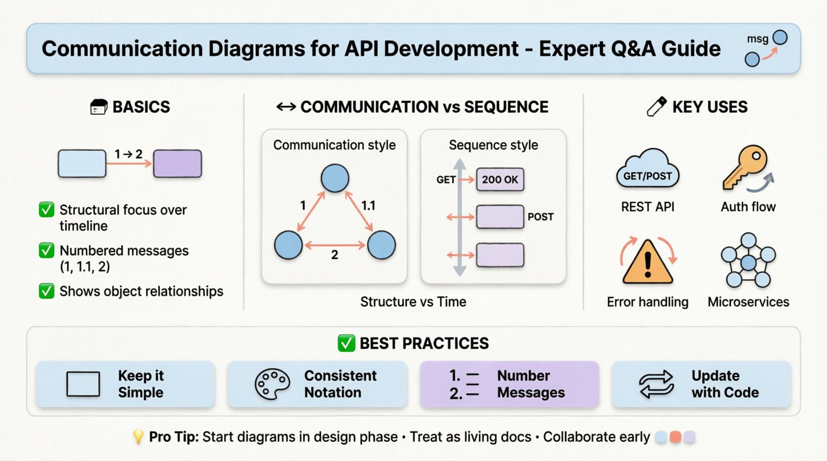
Before diving into specific implementation details, it is essential to establish a shared vocabulary. In software architecture, a communication diagram represents a type of interaction diagram. It focuses on the structural organization of objects and the messages they exchange. Unlike a sequence diagram, which emphasizes the chronological order of events, a communication diagram highlights the static structure and the relationships between participants.
For API developers, this distinction is critical. APIs are essentially interfaces between services. Visualizing these interfaces as structural connections rather than just time-stamped events can reveal architectural bottlenecks early in the design phase.
❓ Frequently Asked Questions
1. What exactly is a communication diagram in the context of API design?
A communication diagram models the flow of messages between objects or components. In an API context, these objects often represent service endpoints, database entities, or external clients. The diagram uses nodes to represent the participants and arrows to represent the messages passed between them. Each arrow is labeled with the operation being performed, such as GET /users or POST /orders.
Key characteristics include:
- Structural Focus: It shows the topology of the system rather than just the timeline.
- Message Sequencing: Messages are numbered to indicate order (e.g., 1, 1.1, 2).
- Object Instances: Specific instances of classes are often depicted to show runtime behavior.
2. How does a communication diagram differ from a sequence diagram?
Both diagrams are part of the Unified Modeling Language (UML) suite and serve similar purposes, yet they offer different cognitive advantages. The table below outlines the primary distinctions.
| Feature | Communication Diagram | Sequence Diagram |
|---|---|---|
| Primary Focus | Object relationships and structure | Time sequence and ordering |
| Layout | Flexible spatial arrangement | Vertical timeline (time flows down) |
| Message Labeling | Numbered messages (1, 2, 3) | Positional (top to bottom) |
| Best Use Case | Understanding complex connections | Understanding step-by-step logic |
When designing an API, if the complexity lies in how many services talk to each other, a communication diagram is often superior. If the complexity lies in the exact timing of retries or timeouts, a sequence diagram may be preferred.
3. How do you model REST API calls using these diagrams?
Modeling RESTful interactions requires mapping HTTP methods to specific message flows. Here is a standard approach:
- Define Participants: Identify the Client, the API Gateway, the Microservice, and the Database.
- Label Messages: Use HTTP verbs (GET, POST, PUT, DELETE) as the message labels.
- Indicate Payloads: Annotate arrows with the data structure being transferred, such as JSON schemas.
- Show Return Values: Include response arrows for status codes or data retrieval.
For example, a POST /users request would be an arrow from the Client to the API Gateway labeled 1: POST /users. A subsequent arrow from the Gateway to the Service would be labeled 2: Create User.
4. How should authentication flows be represented?
Authentication is a critical component of API security and often introduces additional steps in the communication flow. These diagrams should not hide security checks.
When drawing authentication:
- Token Exchange: Show the request for an access token and the return of that token.
- Validation: Indicate where the API Gateway validates the token before passing the request to the backend.
- Refresh Mechanisms: If tokens expire, show the flow for requesting a refresh token.
Neglecting to diagram these steps often leads to security gaps in the final implementation. Every hop in the diagram should account for authorization checks.
5. What is the best way to handle error scenarios?
Happy paths are easy to draw, but robust APIs require clear error handling. Communication diagrams are excellent for mapping out failure states because they can show branching paths clearly.
Key strategies for modeling errors include:
- Return Codes: Label arrows with specific HTTP status codes (e.g., 401, 500).
- Timeout Loops: Show what happens when a service does not respond within a set time.
- Retry Logic: Depict the loop where the client retries a failed request.
- Fallbacks: Illustrate alternative data sources if the primary service is unavailable.
6. Can communication diagrams help with microservices architecture?
Absolutely. Microservices introduce distributed complexity. Communication diagrams help visualize the network topology of these services without getting bogged down in exact millisecond timings.
Benefits for microservices include:
- Identifying Chatty Services: If a single request triggers ten different arrows between services, the system is likely too fragmented.
- Dependency Mapping: It becomes clear which services rely on which others, aiding in decoupling strategies.
- Boundary Definition: Helps define clear service boundaries and ownership.
7. How do you maintain these diagrams as the API evolves?
Documentation becomes outdated quickly if not managed well. To keep communication diagrams relevant:
- Integrate with Code: Use tools that can generate diagrams from code comments or annotations.
- Version Control: Store diagram files in the same repository as the API code.
- Review Process: Treat diagram updates as part of the pull request review process.
- Automated Checks: Run scripts to verify that the diagram matches the current API routes.
🛠️ Best Practices for Implementation
To get the most value from communication diagrams, adhere to these guidelines during the design process.
Keep it Simple
Do not try to diagram every single method call in a massive system. Focus on critical paths. High-level diagrams show the flow of data; low-level diagrams show the internal logic. Choose the appropriate level of abstraction.
Use Consistent Notation
Ensure that all team members use the same symbols for:
- External Clients
- Internal Services
- Databases
- Third-Party Integrations
Consistency reduces cognitive load during code reviews.
Number Messages Clearly
Since the order is not strictly vertical, numbering is vital. Use decimal notation for sub-steps (e.g., 1.1, 1.2) to show that they belong to the parent step.
⚠️ Common Pitfalls to Avoid
Even experienced architects make mistakes when modeling interactions. Watch out for these common traps.
- Ignoring Latency: A diagram showing a connection does not imply it is fast. Be aware of network hops.
- Over-Modeling: Including every internal variable makes the diagram unreadable. Stick to data that crosses boundaries.
- Static vs. Dynamic: Do not confuse the static structure of the code with the dynamic flow of messages. The diagram should represent the runtime behavior.
- Lack of Context: Always label the diagram with the scenario it represents (e.g., “User Login Flow” vs. “Data Sync Flow”).
🔄 Integration into the Development Lifecycle
Communication diagrams should not be an afterthought. They fit into the standard software development lifecycle at specific stages.
1. Design Phase
Use diagrams to validate the architecture before writing any code. This is the cheapest time to make changes. If the diagram shows a circular dependency, resolve it on paper.
2. Implementation Phase
Developers can use the diagram as a checklist. Ensure that every message defined in the diagram has a corresponding implementation in the code.
3. Testing Phase
Test cases can be derived directly from the diagram. Each message flow represents a potential test scenario. This ensures coverage of both success and failure paths.
4. Maintenance Phase
When onboarding new developers, the diagram serves as a map of the system. It explains how the pieces fit together without requiring them to read the entire codebase.
📊 Visualizing Data Flows
One of the most powerful uses of communication diagrams is tracking data transformation. In API development, data often changes shape as it moves from the client to the database.
Consider the following flow:
- Client: Sends a raw JSON object.
- Gateway: Validates schema and strips sensitive fields.
- Service: Transforms data into an internal domain model.
- Database: Persists the final normalized structure.
By mapping this in a communication diagram, you can identify where data validation occurs and where transformations might introduce bugs.
🚀 Future-Proofing Your Design
APIs often evolve. New endpoints are added, and old ones are deprecated. Communication diagrams help manage this evolution.
To future-proof your diagrams:
- Modularize: Group related interactions into sub-diagrams.
- Abstract: Use placeholders for complex internal logic.
- Document Assumptions: Note any assumptions about third-party availability or network stability.
🔍 Summary and Next Steps
Communication diagrams provide a structural view of API interactions that complements the temporal view of sequence diagrams. By focusing on the relationships between components, developers can design systems that are easier to understand, maintain, and scale.
Key takeaways for your next project:
- Start Early: Create diagrams during the design phase, not after coding.
- Focus on Structure: Use them to map connections, not just timelines.
- Keep it Current: Treat diagrams as living documents.
- Collaborate: Use them to facilitate discussion among team members.
Adopting these practices will lead to more resilient architectures and fewer surprises during deployment. The effort invested in modeling now pays dividends in reduced technical debt later.