


Creating digital experiences that work for everyone is no longer optional. It is a fundamental requirement for any product aiming for longevity and ethical integrity. Accessibility in UX design involves designing interfaces that are perceivable, operable, understandable, and robust for all users, regardless of their abilities or the technology they use. This guide provides a comprehensive, actionable checklist to ensure your applications meet high standards of inclusivity.
When we talk about accessibility, we are talking about removing barriers that prevent interaction with or access to websites on the World Wide Web. This includes people with disabilities that affect their ability to see, hear, move, or read. However, accessibility benefits everyone. A person with a temporary injury, an older adult with declining senses, or a user in a bright outdoor environment all gain from accessible design. Building with inclusivity in mind creates a stronger, more resilient product.
Understanding the Core Principles 🧠
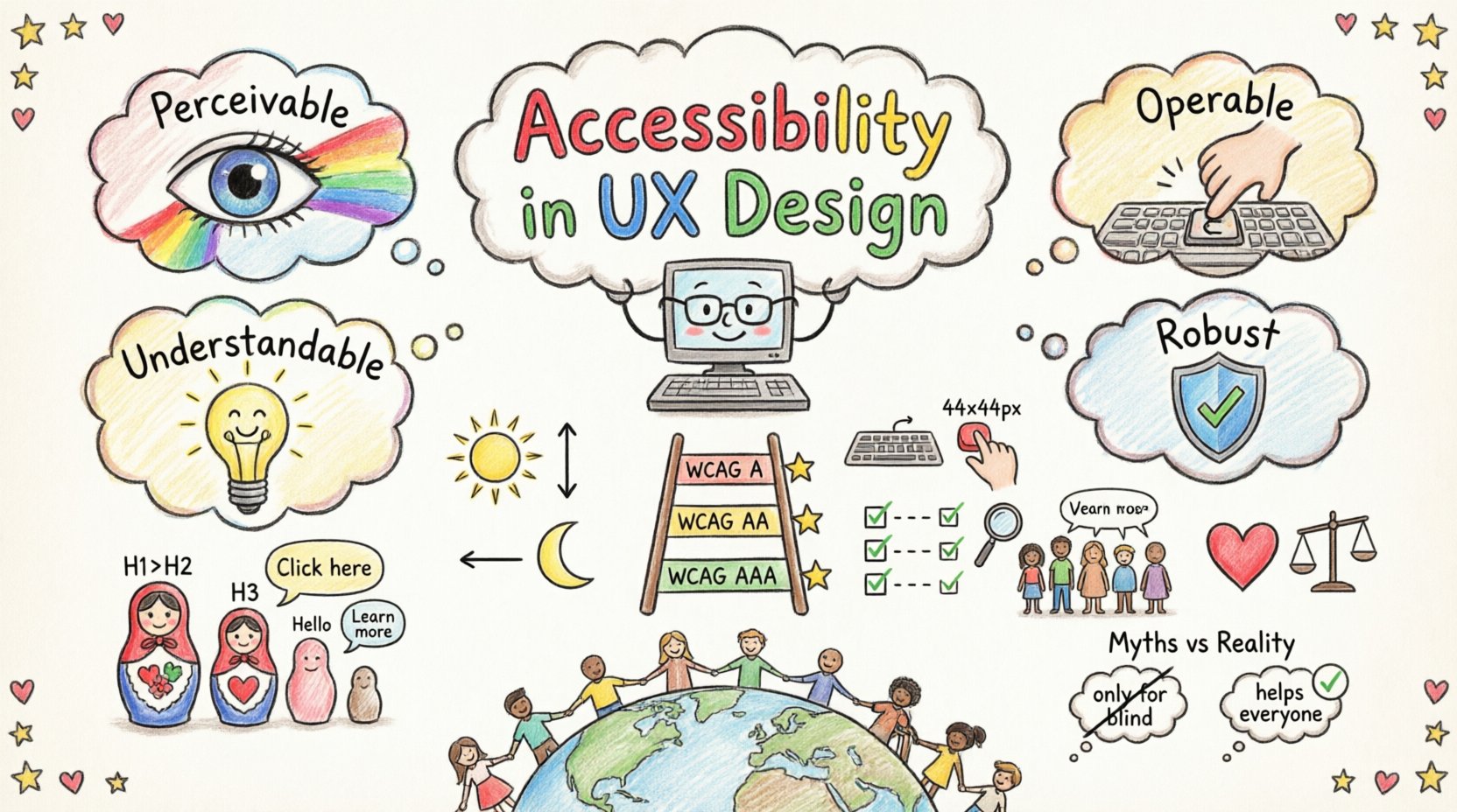
To build truly accessible applications, designers and developers must adhere to the Web Content Accessibility Guidelines (WCAG). These guidelines are organized around four core principles, often remembered by the acronym POUR. Each principle represents a category of requirements that must be met.
- Perceivable: Information and user interface components must be presentable to users in ways they can perceive. Users must be able to see or hear the content.
- Operable: User interface components and navigation must be operable. Users must be able to interact with the interface using various input methods, including keyboard, voice, or touch.
- Understandable: Information and the operation of user interface must be understandable. Users must be able to understand the content and how to use the interface.
- Robust: Content must be robust enough to be interpreted reliably by a wide variety of user agents, including assistive technologies.
Ignoring these principles leads to exclusion. Prioritizing them ensures that your application is usable by the widest possible audience. This is not just about compliance; it is about empathy and functionality.
The WCAG Framework Explained 📋
The WCAG standards are divided into three levels of conformance: A, AA, and AAA. Level A is the minimum level of accessibility. Level AA addresses the most common barriers for disabled users and is often the target for legal compliance. Level AAA is the highest level of conformance, though not always achievable for all content.
For most modern applications, targeting WCAG 2.1 Level AA is the industry standard. This ensures a balance between feasibility and comprehensive accessibility. Below is a breakdown of the key technical requirements associated with these levels.
| Principle | Key Requirement | Level | Why It Matters |
|---|---|---|---|
| Perceivable | Text Alternatives for Non-Text Content | A | Screen readers need text to describe images. |
| Perceivable | Color Contrast Ratio | AA | Ensures text is readable for low vision users. |
| Operable | Keyboard Accessibility | A | Users without a mouse must navigate the app. |
| Operable | Focus Indicators | A | Users need to know where they are on the page. |
| Understandable | Consistent Navigation | A | Reduces cognitive load and confusion. |
| Robust | Valid Markup | A | Assistive technology parses the code correctly. |
Visual Design Requirements 👁️
Visual accessibility is often the first hurdle in the design process. It involves ensuring that information is conveyed in ways that do not rely solely on color, size, or sound. Designers must consider contrast, typography, and spacing.
Color Contrast and Text Readability
Contrast is the difference in luminance between the text and its background. Low contrast text is difficult to read for people with visual impairments or color vision deficiency. The standard ratio for normal text is 4.5:1, and for large text (18pt or 14pt bold), it is 3:1. This applies to both light text on dark backgrounds and dark text on light backgrounds.
Do not rely on color alone to convey meaning. If a form field has an error, do not just turn the border red. Include an icon and a text message explaining the issue. This ensures that color-blind users receive the same information as others.
Typography and Spacing
Typography choices impact readability significantly. Use clear, sans-serif fonts for digital interfaces as they are generally easier to read on screens. Avoid using all caps for large blocks of text, as this reduces reading speed. Ensure there is enough line height, typically 1.5 times the font size, to prevent lines of text from running together.
Text resizing is a critical feature. Users should be able to increase text size up to 200% without losing functionality or having text overlap. This requires a fluid layout that adjusts to content size rather than fixed containers.
Interaction and Navigation 🖱️
Operability focuses on how users interact with the interface. It ensures that navigation is possible without a mouse and that interactions are predictable.
Keyboard Navigation
Many users rely on the keyboard to navigate. This includes people with motor impairments who cannot use a mouse, as well as power users who prefer keyboard shortcuts. Every interactive element must be accessible via the Tab key. This includes buttons, links, form fields, and custom widgets.
The focus order must be logical. When a user presses Tab, the focus should move through the content in the same order it appears visually. Focus order cannot be random or based on the source code alone. If the visual layout changes, the focus order must adapt accordingly.
Focus Indicators
When a user tabs through a page, they need a clear indication of which element is currently selected. This is called the focus indicator. It is common practice to remove the default browser outline for aesthetic reasons, but this must be replaced with a custom style that is equally visible. A thick outline or a distinct color change is necessary.
Hidden focus indicators are a major accessibility failure. If a user cannot see where the focus is, they cannot navigate the application. Ensure the focus state is visible in all interactive states, including hover and active states.
Touch Targets
For mobile applications, touch targets must be large enough to be tapped accurately. Small targets lead to frustration and errors. The recommended minimum size for touch targets is 44×44 pixels. This ensures that users with motor impairments can tap the correct element without accidentally hitting a neighbor.
Spacing between touch targets is also important. If buttons are too close together, users may activate the wrong one. Provide adequate padding to separate interactive elements.
Content and Readability 📝
Content must be understandable for users with cognitive disabilities and those who use assistive technology. This involves structure, language, and labeling.
Heading Structure
Headings provide a roadmap for the page. Screen reader users often navigate by jumping from heading to heading. A logical hierarchy is essential. Do not skip heading levels. Start with H1, then H2, then H3, and so on. Avoid using headings solely for visual styling.
Each page should have only one H1 tag. This tag should describe the main topic of the page. Subsequent headings break down the content into manageable sections. This structure helps all users scan the page quickly to find relevant information.
Language and Labels
Use clear, simple language. Avoid jargon where possible. If technical terms are necessary, define them. Ensure that the language of the page is correctly declared. This allows screen readers to pronounce words correctly based on the language context.
Form labels are critical. Every input field must have a programmatically associated label. This label should describe what information is expected. Do not rely on placeholders as labels, as they disappear when the user starts typing. Use visible labels positioned above or next to the input field.
Links and Navigation
Link text should be descriptive. Avoid phrases like “click here” or “read more” as standalone links. These do not make sense out of context. Instead, use “read the accessibility guidelines” or “download the report.” This helps screen reader users understand where a link will take them.
Testing and Validation ✅
Building accessibility into the design phase is cost-effective, but testing is essential to verify implementation. Relying on a single method is insufficient. A combination of automated, manual, and user testing provides the most accurate results.
Automated Scanning
Automated tools can catch a significant portion of accessibility issues, such as missing alt text, color contrast failures, and invalid HTML. These tools scan the code and provide a list of violations. However, they cannot determine if the content is actually useful or logical. They are a starting point, not a finish line.
Manual Testing
Manual testing involves navigating the application using only a keyboard. This verifies keyboard accessibility and focus management. It also requires checking color contrast ratios and ensuring that focus indicators are visible. Manual testing is time-consuming but necessary for complex interactions.
User Testing
The most reliable validation comes from testing with real users. Include people with disabilities in your testing pool. Observe how they interact with the application. Note where they struggle or get confused. Their feedback is invaluable for identifying issues that tools and manual checks might miss.
Legal and Ethical Implications ⚖️
Accessibility is not just a design goal; it is a legal requirement in many jurisdictions. Laws such as the Americans with Disabilities Act (ADA) and Section 508 of the Rehabilitation Act require digital products to be accessible. Failure to comply can result in lawsuits and financial penalties.
Beyond legal compliance, there is an ethical obligation. Excluding people from using your product limits their ability to work, learn, and participate in society. Designing for accessibility aligns with values of equity and human rights. It signals that your brand values all customers.
Common Misconceptions 🚫
There are several myths surrounding accessibility that hinder progress. Understanding these helps clarify the true scope of the work.
- Myth: Accessibility is only for blind users.
Reality: It helps people with hearing, motor, and cognitive impairments, as well as situational limitations like bright sunlight or noisy environments. - Myth: Accessibility makes the design ugly.
Reality: Accessible design often leads to cleaner, simpler, and more user-friendly interfaces. - Myth: It is too expensive to implement.
Reality: Fixing accessibility after launch costs significantly more than building it in from the start. - Myth: Automated tools are enough.
Reality: Tools miss context. Human review is always required.
Building an Inclusive Culture 🤝
Accessibility is a team effort. It requires collaboration between designers, developers, product managers, and content creators. Establishing a culture of inclusivity ensures that accessibility is considered at every stage of the development lifecycle.
Training and Awareness
Provide regular training for the team on accessibility standards and best practices. Ensure everyone understands the POUR principles. When team members understand the “why,” they are more likely to prioritize the “how.”
Documentation
Maintain an accessibility style guide. Document how components should be built and styled to meet standards. This ensures consistency across the application. Include examples of accessible patterns and anti-patterns.
Ongoing Maintenance
Accessibility is not a one-time task. New features are added constantly. Ensure that accessibility checks are part of the definition of done for every user story. Integrate accessibility testing into the CI/CD pipeline to catch regressions early.
Future Considerations 🔮
The landscape of accessibility is evolving. New technologies introduce new challenges and opportunities. Voice user interfaces, for example, require specific considerations for clarity and feedback. Augmented reality and virtual reality present unique spatial navigation requirements.
Staying informed about emerging standards is crucial. The WCAG guidelines are updated periodically to reflect new technologies and user needs. Subscribe to industry updates and participate in accessibility communities to stay current.
By committing to a rigorous accessibility checklist, you build products that are not only compliant but also superior. You create experiences that work for everyone, everywhere. This is the foundation of modern, responsible UX design.