


Creating a user experience that works is not about guessing. It is about understanding human behavior, solving complex problems, and validating solutions with evidence. For interaction designers, the portfolio is the primary vehicle for demonstrating competence. However, a collection of screenshots does not tell the full story. What hiring managers and stakeholders truly value are detailed case studies that reveal the thinking behind the visuals. This guide explores how to construct compelling narratives around your design work, drawing from real-world successes in digital design.
Why Case Studies Define Modern Interaction Design 📊
In the current digital landscape, the barrier to entry for visual design is lower than ever. Tools are more accessible, and templates are abundant. This shift has raised the bar for what constitutes a professional portfolio. A static image of a screen can be replicated by anyone with basic skills. A case study, however, demonstrates the intellectual rigor required to solve a problem.
Case studies serve several critical functions for both the designer and the audience:
- Demonstrating Process: They show how you move from ambiguity to clarity. Stakeholders need to know you can navigate uncertainty.
- Highlighting Problem-Solving: It is not enough to make things look good. You must explain why a specific decision was made and how it addressed a user need.
- Providing Context: A single screen lacks context. A case study explains the business goals, the user constraints, and the technical limitations.
- Building Trust: When you share your failures and how you overcame them, you build credibility. Perfection is suspicious; iteration is human.
Without a strong narrative, your work remains invisible. A well-structured case study allows a recruiter to understand your value in under three minutes. It connects the dots between your actions and the resulting impact.
The Anatomy of a High-Impact Portfolio Piece 🧩
Every successful project follows a logical flow. While the specifics vary by industry, the core structure remains consistent. A comprehensive guide should break down the project into digestible sections. This structure helps the reader follow your train of thought without getting lost in technical jargon.
Here is the essential framework for a robust case study:
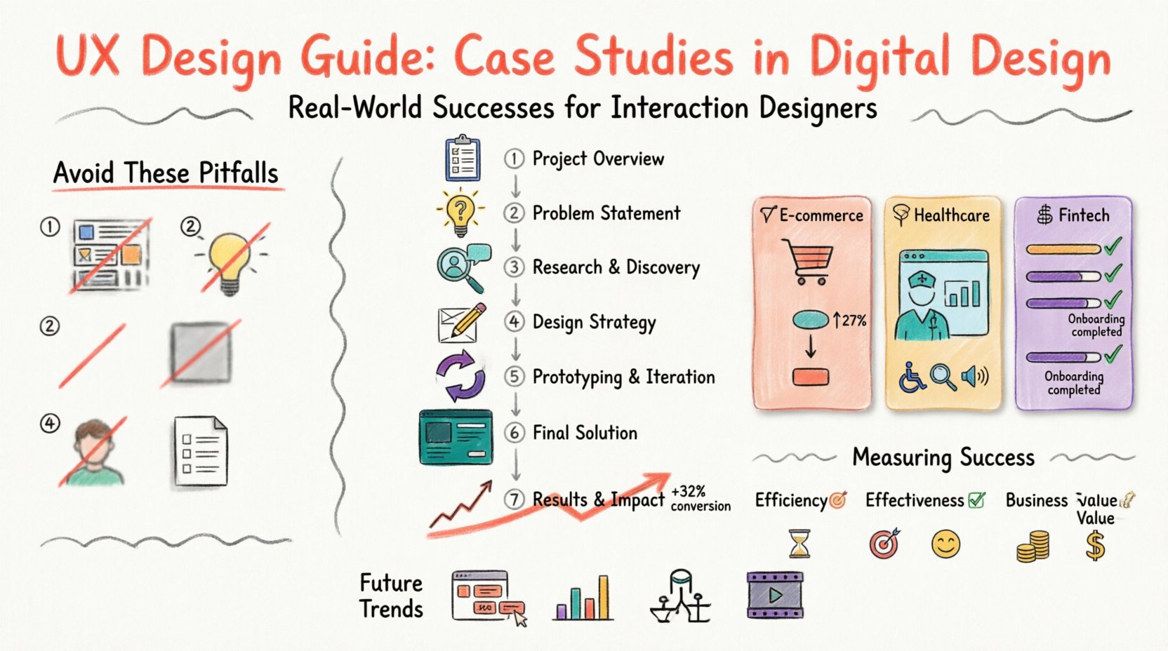
- Project Overview: A brief summary of the challenge, the timeline, and your role.
- Problem Statement: What was broken? Who was affected? What were the business implications?
- Research & Discovery: How did you gather information? Who did you talk to? What data did you analyze?
- Design Strategy: How did you translate insights into concepts? What were the guiding principles?
- Prototyping & Iteration: How did you build the solution? What happened during testing?
- Final Solution: The finished product, presented in context.
- Results & Impact: The metrics that prove the design worked.
It is important to remember that this is not a linear checklist. In practice, design is cyclical. You may return to research after prototyping. Your case study should reflect this reality, showing that the process was adaptive rather than rigid.
Real-World Success Stories Across Industries 💡
Theory becomes clear when applied to practice. Below are three distinct examples of how interaction designers have tackled challenges in different sectors. These examples highlight the diversity of the field and the specific skills required for each domain.
1. E-Commerce Checkout Optimization 🛒
The Challenge: An online retailer was losing customers at the final stage of the purchase process. Cart abandonment rates were high, and revenue was stagnating despite strong traffic.
The Approach: The design team began by analyzing user flow data. They identified a specific friction point where users were forced to create an account before purchasing. This created unnecessary friction for first-time buyers.
The Solution: The team introduced a guest checkout option. They simplified the form fields by removing non-essential data and implementing auto-fill features where possible. They also added trust signals, such as security badges, directly adjacent to the payment button.
The Outcome: After launching the new flow, the conversion rate increased significantly. The number of completed purchases rose, and support tickets regarding checkout errors dropped. This proved that removing barriers is often more effective than adding features.
2. Healthcare Dashboard Accessibility 🏥
The Challenge: A medical practice management software was difficult for nurses to use during high-stress shifts. Critical information was hidden behind multiple clicks, leading to potential safety risks.
The Approach: The team conducted shadowing sessions in the hospital. They observed how nurses interacted with the system while performing other tasks. They found that the interface was too text-heavy and lacked visual hierarchy.
The Solution: The redesign focused on information density and clarity. Critical alerts were color-coded and positioned at the top of the screen. Touch targets were enlarged to accommodate use while moving. Dark mode was introduced to reduce eye strain in dimly lit rooms.
The Outcome: Task completion times decreased by nearly twenty percent. Staff reported feeling less overwhelmed by the system. The project highlighted the importance of designing for the environment, not just the screen.
3. Fintech Onboarding Experience 🏦
The Challenge: A financial institution struggled to get users to complete their identity verification process. The drop-off rate was over fifty percent, limiting growth.
The Approach: User interviews revealed anxiety regarding data privacy and confusion about the technical requirements. Users did not understand why certain documents were needed or how they would be used.
The Solution: The team redesigned the onboarding flow to include educational tooltips at every step. They broke the process into smaller, manageable chunks to reduce cognitive load. They also provided a progress bar to show users how close they were to completion.
The Outcome: Completion rates doubled within a quarter. Customer satisfaction scores improved, and the support team saw a reduction in related inquiries. This case demonstrated that trust can be engineered through clear communication.
Measuring Success: Data Over Opinion 📈
One of the most common mistakes in design documentation is relying on subjective statements like “I think this looks better.” To validate your work, you need quantitative and qualitative data. Metrics provide the evidence required to defend your decisions.
When documenting results, consider these categories of measurement:
- Efficiency: How much time does it take to complete a task? (e.g., Time on Task)
- Effectiveness: How many users successfully complete the goal? (e.g., Task Success Rate)
- Satisfaction: How do users feel about the experience? (e.g., Net Promoter Score, System Usability Scale)
- Business Value: How does the design impact the bottom line? (e.g., Conversion Rate, Revenue per User)
It is also vital to distinguish between leading and lagging indicators. A leading indicator might be the number of clicks required to reach a button. A lagging indicator might be the total revenue generated over a month. Both are useful, but they tell different parts of the story.
| Method | Type | Best For | Example Metric |
|---|---|---|---|
| Usability Testing | Qualitative | Identifying friction points | Task Success Rate |
| A/B Testing | Quantitative | Comparing design variations | Conversion Rate |
| Analytics Review | Quantitative | Understanding behavior at scale | Bounce Rate |
| Surveys | Qualitative/Quantitative | Gathering user sentiment | Satisfaction Score |
Common Pitfalls in Design Documentation 🚫
Even experienced designers can stumble when presenting their work. Avoiding these common errors ensures your portfolio remains focused and professional.
- Too Much Visuals, Too Little Context: Posting high-resolution images without explaining the problem they solve is a missed opportunity. Always pair visuals with the “why” behind them.
- Selling the Wrong Problem: Ensure the problem you solved is actually the one the business faced. Do not claim to solve a business issue if you only changed the color scheme.
- Ignoring the Negative: If a feature failed, document it. Explain what you learned. This shows resilience and a commitment to continuous improvement.
- Lack of Focus: Do not try to include every single screen. Select the moments that best illustrate the journey. Curate the content to support the narrative.
- Skipping the Research: Skipping the research phase makes the solution look arbitrary. Show the user interviews, the personas, and the data that drove the design.
Future Trends in Digital Design Case Studies 🔮
The landscape of design documentation is evolving. As tools become more integrated and data collection becomes easier, case studies are becoming more dynamic. Here is what to watch for in the near future.
Interactive Prototypes: Static images are becoming less effective. Embedding clickable prototypes allows reviewers to experience the flow directly within the portfolio. This provides a more immersive understanding of the interaction.
Data Visualization: Raw numbers are hard to digest. Using charts and graphs to represent research findings makes complex data accessible. A heat map of user clicks can tell a story faster than a paragraph of text.
Accessibility as a Standard: Inclusion is no longer an afterthought. Case studies that explicitly detail how accessibility was considered and tested will stand out. This includes color contrast, screen reader compatibility, and keyboard navigation.
Video Narratives: Short video clips of you explaining the process can add a personal touch. It humanizes the work and allows you to convey enthusiasm and passion that text cannot capture.
Building Your Own Archive 📚
Creating these stories takes time. You do not need to start from scratch for every new project. Maintain a system for collecting artifacts as you work. Save your sketches, your notes from meetings, and your rough drafts. These materials become the fuel for your future case studies.
Start small. Pick one project from your past and rewrite it using the structure outlined in this guide. Focus on clarity and honesty. Ask yourself: If I were hiring for this role, would I feel confident that this person could solve my problems? If the answer is no, dig deeper. Add more detail to the research. Clarify the constraints. Show the iteration.
Remember, a case study is a story about people. It is about the user who benefited from the design and the business that grew because of it. When you center your narrative on human impact, your work resonates. It moves beyond pixels and into the realm of value creation.
By adhering to these principles, you build a body of work that speaks for itself. You demonstrate that you are not just a creator of interfaces, but a strategic partner in product development. This is the standard for interaction design today.