


Building distributed systems requires a shift in mindset. Instead of monolithic code flowing through a single process, you are now managing distinct services that talk to one another across a network. 🌐 To navigate this complexity, visual documentation becomes essential. Communication diagrams serve as a critical map for understanding how data moves between these independent units. This guide explores the mechanics, patterns, and best practices for designing these diagrams effectively.
Understanding the Core Purpose 🎯
A communication diagram is a type of interaction diagram used to visualize how objects or components in a system interact with each other. In the context of microservices, these objects represent your individual services. Unlike other diagrams that focus strictly on timing, communication diagrams emphasize the structural relationships and the flow of messages between nodes.
When you start a new project, the architecture can seem overwhelming. You might have a user interface, an authentication service, a billing engine, and a notification worker. Without a clear map, the connections between these entities can become a tangled web. Diagramming helps you:
- Identify Dependencies: See exactly which services rely on others before writing code. 🕸️
- Visualize Data Flow: Track how a request enters the system and how it propagates. 🔄
- Spot Bottlenecks: Find single points of failure or high-latency paths. ⏳
- Onboard Team Members: Provide a clear visual reference for new engineers joining the team. 👥
Anatomy of a Service Communication Map 🗺️
To draw an effective diagram, you must understand the building blocks. These elements remain consistent regardless of the tool you use.
1. Participants (Services) 🏗️
Each box or node represents a logical unit of deployment. In a distributed environment, this could be a container, a function, or a virtual machine. Labeling them clearly is vital. Avoid generic names like “Service 1”. Use domain-driven names like “Order Processing” or “Inventory Check”.
2. Links (Connections) 🔗
Lines connecting the participants represent the communication channels. These are not physical wires but logical paths over the network. You should indicate the direction of the relationship. A solid line usually implies a direct dependency, while a dashed line might indicate an optional or asynchronous link.
3. Messages (Interactions) 💬
Messages are the arrows placed along the links. They represent the actual data or requests being exchanged. Every arrow needs a label describing the action, such as “GET /orders” or “Publish Event”. If the interaction is complex, you can number the messages to indicate the sequence of events.
Message Types and Protocols 📡
Not all communication is created equal. The way services talk to each other dictates the diagram’s structure. You generally categorize these into synchronous and asynchronous flows.
Synchronous Communication ⏱️
In this model, the caller waits for the responder to reply before continuing. This is common for user-facing APIs where immediate feedback is required.
- Request/Response: Service A sends a request and blocks until Service B returns data. 🔒
- HTTP/REST: A standard protocol for stateless interactions. Often used in diagrams to show web gateways.
- gRPC: A binary protocol for high-performance internal communication. Best for service-to-service calls.
Asynchronous Communication ⚡
Here, the sender does not wait for a response. It sends the data and continues its work. This is crucial for decoupling systems.
- Event Publishing: A service publishes an event to a broker. Other services subscribe to it. 📢
- Fire-and-Forget: The sender initiates a task and never checks the result. Useful for logging or notifications.
- Queues: Messages sit in a buffer until a consumer is ready to process them. 📥
Architectural Patterns in Diagrams 🏛️
When designing the flow, you will likely choose between two dominant patterns. Visualizing the difference is key to understanding the trade-offs.
Service Orchestration 🎼
In orchestration, a central coordinator directs the workflow. It tells other services what to do and in what order. If one service fails, the coordinator decides how to handle the error.
- Pros: Easy to understand the flow; centralized error handling. 🎛️
- Cons: The coordinator becomes a single point of failure; tight coupling.
Service Choreography 💃
In choreography, there is no central director. Services react to events published by other services. Each service knows what to do when it receives a specific signal.
- Pros: Highly decoupled; scalable; no single point of failure. 🚀
- Cons: Harder to trace the full flow; logic is distributed across many nodes.
Comparison Table
| Feature | Orchestration | Choreography |
|---|---|---|
| Control Flow | Centralized | Distributed |
| Coupling | Higher | Lower |
| Complexity | Logic in one place | Logic spread out |
| Failure Handling | Coordinator manages | Individual services manage |
| Best For | Simple, linear workflows | Complex, reactive systems |
Designing for Reliability 🛡️
A diagram is not just about success paths. You must visualize what happens when things go wrong. In a distributed system, network partitions and timeouts are inevitable.
Timeouts and Retries ⏳
Every arrow representing a network call should imply a timeout mechanism. If Service A calls Service B, what happens if Service B is slow? The diagram should indicate where the retry logic resides. Is it in the client or the server?
Circuit Breakers 🚨
When a service is failing repeatedly, you want to stop sending requests to it immediately. This prevents cascading failures. In your diagram, show a “Circuit Breaker” component sitting between the caller and the callee. This component blocks traffic during outages.
Dead Letter Queues 💀
In asynchronous flows, messages might fail processing multiple times. Instead of losing them, route them to a dead letter queue. This allows you to inspect the failed message later without blocking the main flow.
Security Considerations 🔐
Security cannot be an afterthought. Your diagrams must reflect how authentication and authorization flow through the system.
- Token Propagation: When a user hits the entry point, a token is generated. This token must be passed to every downstream service. Show this propagation with a specific note on the link.
- Service-to-Service Auth: Internal services also need to verify identity. Use mutual TLS or API keys. Mark these links with a lock icon or specific label.
- Data Encryption: Indicate if data is encrypted in transit (HTTPS) or at rest. This is often implied but good to note for compliance.
Common Design Pitfalls ⚠️
Even experienced engineers make mistakes when mapping these flows. Avoid these common traps to keep your architecture clean.
1. Tightly Coupled Loops 🔁
Ensure you do not create circular dependencies. If Service A calls Service B, and Service B calls Service A, you risk a deadlock. Use the diagram to trace every path and ensure there are no cycles.
2. The N+1 Problem 📉
Visualizing a list request can reveal performance issues. If a user requests a list of orders, and the order service calls the user service for every single order, you create an N+1 query problem. The diagram should show batch operations instead of individual calls.
3. Ignoring Latency ⏲️
A line on a diagram looks the same as a short link and a long link. However, a call across regions has different latency than a call within a data center. Use different line styles or colors to indicate geographic distance or latency tiers.
4. Over-Engineering 🏗️
Do not diagram every single method call. Focus on the high-level interactions. If a service has 100 internal methods, only show the entry points exposed to other services. Keep the view macro-level for clarity.
Best Practices for Documentation 📝
Once you have drawn the diagram, how do you maintain it? Documentation decays quickly if not managed.
- Keep it Updated: Treat the diagram as code. If the API changes, the diagram must change. Include it in your pull requests. 🔄
- Use Standard Notation: Stick to UML standards where possible. It ensures everyone on the team understands the symbols. 📐
- Version Control: Store diagram files in your repository. Do not keep them in a separate wiki that is disconnected from the code. 🗂️
- Layer Your Views: Create a high-level overview for stakeholders and a detailed view for developers. Do not mix them in one massive image.
Tools and Implementation 🛠️
While you should not rely on specific software vendors, the ecosystem offers various ways to create these diagrams. You can use text-based definitions that render into images, or drag-and-drop interfaces.
Text-based approaches are often preferred because they live in your code repository. You can version them, diff them, and review them just like source code. This ensures the diagram evolves with the system.
When drawing by hand, use consistent shapes. Rectangles for services, circles for external actors, and diamonds for decision points. Consistency reduces cognitive load when reading the map.
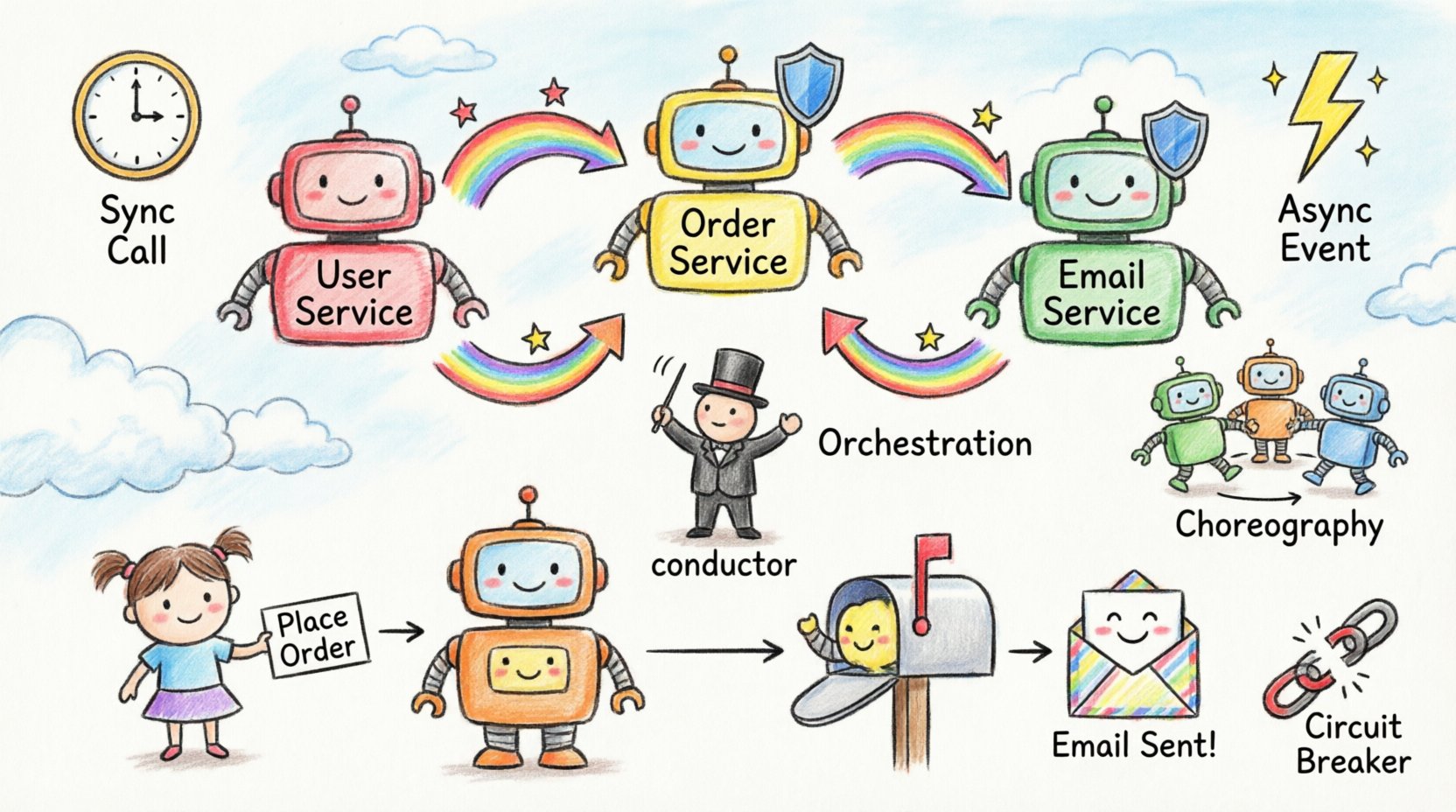
Scenario: The Order Workflow 🛒
Let us look at a concrete example of a typical microservice interaction. Imagine a user placing an order.
- API Gateway: The request enters here. It validates the token and routes the traffic. 🔑
- Order Service: Receives the request. It creates a record in its database. 📝
- Inventory Service: The Order Service calls Inventory to check stock. This is a synchronous call. 📦
- Payment Service: If stock is available, Order Service calls Payment. This is also synchronous. 💳
- Notification Service: Once payment succeeds, Order Service publishes an event. Notification Service listens and sends an email. 📧
In this scenario, the diagram would show the Gateway at the top, branching down to the Order Service. From there, lines go to Inventory and Payment. A dashed line goes to Notification, indicating the asynchronous event. This visual separation helps engineers understand which parts of the system are critical for the immediate response and which are background tasks.
Measuring Success with Diagrams 📊
How do you know if your communication design is working? You can track specific metrics during the implementation phase.
- Latency Distribution: Measure the time taken for each arrow in your diagram. If one link consistently takes longer than expected, investigate the service behind it.
- Error Rates: Track the failure rate of each interaction type. High failure rates on a specific link indicate a need for better retry logic or circuit breaking.
- Throughput: Determine if the diagram supports the required load. A synchronous call might work for 100 requests per second but fail at 10,000.
Final Thoughts on Architecture 🏁
Communication diagrams are more than just pictures. They are a language for discussing system design. They force you to think about boundaries, ownership, and data integrity before a single line of code is written. By mastering the art of mapping these interactions, you build systems that are resilient, understandable, and maintainable.
Remember that architecture is a continuous process. As your system grows, the diagram will change. Embrace the change. Update the visuals as you learn. This keeps your team aligned and your infrastructure healthy.