


Backend debugging is often a solitary struggle against a wall of logs. Engineers stare at terminal screens, filtering lines of text, trying to trace a request as it hops across services. The data is there, but the context is missing. This is where visual modeling steps in. Specifically, the communication diagram offers a distinct advantage over standard sequence diagrams when analyzing system interactions. It shifts the focus from time-based ordering to object relationships and link structures.
When a system fails under load or behaves unexpectedly, text logs can become overwhelming. A communication diagram condenses this complexity into a map of connections. It reveals the topology of the failure. This guide explores how leveraging these diagrams improves the debugging process, reduces mean time to resolution (MTTR), and fosters better team collaboration.
🧩 Understanding the Communication Diagram
A communication diagram is a type of Unified Modeling Language (UML) diagram. It depicts interactions between objects or systems by showing the links between them and the messages passed along those links. Unlike a sequence diagram, which emphasizes the chronological order of messages, a communication diagram emphasizes the structural organization of the system.
- Objects: Represented as boxes, these are the components involved (e.g., User Service, Database, Cache Layer).
- Links: Lines connecting objects that represent a physical or logical connection.
- Messages: Arrows indicating data flow. These include activation bars to show processing duration.
- Sequence Numbers: Numbers on arrows clarify the order of operations without a strict vertical timeline.
In a backend context, these objects often represent microservices, database instances, or middleware components. The diagram provides a snapshot of how data moves through the architecture at a specific moment in time.
🐞 The Debugging Dilemma in Modern Backends
Modern backend architectures are rarely monolithic. They are distributed systems composed of numerous services. When a request fails, it might traverse five different hops. Logs are generated at each hop, scattered across different containers or servers.
Here are the common pain points engineers face:
- Fragmented Context: Logs from Service A do not easily link to logs from Service B without a unique correlation ID.
- State Blindness: Logs show actions but rarely show the state of the connection at the moment of failure.
- Network Ambiguity: It is difficult to visualize network latency or timeout chains purely through text.
- Cognitive Load: The human brain processes visual patterns faster than sequential text streams.
When an engineer tries to reconstruct the flow mentally, they risk missing a critical dependency. A communication diagram externalizes this mental model, allowing the team to see the entire interaction path at once.
🚀 Why Visuals Beat Logs Alone
Logs are essential for auditing and granular data inspection. However, they are poor at showing relationships. A communication diagram excels at showing relationships.
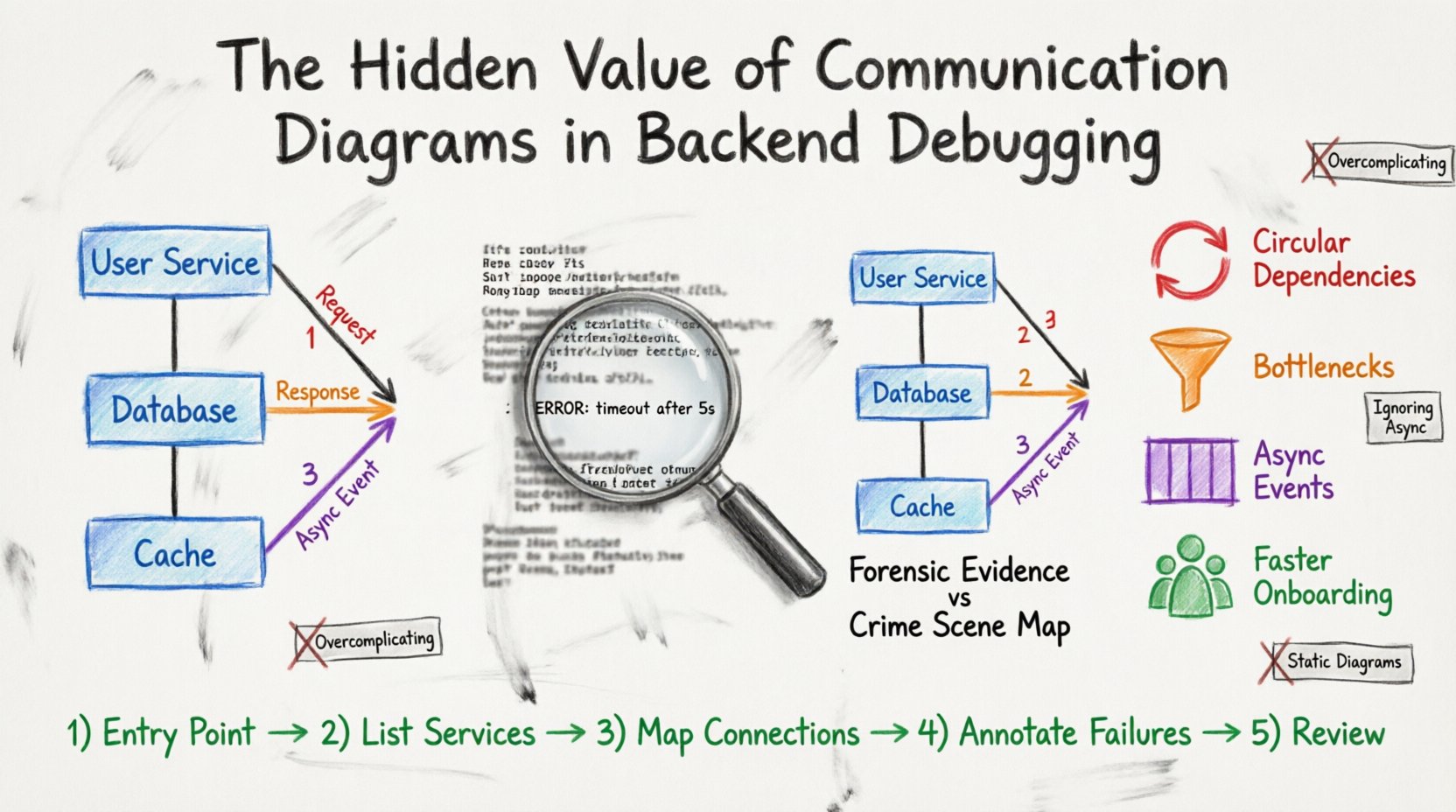
1. Identifying Circular Dependencies
In complex systems, services sometimes depend on each other in a loop. Service A calls Service B, which calls Service A. Logs might show a stack overflow or a timeout, but the root cause is the loop. A diagram makes this loop immediately visible as a closed circle of arrows.
2. Visualizing Data Flow Bottlenecks
If a specific link in the diagram has a high message count or long duration, it indicates a bottleneck. You can see which service is the choke point without tracing every log entry.
3. Clarifying Asynchronous Events
Backend systems often use message queues. Logs show a message sent and a message received, but the gap between them is invisible. A diagram can annotate the queue as a distinct object, showing the handoff point clearly.
4. Reducing Onboarding Time for New Engineers
When a new team member joins a debugging session, they need to understand the flow. Showing a diagram is faster than walking them through a log file. It provides a shared mental model for the group.
🛠️ Core Components of an Effective Diagram
To make a communication diagram useful for debugging, it must contain specific elements. Vague sketches do not help. Precision is required.
- Clear Object Labels: Use consistent naming conventions. Avoid “Service 1”. Use “Payment Gateway” or “Inventory API”.
- Message Types: Distinguish between synchronous (blocking) and asynchronous (fire-and-forget) calls. Use different line styles or arrowheads if possible.
- Error States: Mark failure points. If a timeout occurs at a specific link, note it directly on the diagram.
- Thresholds: Indicate expected vs. actual latency. If a link usually takes 50ms but took 5000ms, highlight that discrepancy.
- External Systems: Clearly mark third-party APIs or external databases. These are often the source of hidden issues.
💡 Practical Scenarios for Backend Troubleshooting
Here are specific scenarios where a communication diagram provides immediate value during a debugging session.
Scenario 1: The Timeout Chain
A user reports a slow page load. Logs show the frontend waits, the API gateway times out, and the backend service is busy. A communication diagram reveals the chain: Frontend → Gateway → Auth Service → Database. The diagram shows the Auth Service waiting on the Database. The visual confirms that the database connection pool is exhausted, not the gateway configuration.
Scenario 2: Data Inconsistency
Orders are placed, but inventory is not updated. Logs show the order service sent a message. The inventory service received it. Why is stock not deducted? The diagram shows a secondary path where the inventory service sends a confirmation back to the order service, which fails silently. The visual highlights the missing confirmation link.
Scenario 3: Race Conditions
Two users try to update the same resource. The logs show simultaneous writes. The diagram visualizes the two concurrent streams hitting the same object. It helps the team discuss locking mechanisms or optimistic concurrency control strategies.
Scenario 4: Dependency Failure
A third-party payment provider is down. The backend retries three times. The diagram shows the retry loop. It highlights that the error handling logic is trapped in a cycle, wasting resources. The team can see the need for a circuit breaker pattern visually.
📝 Creating a Diagram During a Live Incident
When a production incident occurs, stress is high. Drawing a diagram from scratch takes time. However, having a template or a quick method is crucial.
Follow these steps to build a diagram during a debugging session:
- Step 1: Identify the Entry Point: Start with the user or the triggering event.
- Step 2: List Active Services: Write down every service involved in the current request.
- Step 3: Map Connections: Draw lines between services based on what you know from the logs.
- Step 4: Annotate Failures: Mark where the process stopped or where errors occurred.
- Step 5: Review with Peers: Ask others if the connections match their understanding of the code.
This process does not require complex software. A whiteboard, a notepad, or a digital sketching tool works. The goal is clarity, not artistic perfection.
📊 Comparison: Logs vs. Communication Diagrams
To understand the value proposition, compare the two methods directly.
| Feature | Text Logs | Communication Diagram |
|---|---|---|
| Data Granularity | High (every line) | Low (abstracted flow) |
| Context | Low (fragmented) | High (systemic view) |
| Speed of Analysis | Slow (scanning required) | Fast (pattern recognition) |
| Dependency Visibility | Hidden in text | Explicit (links) |
| Collaboration | Hard to share context | Easy to share visual |
| Best For | Root cause deep-dive | Flow understanding & topology |
Logs provide the forensic evidence. The diagram provides the crime scene map. You need both for a complete investigation.
🚧 Common Mistakes to Avoid
Even with good intentions, diagrams can become misleading if created carelessly.
- Overcomplicating: Do not include every single variable. Focus on the flow of control and data between services.
- Ignoring Asynchrony: If a message is queued, do not draw it as an immediate arrow. Mark it as a queue interaction.
- Static Thinking: Backend systems change. A diagram from six months ago might show services that no longer exist. Keep diagrams updated.
- One-Size-Fits-All: Do not use the same diagram for a high-level overview and a specific bug. Create a detailed version for debugging and a high-level version for architecture.
- Skipping the Return Path: Debugging often involves how errors are propagated back. Ensure response paths are drawn, not just request paths.
🔧 Integrating into Your Workflow
How do you make this a standard part of your debugging routine? It requires a shift in process.
1. Pre-Mortem Planning
Before a deployment, sketch the expected communication path. If you know the flow, you know where to look when it breaks. This is proactive debugging.
2. Post-Mortem Documentation
After an incident is resolved, update the communication diagram with the actual failure path. This creates a living document of system health and known issues.
3. Pair Debugging
When two engineers debug together, one should read the logs while the other draws the diagram. This dual-approach ensures that the visual model matches the raw data.
4. Automated Generation (If Possible)
Some tracing platforms can generate visualizations from trace data. While manual diagrams offer more control, using automated traces as a base for a communication diagram can save time.
📈 The Long-Term Impact on Team Efficiency
Investing time in creating communication diagrams pays off over time. It builds institutional knowledge.
- Faster Onboarding: New hires can understand the system topology without reading thousands of lines of code.
- Better Code Reviews: Reviewers can spot potential communication bottlenecks before code is merged.
- Reduced Rework: Understanding the full flow prevents patching one symptom while ignoring another.
- Improved Incident Response: When a system goes down, the team can quickly identify the affected area based on the visual map.
This approach transforms debugging from a reactive activity into a structured engineering practice. It moves the focus from “fixing the bug” to “understanding the system”.
🎨 Conclusion
Backend debugging is a complex task that requires both depth and breadth. Text logs offer the depth needed to understand specific errors. Communication diagrams offer the breadth needed to understand system interactions. By combining these tools, engineers can navigate complex architectures with confidence.
There is no single tool that solves every problem. However, the visual representation of data flow remains one of the most effective ways to communicate technical issues. It bridges the gap between abstract code and concrete reality. Start sketching your next debugging session. You might find the solution was hidden in the lines all along.
Remember, the goal is clarity. Whether you use a whiteboard, a digital tool, or pen and paper, the act of mapping the flow forces you to slow down and think. That pause is often where the breakthrough happens.