


Releasing a digital product without a thorough review of user experience is akin to launching a vessel without checking the hull for leaks. While design aesthetics attract attention, usability ensures retention. When friction points exist within a user journey, they create barriers that prevent users from achieving their goals. This guide provides a structured approach to identifying, analyzing, and resolving critical usability problems before deployment. By adhering to established principles and rigorous testing protocols, teams can ensure the final deliverable functions smoothly for all intended audiences.
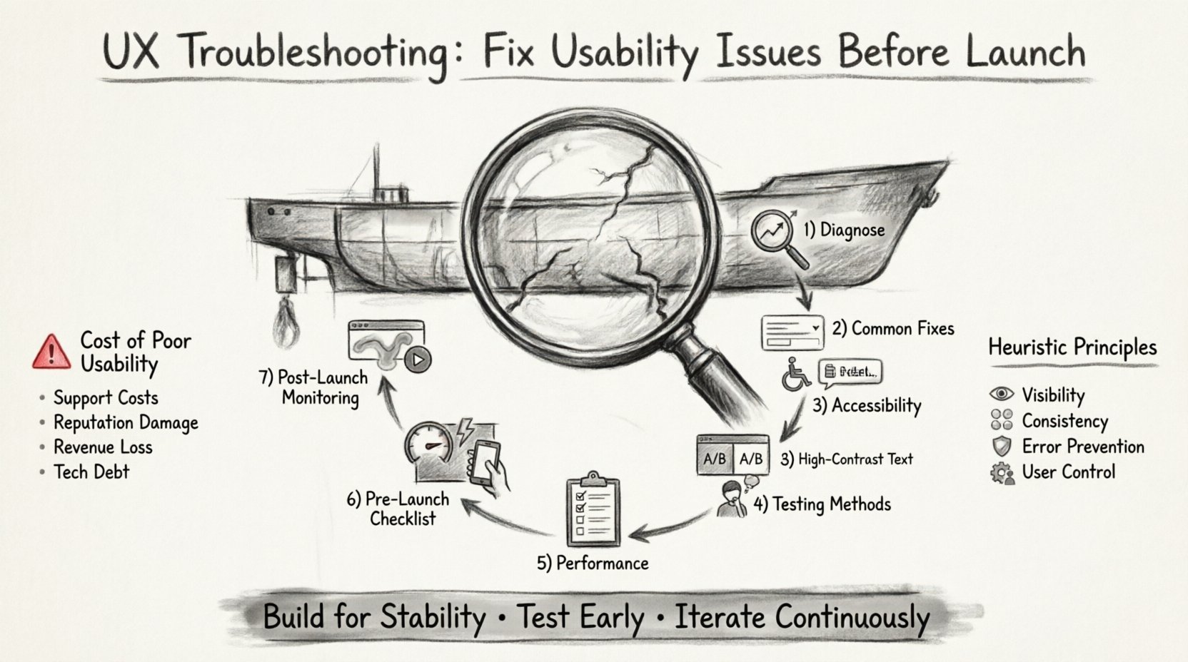
Understanding the Cost of Poor Usability 💸
Usability issues manifest in various forms, from confusing navigation menus to slow loading times. Each instance of friction contributes to a cumulative negative experience. When users encounter obstacles, they often abandon the task rather than persist. This abandonment rate directly impacts key performance indicators such as conversion rates, customer satisfaction scores, and long-term engagement. Fixing these issues during the design phase is significantly less resource-intensive than attempting to patch them post-launch.
Consider the following impacts of unresolved usability problems:
- Increased Support Costs: Confusing interfaces lead to higher volumes of help desk tickets and customer inquiries.
- Brand Reputation Damage: Frustrated users share negative experiences through reviews and social channels.
- Lost Revenue: Every step of friction in a checkout or sign-up process reduces the likelihood of completion.
- Development Debt: Major structural changes after launch require significant engineering resources and time.
Phase 1: Diagnosing the Problem 🕵️♂️
Effective troubleshooting begins with accurate diagnosis. You cannot fix what you cannot measure. This phase involves gathering data to pinpoint exactly where users are struggling. Relying on intuition alone is insufficient; empirical evidence guides the solution.
1. Heuristic Evaluation
A heuristic evaluation involves reviewing the interface against established usability principles. Experts examine the product to identify violations of standard design conventions. Common areas of concern include:
- Visibility of System Status: Does the user know what is happening? Loading indicators, progress bars, and error messages must be clear.
- Match Between System and Real World: Does the language used align with how users speak and think?
- User Control and Freedom: Can users easily undo actions or exit unwanted states?
- Consistency and Standards: Do elements behave predictably across different sections of the application?
- Error Prevention: Can the design prevent errors from occurring in the first place?
2. Analytics Review
Quantitative data reveals patterns that qualitative observation might miss. Look for specific metrics that indicate friction:
- Bounce Rate: High bounce rates on entry pages may suggest the content does not match user intent.
- Drop-off Points: Where do users abandon a multi-step process?
- Time on Page: Excessive time spent on a single page might indicate confusion or difficulty in finding information.
- Search Terms: What are users searching for internally? High-volume searches often indicate missing content or poor information architecture.
Phase 2: Common Usability Patterns & Fixes 🧩
Certain usability issues recur across digital products. Understanding these common patterns allows for faster remediation.
Navigation and Information Architecture
If users cannot find what they need, the design has failed. Navigation structures must be logical and intuitive.
- Labeling: Use clear, descriptive labels for menu items. Avoid jargon or internal terminology.
- Depth: Limit the number of clicks required to reach key information. Ideally, critical actions should be within three clicks from the homepage.
- Breadcrumbs: Implement breadcrumb trails so users understand their location within the hierarchy and can backtrack easily.
- Search Functionality: Ensure the search bar is prominent and offers autocomplete suggestions to guide queries.
Form Optimization
Forms are often the highest-friction point in a user journey. Every field added increases the cognitive load and the time required to complete the task.
- Minimize Fields: Remove any field that is not absolutely necessary for the transaction.
- Inline Validation: Provide immediate feedback on input errors rather than waiting for form submission.
- Clear Error Messages: Errors should explain what went wrong and how to fix it. Avoid generic messages like “Invalid Input.”
- Input Formatting: Format inputs automatically (e.g., phone numbers, dates) to reduce user effort.
Feedback Loops
Systems must communicate their state to users. A silent system is a confusing system.
- Success States: Confirm when an action is completed successfully.
- Processing States: Show loading indicators during asynchronous operations to prevent duplicate submissions.
- Failure States: Clearly indicate when an operation fails and provide actionable recovery steps.
Phase 3: Accessibility and Inclusivity ♿
Usability is not limited to the average user. It must encompass individuals with varying abilities and preferences. Ignoring accessibility excludes a significant portion of the audience and can lead to legal risks.
Key Accessibility Standards
- Color Contrast: Ensure text and background colors have sufficient contrast ratios to be readable for users with visual impairments.
- Keyboard Navigation: All interactive elements must be accessible via keyboard alone, without requiring a mouse.
- Screen Reader Compatibility: Use semantic HTML tags and ARIA labels to ensure screen readers can interpret content correctly.
- Touch Target Size: Ensure buttons and links are large enough to be tapped accurately on mobile devices.
Phase 4: Testing Methodologies 🧪
Before launch, the product must undergo testing. This process validates assumptions and reveals hidden issues.
1. Remote Unmoderated Testing
This method allows users to complete tasks on their own time using their own devices. It provides data on how the product performs in a natural environment. Key benefits include:
- Scalability: Recruit many participants quickly.
- Authenticity: Users are in their own environment, not a lab.
- Cost Efficiency: Generally less expensive than moderated sessions.
2. Moderated Usability Testing
In this scenario, a facilitator guides the user through tasks. This allows for deeper probing into user thoughts and behaviors.
- Think Aloud Protocol: Ask users to verbalize their thoughts as they navigate the interface.
- Task Completion: Observe whether users can successfully finish assigned goals.
- Emotional Response: Note signs of frustration or confusion during the session.
3. A/B Testing
When unsure which design variation works best, present different versions to different segments of users. Measure performance metrics to determine the superior option.
- Compare button colors, copy variations, or layout structures.
- Run tests for a statistically significant duration to avoid skewed data.
- Focus on one variable at a time to isolate causes of changes.
Phase 5: Performance as UX ⚡
Speed is a fundamental aspect of usability. Users expect digital interactions to be instantaneous. Delays disrupt flow and degrade trust.
- Load Times: Optimize images and code to ensure pages render quickly. Aim for under three seconds for initial load.
- Interactive Readiness: Ensure the interface responds immediately to user input. Delays in button clicks or page transitions feel broken.
- Mobile Optimization: Ensure performance holds up on cellular networks, which may be slower than Wi-Fi.
Phase 6: The Pre-Launch Audit Checklist 📋
To ensure nothing is overlooked, use a comprehensive checklist before pushing the product to production. This table outlines critical areas to verify.
| Category | Check Item | Priority | Status |
|---|---|---|---|
| Navigation | Are all links active and leading to the correct destination? | High | Pending |
| Forms | Do error messages appear immediately upon incorrect entry? | High | Pending |
| Accessibility | Is the site navigable using only the keyboard? | Critical | Pending |
| Performance | Does the site load within 3 seconds on 4G networks? | Medium | Pending |
| Mobile | Is touch target size adequate for thumbs? | High | Pending |
| Content | Is all text free of grammatical errors and typos? | Medium | Pending |
| Security | Are data transmission protocols encrypted? | Critical | Pending |
| Analytics | Are tracking pixels and events firing correctly? | Medium | Pending |
Phase 7: Post-Launch Monitoring 📈
Even with extensive pre-launch testing, issues may arise after deployment. Continuous monitoring is essential to maintain usability standards.
- Session Recordings: Review recordings of user sessions to observe real-world interactions.
- Heatmaps: Analyze where users click and scroll to identify areas of interest or confusion.
- Feedback Channels: Maintain open lines of communication for users to report bugs or suggest improvements.
- Iterative Updates: Treat the product as a living entity. Plan regular updates to address new findings.
Conclusion: Building for Stability 🏗️
Fixing usability issues before launch is not merely a technical step; it is a strategic necessity. It demonstrates respect for the user’s time and attention. By systematically applying diagnostic tools, adhering to accessibility standards, and validating designs through testing, teams can deliver products that function reliably. The goal is a seamless experience where the technology recedes into the background, allowing the user to focus entirely on their objectives. This approach fosters trust and encourages long-term engagement.
Remember that usability is not a one-time check. It requires vigilance and a commitment to continuous improvement. As user behaviors evolve and new devices emerge, the need for troubleshooting remains constant. Prioritize the user journey at every stage of development to ensure success in the digital landscape.