Building robust application programming interfaces requires more than just defining endpoints and return codes. It demands a clear understanding of how information moves through a system. Data Flow Diagrams (DFDs) provide this structural clarity. When applied to API documentation, they transform abstract technical specifications into tangible visual narratives. This approach helps stakeholders, developers, and consumers understand the lifecycle of data without needing to parse complex text descriptions.
This guide explores the practical application of DFDs within the context of API design. We will examine the components, the levels of abstraction, and how these diagrams integrate with standard documentation practices. The goal is to create a shared understanding of data architecture that supports maintenance and scaling.
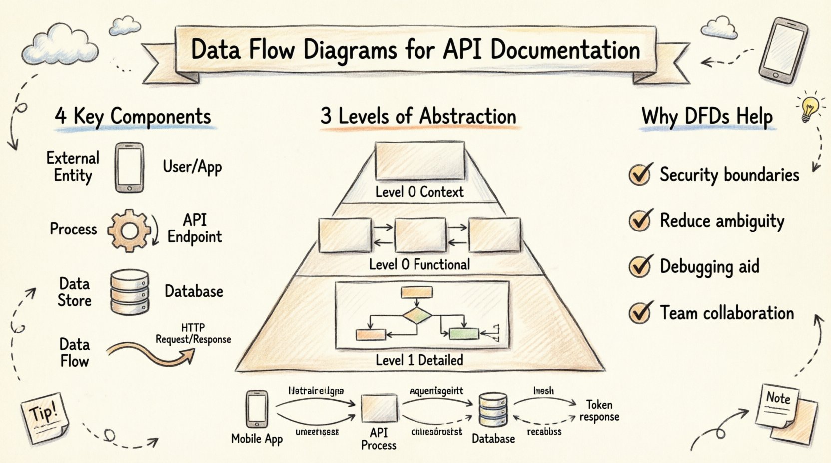
Understanding the Core Concept 🧩
A Data Flow Diagram is a graphical representation of the flow of data through an information system. Unlike sequence diagrams, which focus on time and order, DFDs focus on
what moves and
where it goes. In the context of an API, the diagram maps the interaction between external systems and the internal processing logic.
Think of an API as a bridge. The DFD illustrates the traffic crossing that bridge, the checkpoints at the ends, and the destinations within the receiving infrastructure. This visual abstraction is crucial for teams managing complex microservices or legacy integrations.
Key Components of a DFD for APIs 📝
To construct an effective diagram, one must understand the four fundamental elements used in standard notation.
- External Entities: These are sources or destinations outside the system boundary. In API terms, this could be a mobile application, a third-party service, or a human user interface. They initiate requests or receive responses.
- Processes: These represent actions that transform data. An API endpoint often acts as a process node. For example, a “Validate User” process takes credentials and outputs a token.
- Data Stores: These are repositories where information rests. A database, a cache, or a file system falls into this category. APIs often read from or write to these stores.
- Data Flows: These are the arrows indicating the movement of information. Every line on the diagram represents a packet of data traveling from one component to another.
Levels of Abstraction 📉
Complex systems require documentation at varying levels of detail. DFDs support this through a hierarchical approach. This allows stakeholders to view the big picture without getting lost in the implementation details immediately.
1. Context Diagram (Level 0)
The Context Diagram is the highest level of abstraction. It shows the entire API system as a single process and its relationship with external entities. It answers the question: “What is this API, and who uses it?”
| Component |
Description |
| Central Process |
Represents the API as a whole. |
| External Entity |
The Client Application. |
| External Entity |
The Database Server. |
| Data Flow |
Request and Response data. |
This diagram is ideal for high-level architectural reviews. It sets the boundaries for the system and defines the scope of integration.
2. Level 0 Diagram (Functional Decomposition)
Once the boundaries are clear, the central process is exploded into major sub-processes. This level breaks the API down into logical functional areas. For example, an e-commerce API might have processes for “Order Management”, “Inventory Check”, and “Payment Processing”.
At this stage, the diagram reveals the internal structure without detailing every single logic gate. It helps developers see how data splits and merges across different functional modules.
3. Level 1 Diagram (Detailed Logic)
This is the most granular level. Each process from Level 0 is broken down further. This is where specific API endpoints might be represented. It shows exactly which data fields are required for a specific action and where the result is stored.
This level is critical for onboarding new developers. It provides a map of the logic flow that complements the codebase.
Why DFDs Enhance API Documentation 🛡️
Standard API documentation often relies heavily on text and code snippets. While necessary, text can be dense and difficult to visualize. A DFD adds a layer of comprehension that text alone cannot achieve.
1. Clarifying Data Boundaries
Security is a primary concern in modern development. DFDs explicitly show where data crosses system boundaries. By identifying external entities clearly, teams can better implement authentication and authorization at the correct points. It becomes visually obvious where sensitive information enters or leaves the trusted zone.
2. Reducing Ambiguity
Text descriptions of data flow can be misinterpreted. “The system sends data to the database” could mean a write operation, a read operation, or an update. A DFD uses specific shapes and arrows to denote direction and type. This reduces the cognitive load on the reader trying to understand the architecture.
3. Supporting Debugging
When an integration fails, having a visual map of the expected data path is invaluable. Engineers can trace the flow on the diagram to identify where the breakdown occurred. Is the data failing to reach the process? Is the output from the process not reaching the destination?
Integrating DFDs with Technical Specs 🔄
DFDs do not replace OpenAPI specifications or GraphQL schemas. They complement them. The text-based specs define the syntax (the rules), while the DFD defines the semantics (the meaning and flow).
To integrate these effectively, consider the following workflow:
- Define the Schema: Create the API specification first. This defines the inputs and outputs.
- Map the Flow: Use the specification to draw the DFD. Map each endpoint to a process node.
- Verify Consistency: Review the diagram against the spec. Ensure every data flow in the diagram has a corresponding endpoint in the spec.
- Update Together: Treat the diagram as living documentation. If an endpoint changes, update the diagram immediately.
Security and Privacy Considerations 🔐
When documenting data flow, privacy regulations like GDPR or CCPA must be considered. A well-drawn DFD highlights where Personal Identifiable Information (PII) travels.
By labeling specific data flows with sensitivity levels, teams can ensure that data encryption is applied where necessary. For instance, a flow moving data from an external entity to a data store should be marked as “Encrypted” if it contains user credentials.
Furthermore, DFDs help in identifying unauthorized data paths. If a diagram shows data moving from a secure internal store to an external entity without a process node in between, it indicates a potential security vulnerability that needs addressing.
Best Practices for Maintenance 📋
Documentation often becomes outdated because it is hard to maintain. To keep DFDs useful, follow these guidelines.
Keep It Simple
Do not attempt to capture every single line of code in a diagram. Focus on the logical flow. If a diagram becomes too crowded, it loses its value. Split complex processes into separate diagrams if necessary.
Use Consistent Notation
Ensure that everyone on the team understands the symbols used. If you use a specific shape for a database, do not use a different shape for a cache unless there is a distinct reason. Consistency reduces friction when reading the documentation.
Version Control
Store diagrams in the same repository as the code. Use version control to track changes over time. This history allows teams to see how the data architecture evolved, which is helpful during audits or retrospectives.
Collaboration Across Teams 🤝
APIs sit at the intersection of frontend, backend, and infrastructure teams. A shared visual language facilitates communication.
When a frontend developer needs to know what data an API returns, they look at the output flows on the diagram. When a backend developer needs to know what triggers a process, they look at the input flows. This shared reference point reduces the need for lengthy meetings to explain basic interactions.
It also helps non-technical stakeholders. Product managers and business analysts can review the DFD to understand the impact of a feature request without needing to read technical specifications.
Example Scenario: User Authentication 🔑
Consider a standard authentication flow. An external entity (Mobile App) sends credentials to the API (Process). The API verifies the credentials against a User Database (Data Store). If valid, the API generates a token and sends it back to the Mobile App.
In a DFD, this appears as:
- Arrow from Mobile App to API Process labeled “Login Request”.
- Arrow from API Process to Database labeled “Verify Credentials”.
- Arrow from Database to API Process labeled “User Record”.
- Arrow from API Process to Mobile App labeled “Auth Token”.
This simple visual captures the entire security handshake. It highlights that the credentials leave the client, touch the backend, interact with storage, and result in a token. Any deviation from this flow in the actual code would be immediately visible as a discrepancy between the diagram and the implementation.
Conclusion 🎯
Data Flow Diagrams offer a structured way to document the movement of information within an API ecosystem. They bridge the gap between abstract logic and concrete implementation. By visualizing the inputs, processes, and outputs, teams can ensure clarity, security, and maintainability.
Adopting this practice does not require complex tools or significant overhead. It requires a commitment to visual communication and consistency. As systems grow in complexity, the value of a clear map of data flow increases proportionally. Investing time in these diagrams pays dividends in reduced errors, faster onboarding, and more secure architectures.
Start small. Document the context diagram for your primary API. Expand as the system grows. The result will be documentation that is not just read, but understood.