


Entering a complex microservice ecosystem often feels like walking into a maze without a map 🗺️. New developers face a steep learning curve when trying to understand how dozens of independent services interact to deliver a single feature. Text-based documentation often falls short, and code reviews can be too granular to show the big picture. This is where visual modeling becomes essential. Specifically, communication diagrams offer a powerful way to map service interactions without overwhelming the reader with unnecessary detail.
By visualizing the flow of information between objects and services, teams can accelerate knowledge transfer, reduce context switching, and clarify dependencies. This guide explores how to leverage communication diagrams to streamline the onboarding process for distributed systems. We will cover the anatomy of these diagrams, the strategic value for new team members, and practical steps to implement them effectively.
Understanding Communication Diagrams in Distributed Systems 🧩
A communication diagram, often associated with the Unified Modeling Language (UML), focuses on the organization of objects and the links between them. Unlike sequence diagrams, which prioritize the time ordering of messages in a vertical flow, communication diagrams emphasize the structural relationships and the flow of information across the system.
Key Differences from Sequence Diagrams
While both diagram types describe interactions, they serve different cognitive purposes during onboarding. New hires need to understand who talks to whom before they understand the exact when.
| Feature | Communication Diagram | Sequence Diagram |
|---|---|---|
| Primary Focus | Structural relationships and organization | Time-ordered message flow |
| Layout | Objects placed spatially to show topology | Objects arranged vertically with lifelines |
| Best For | Understanding system topology and dependencies | Debugging specific transaction flows |
| Readability | High for architectural context | High for detailed logic steps |
For onboarding, the communication diagram acts as a roadmap. It allows a new developer to see that Service A relies on Service B, which in turn calls Service C, without getting lost in the milliseconds of latency between calls.
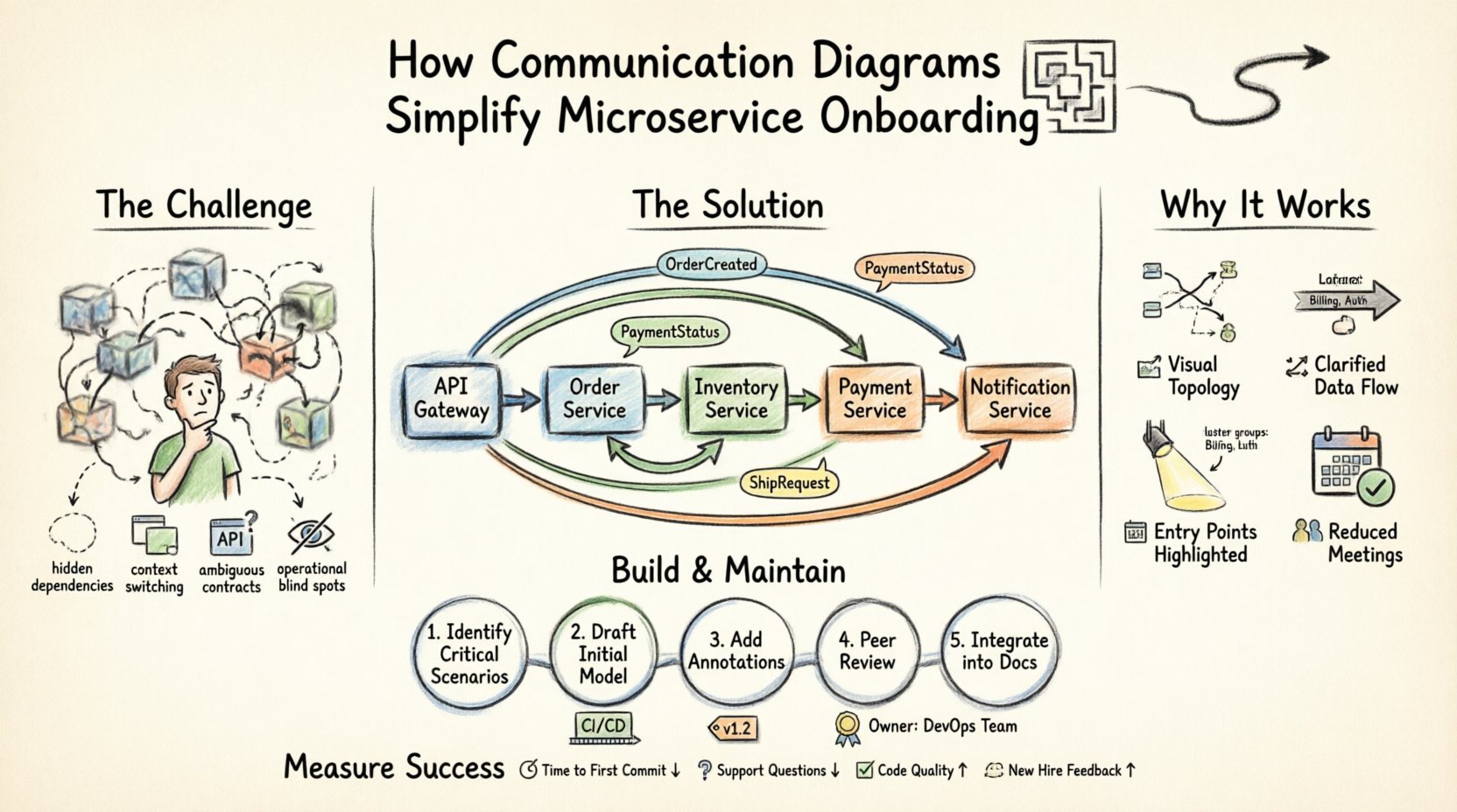
The Onboarding Challenge in Microservices 🚧
Microservice architectures introduce significant complexity compared to monolithic applications. In a monolith, code paths are often visible within a single repository. In a distributed system, data traverses the network, crosses service boundaries, and may undergo transformation at each hop.
Common Pain Points for New Hires
- Hidden Dependencies: Services often call each other indirectly through message queues or event buses, making the chain of responsibility invisible.
- Context Switching: Developers must understand multiple codebases, configurations, and deployment pipelines to trace a single request.
- Ambiguous Contracts: API documentation may describe parameters but rarely explains the business context of the data exchange.
- Operational Blind Spots: Understanding how a service handles failure or retries is rarely captured in functional specifications.
Text-heavy wikis and API specifications do not solve these issues effectively. They require the reader to mentally construct the architecture, which is a high-cognitive load task. Visual aids reduce this load by externalizing the mental model.
Why Communication Diagrams Work for Onboarding 🎯
When a developer sits down for their first week, they need to answer three core questions: What does this system do? How does it work? Where do I start? Communication diagrams address these directly.
1. Visualizing the Topology
Seeing the services laid out spatially helps new hires grasp the scale of the system. They can identify clusters of related services, such as a “Billing Cluster” or an “Authentication Cluster,” without reading a list of twenty microservices.
2. Clarifying Data Flow
Arrows in a communication diagram indicate the direction of information. By labeling these arrows with the specific data payload (e.g., OrderCreated, PaymentStatus), the diagram becomes a legend for the data schema. This helps developers understand what data they need to handle when writing new code.
3. Identifying Entry Points
Onboarding often involves fixing bugs or adding features. A diagram highlights the entry points of the system. If a developer needs to modify the checkout process, the diagram shows exactly which gateway service initiates the flow and which downstream services participate.
4. Reducing Meeting Load
Instead of scheduling three separate meetings to explain the order flow, the onboarding engineer can review the diagram. This frees up senior engineers to focus on complex architectural decisions rather than repetitive explanations.
Anatomy of an Effective Communication Diagram 🛠️
To be useful for onboarding, a diagram must be readable. It should not attempt to show every single method call. Instead, it should focus on the critical paths that define the system’s behavior.
Core Elements
- Objects/Nodes: Represent services, databases, or external APIs. These should be named clearly, using the standard naming convention of the organization (e.g.,
OrderService,InventoryDB). - Links/Connections: Lines connecting objects that represent network channels, API endpoints, or message queues.
- Messages: Labels on the links describing the action (e.g.,
POST /orders,Send Email). Include directionality. - Responsibility: Optional annotations indicating which service owns specific logic (e.g.,
Validates Stock).
Labeling Conventions
Consistency is key. If the team uses REST APIs, the diagram should reflect HTTP verbs. If using gRPC, it should show the method names. If using events, it should show the topic names. This alignment ensures the diagram matches the actual codebase, preventing confusion.
Step-by-Step: Creating Diagrams for Onboarding 📝
Creating these diagrams is a collaborative effort. It should not be a solo task performed by one architect and then forgotten. The process of building them is just as valuable as the resulting artifact.
Step 1: Identify Critical Scenarios
Do not try to diagram every function in the system. Focus on the Happy Path and the Core Business Flow.
- For an e-commerce platform: Create Order → Reserve Inventory → Process Payment → Ship.
- For a SaaS platform: Sign Up → Provision Tenant → Configure Settings → Activate.
Step 2: Draft the Initial Model
Start with the entry point. Place the API Gateway or Client on the diagram. Connect it to the first service responsible for handling the request. From there, branch out to downstream services.
Use a top-down or left-to-right flow to mimic the natural reading direction. This helps new hires follow the logic intuitively.
Step 3: Add Contextual Annotations
A line between two boxes is not enough. Add notes that explain why the connection exists.
- Authentication: Note where tokens are passed.
- Retries: Indicate if a service handles retries internally or if the caller must manage them.
- Data Ownership: Specify which service is the Source of Truth for specific data entities.
Step 4: Peer Review and Validation
Before presenting this to a new hire, have the existing team review it. Ask the following questions:
- Is any critical service missing?
- Are the message labels accurate to the current API version?
- Is the diagram too crowded? Can it be split into sub-diagrams?
Step 5: Integrate into Documentation
The diagram must live where the new hire looks for answers. Embed it in the onboarding wiki, the README of the repository, or the architecture overview page. Do not store it in a local image folder that might get deleted.
Maintaining Diagrams Over Time ⏳
A common failure mode in software documentation is obsolescence. If the diagram does not match the code, it becomes noise. To ensure communication diagrams remain a valuable onboarding tool, they must be maintained.
Integration with CI/CD
Consider linking diagram creation to the code review process. If a new service is added or a major interaction changes, the diagram should be updated as part of the pull request. This ensures the documentation evolves with the code.
Versioning the Diagrams
Just like the API, the diagrams should have versions. If a major architectural shift occurs, create a new diagram set and archive the old ones. This allows new hires to understand the historical evolution of the system if necessary.
Assigning Ownership
Every diagram should have an owner. This is usually a senior engineer or an architect. They are responsible for reviewing the diagram quarterly to ensure it remains accurate.
Advanced Techniques for Complex Systems 🧠
As the system grows, a single diagram becomes impossible to read. You may need to adopt a layered approach.
Layered Diagrams
- Level 1 (High Level): Shows major domains (e.g., User, Order, Payment) and how they interact at a macro level.
- Level 2 (Domain Level): Drills down into a specific domain, showing internal service interactions.
- Level 3 (Component Level): Shows specific component interactions within a single service if necessary.
Handling Asynchronous Flows
Microservices often rely on event-driven architectures. Communication diagrams can represent this by using dashed lines or specific icons to indicate event publishing and subscribing. Label the event names clearly (e.g., OrderPlacedEvent).
Common Pitfalls to Avoid ⚠️
Even with good intentions, teams often make mistakes that reduce the value of the diagrams.
1. Over-Engineering
Do not try to diagram the entire system at once. Start small. A diagram showing five key services is better than a diagram showing fifty services that no one can read.
2. Ignoring Error Paths
Onboarding includes understanding how the system fails. If a service times out or a database connection drops, where does the control flow go? Including error handling paths helps new hires understand resilience patterns.
3. Static Images Only
Static images are hard to navigate. If possible, use interactive diagrams that allow zooming or clicking to see details. This keeps the high-level view clean while providing depth on demand.
4. Lack of Context
Never assume the reader knows the business domain. Include a brief legend explaining acronyms or business terms used in the labels. For example, explain what “SLO” or “SLA” means if referenced in the flow.
Measuring the Impact on Onboarding 📈
How do you know if communication diagrams are working? Look for specific metrics related to the onboarding experience.
- Time to First Commit: Does it take less time for a new hire to make their first contribution?
- Support Ticket Volume: Does the number of basic architectural questions drop?
- Code Quality: Do new hires introduce fewer bugs related to service dependencies?
- Feedback: Ask new hires directly. Did the diagram help them understand the system better than the code?
Final Thoughts on Visual Documentation 🏁
Effective onboarding is about reducing friction. It is about allowing talent to contribute value as quickly as possible. Communication diagrams serve as a bridge between the complexity of distributed systems and the human mind.
By investing time in creating accurate, maintained, and clear diagrams, teams create a sustainable knowledge base. This reduces the burden on senior engineers and empowers new developers to navigate the system with confidence. The goal is not perfection, but clarity. A diagram that is 80% accurate and easy to read is far more valuable than one that is 100% accurate but impossible to understand.
Start small, iterate often, and treat documentation as a living part of your engineering culture. When you visualize the flow, you make the invisible visible, turning a chaotic onboarding process into a structured journey.