


The landscape of software architecture is undergoing a profound transformation. As organizations migrate from monolithic structures to distributed systems, the tools used to document and visualize these interactions must adapt. Communication diagrams, a staple of unified modeling language (UML), traditionally depicted static relationships between objects. However, the rise of serverless computing and edge computing introduces dynamic, ephemeral, and geographically dispersed components. This shift necessitates a re-evaluation of how we map interactions in modern architectures. This guide explores the technical nuances of evolving communication diagrams within these new paradigms.
Understanding the Shift in Architectural Visualization 🔄
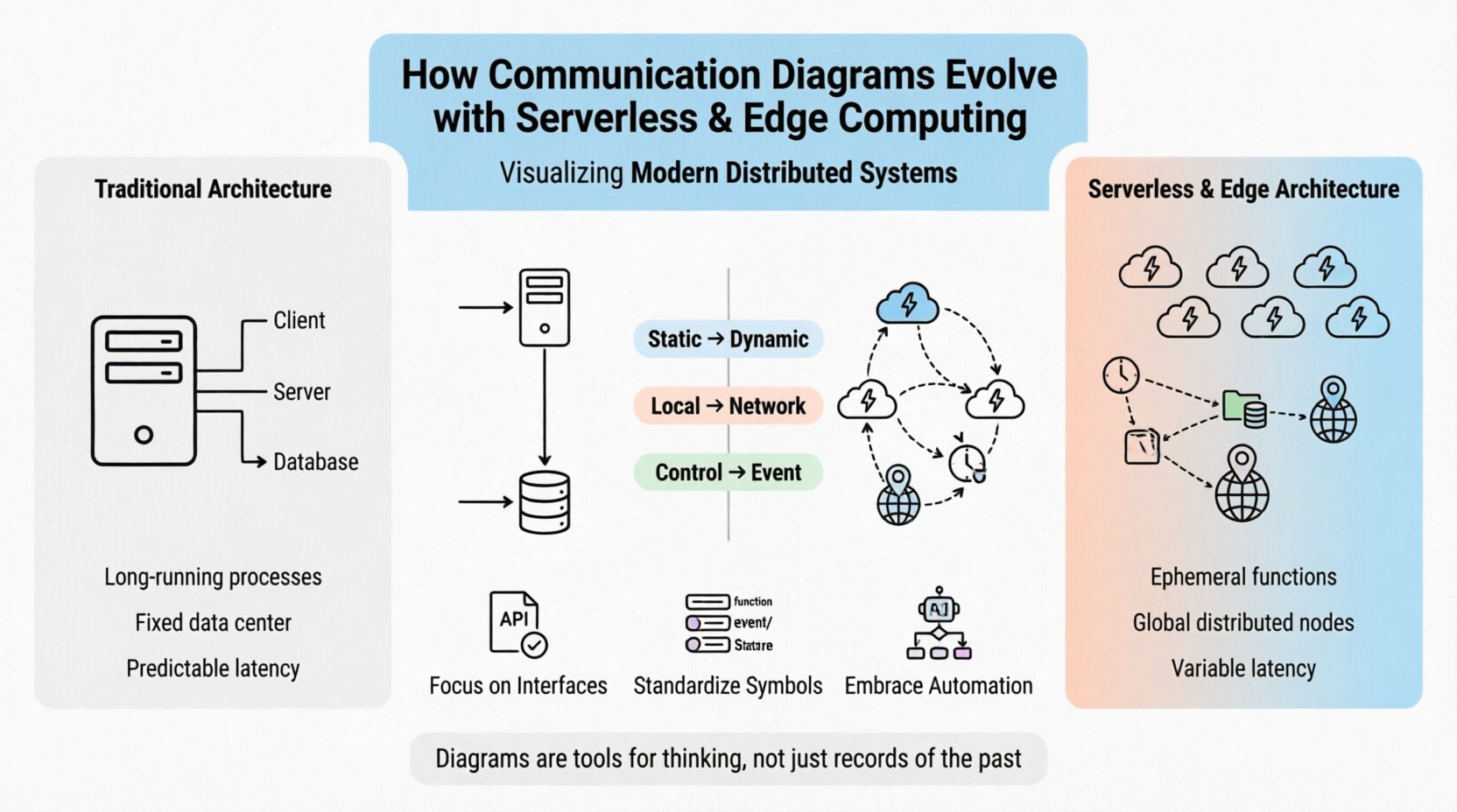
Traditionally, a communication diagram focused on the structural relationships between objects and the messages exchanged between them. The emphasis was on clarity of sequence and object ownership. In a monolithic application, the context was contained within a single deployment unit. The boundaries were clear, and the runtime environment was predictable.
Today, the context is fluid. When we discuss serverless and edge computing, the “objects” of our diagrams are no longer long-running processes. They are short-lived functions or microservices that spin up on demand. The environment is defined by a provider infrastructure rather than a local machine. This change alters the fundamental purpose of the diagram.
- Static vs. Dynamic: Old diagrams captured static states. New diagrams must capture dynamic lifecycles.
- Local vs. Network: Interaction was once memory-bound. Now, it is network-bound.
- Control vs. Event: Flow shifted from explicit control calls to event-driven triggers.
Visualizing this requires a shift in mindset. The diagram is no longer just a map of code; it is a map of probability and latency.
Traditional Communication Diagrams vs. Modern Distributed Systems ⚙️
To understand the evolution, one must first establish the baseline. Traditional communication diagrams relied heavily on the concept of a persistent object graph. In a client-server model, the client initiated a request, and the server responded. The path was direct.
In a serverless architecture, the server is abstracted away. The developer interacts with an API gateway, which routes to a function. The function executes, processes, and terminates. There is no persistent connection in many cases. This makes traditional sequence lines less accurate.
Consider the following comparison of architectural constraints:
| Feature | Traditional Architecture | Serverless & Edge Architecture |
|---|---|---|
| Component Lifespan | Long-running processes | Ephemeral functions |
| Network Topology | Fixed data center | Global, distributed nodes |
| State Management | In-memory or local DB | External state stores |
| Latency Variance | Predictable | Variable based on location |
| Diagrams Focus | Object Interaction | Data Flow & Triggers |
This table highlights the core friction points. When drawing diagrams for modern systems, the lines between objects are no longer just logical connections. They represent network hops, cold starts, and potential failure points.
The Impact of Serverless Architecture on Interaction Flows ☁️
Serverless computing decouples the infrastructure from the application code. This decoupling creates unique challenges for communication diagrams. The most significant change is the removal of the server as a persistent entity in the interaction model.
Event-Driven Logic
Instead of a direct request-response cycle, serverless systems often rely on event sources. A database change, a file upload, or a scheduled time can trigger a function. In a communication diagram, this changes the initiator.
- Trigger Identification: You must explicitly label the event source, not just the client.
- Asynchronous Paths: The response may not be immediate. The diagram must account for callbacks or polling.
- Statelessness: Since functions do not hold state, the diagram must show where state is retrieved from (e.g., a cache or database).
Orchestration vs. Choreography
In monolithic systems, orchestration is common. One service tells another what to do. In distributed serverless environments, choreography is often preferred to reduce coupling. A diagram must reflect this shift.
- Choreography: Each function reacts to an event without a central coordinator.
- Visual Representation: Arrows should indicate event publication rather than method calls.
- Complexity: The diagram becomes a web of events rather than a tree of calls.
When documenting these flows, clarity is paramount. Using standard message labels is insufficient. Labels should describe the payload type or the event name to provide context for the trigger.
Edge Computing and the Geography of Data 🌍
Edge computing pushes computation closer to the data source. This reduces latency but introduces physical constraints into the logical diagram. A communication diagram that ignores geography is incomplete in an edge context.
Location-Aware Diagramming
In a traditional diagram, a message from “Service A” to “Service B” implies a logical connection. In edge computing, it implies a physical distance. The latency between an edge node and a central cloud is significant.
- Cluster Grouping: Group components by their physical location (e.g., “Regional Edge”, “Central Cloud”).
- Latency Labels: Annotate connections with estimated latency or bandwidth constraints.
- Failover Paths: Show how the system behaves if an edge node goes offline.
Data Synchronization
Edge nodes often operate with intermittent connectivity. They may process data locally and sync with the central system later. This creates a split-brain scenario in the diagram.
- Conflict Resolution: The diagram should note where data conflicts are resolved.
- Sync Timing: Indicate if synchronization is real-time or batch-based.
- State Consistency: Highlight where eventual consistency is acceptable versus strong consistency.
This level of detail transforms the communication diagram from a high-level overview into a deployment strategy document. It forces the architect to consider the physical reality of the network.
Managing Dynamic Topologies in Visual Models 📉
One of the most significant challenges in serverless and edge environments is the dynamic nature of the topology. Functions scale up and down based on load. Edge nodes are added or removed as demand shifts.
Abstraction Levels
A single diagram cannot capture every instance of a function running. Therefore, abstraction is key. You must decide what level of detail is necessary for the specific audience.
- Logical View: Focus on the flow of data between functional units without showing instance counts.
- Physical View: Show the deployment units, regions, and network boundaries.
- Implementation View: Detail the specific code paths and libraries used (less common for high-level diagrams).
Handling Concurrency
Concurrency is a core feature of serverless. Hundreds of instances may run simultaneously. A static diagram cannot show this. You must use annotations or legends to indicate scaling behavior.
- Scaling Triggers: Mark the conditions that cause more instances to appear.
- Load Balancing: Indicate how requests are distributed among instances.
- Timeouts: Clearly define timeout thresholds for each interaction path.
Without these annotations, the diagram suggests a single-threaded execution model that does not exist in reality. This can lead to misinterpretation during incident response.
Best Practices for Diagramming in Serverless Environments 📝
To ensure these diagrams remain useful, specific best practices should be followed. Documentation often becomes stale quickly in fast-moving cloud environments. The goal is to create a living representation of the system.
Focus on Interfaces
Since the internal implementation of a function is hidden, the diagram should focus on the interface. What input does it accept? What output does it produce?
- API Contracts: Define the expected request and response formats.
- Error Handling: Show how errors propagate through the chain.
- Security Boundaries: Indicate authentication requirements for each message.
Standardize Symbols
Consistency is vital when teams collaborate. Adopt a standard notation for serverless-specific elements.
- Function Nodes: Use a specific shape to denote ephemeral compute.
- Event Sources: Use a distinct icon for triggers (e.g., queue, timer, webhook).
- Data Stores: Differentiate between persistent storage and transient cache.
Integrate with Infrastructure as Code
Manual diagrams often drift from the actual code. Where possible, link the diagram to the infrastructure definition. If the code changes, the diagram should ideally update or at least prompt a review.
- Version Control: Keep diagrams in the same repository as the code.
- CI/CD Integration: Block deployment if critical architectural changes are detected without updated documentation.
- Automated Generation: Use tools to extract topology from configuration files.
Automated Modeling and the Role of Artificial Intelligence 🤖
The future of architectural documentation lies in automation. As systems become too complex for manual drawing, AI and machine learning offer new possibilities for generating and maintaining communication diagrams.
Code-to-Diagram Generation
Modern tools can parse code repositories and generate diagrams automatically. This reduces the maintenance burden.
- Accuracy: The diagram reflects the actual code structure.
- Updates: Diagrams update as the codebase evolves.
- Limitations: They may miss business logic context or high-level design intent.
Predictive Analysis
AI can analyze the diagram to predict bottlenecks. It can suggest optimizations based on historical data.
- Bottleneck Detection: Identify paths with high latency or frequent retries.
- Resource Estimation: Suggest the required compute power for specific message volumes.
- Security Scanning: Flag unauthorized access paths in the interaction flow.
Human-in-the-Loop
While automation handles the structure, human expertise is still required for semantics. The diagram must be reviewed to ensure it accurately represents the business requirements, not just the code.
- Validation: Architects must verify the generated models.
- Context: Humans add the “why” behind the “how”.
- Refinement: Simplify complex paths for better readability.
Final Thoughts on Architecture Documentation 📚
The evolution of communication diagrams is not merely a change in notation. It is a reflection of the changing nature of software itself. As we move towards serverless and edge computing, the diagrams must become more dynamic, more contextual, and more aware of the physical infrastructure.
Key takeaways for practitioners include:
- Adapt the Notation: Move beyond static object interactions to event flows.
- Consider Geography: Acknowledge the physical distance in edge architectures.
- Embrace Abstraction: Use diagrams to show behavior, not just instance counts.
- Leverage Automation: Reduce maintenance overhead through tooling.
The goal is not to create a perfect static picture. The goal is to create a clear mental model that helps teams reason about the system. As technology continues to evolve, the ability to visualize and communicate these complex interactions will remain a critical skill for architects and developers alike.
By adhering to these principles, teams can ensure their documentation remains relevant, accurate, and useful throughout the lifecycle of the application. The diagram is a tool for thinking, not just a record of the past.