Modern software systems are rarely monolithic blocks of code running in isolation. Instead, they function as complex ecosystems where multiple backend services interact to deliver a cohesive user experience. Understanding the pathways data takes through this ecosystem is critical for maintaining stability, security, and performance. One of the most effective tools for visualizing these interactions is the communication diagram. Unlike static flowcharts, this diagram type emphasizes the structural relationships between objects while simultaneously mapping the flow of information.
Whether you are designing a new microservices architecture or auditing an existing system, visualizing how one service triggers another is not just a nice-to-have—it is a necessity. This guide provides a deep dive into the mechanics, semantics, and practical applications of communication diagrams, ensuring you can map your data flows with precision and clarity. 🛠️
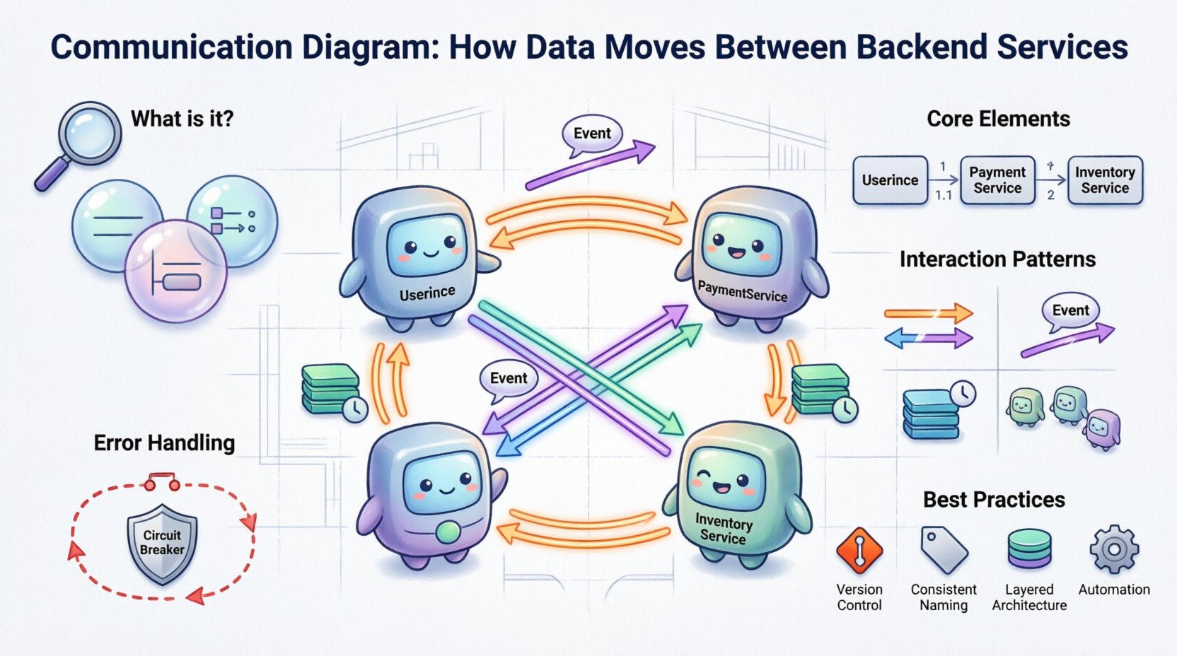
🧩 What Is a Communication Diagram?
A communication diagram is a type of behavior diagram used in system modeling. It shows how objects or services interact with one another to achieve a specific goal. While it is often compared to a sequence diagram, the primary focus here is not on the chronological timing of events, but rather on the structural relationships and the links between components.
In the context of backend services, each “object” in the diagram represents a distinct service, module, or component. The lines connecting them represent the network paths, APIs, or message queues that facilitate data transfer. The arrows indicate the direction of the message or data packet.
Core Characteristics
- Focus on Structure: It highlights which services are directly connected, making it easier to identify dependencies.
- Message Flow: It visualizes the sequence of messages, but without a strict time axis.
- Dynamic Interaction: It captures the runtime behavior of the system rather than just the static design.
- Object Orientation: It is rooted in object-oriented principles, making it ideal for modeling object interactions in distributed systems.
When you look at a communication diagram, you are looking at a map of trust and dependency. If Service A calls Service B, Service B is critical to Service A’s operation. This visibility is essential for impact analysis when changes are required. 🔍
🔗 Anatomy of the Diagram
To effectively use this tool, you must understand its constituent parts. Each element carries specific meaning regarding the system’s architecture and data movement.
1. Objects and Services
These are the nodes in your network. In a backend context, a single box might represent a user authentication service, while another represents an inventory management module. You should label these clearly using standard naming conventions to avoid ambiguity. For example, use UserService rather than Auth.
2. Links and Connections
Links represent the communication channels. These could be HTTP endpoints, gRPC streams, message broker topics, or database connections. The link itself implies a bidirectional capability unless specified otherwise, though arrows indicate the direction of the specific message being modeled.
3. Messages
Messages are the arrows connecting the objects. They represent the actual data or control signals being passed. Each message is typically numbered (1, 1.1, 1.2) to show the order of execution within a specific interaction path.
- Request Message: A call made from one service to another (e.g.,
GET /users). - Response Message: The return data or status code sent back to the caller.
- Notification: A fire-and-forget signal that does not require a direct response (common in event-driven architectures).
4. Activation Bars
While less common in pure communication diagrams than in sequence diagrams, activation bars can be included to show how long a service is “busy” processing a request. This helps visualize processing bottlenecks or latency issues during high-load scenarios.
📊 Communication Diagram vs. Sequence Diagram
Confusion often arises between communication diagrams and sequence diagrams because they share similar roots in modeling system behavior. However, they serve different analytical purposes. Understanding when to use which is key to effective documentation.
| Feature | Communication Diagram | Sequence Diagram |
|---|---|---|
| Primary Focus | Object relationships and structure | Time and order of events |
| Layout | Free-form, based on logical connections | Vertical time axis, horizontal participants |
| Best For | Understanding dependencies and topology | Understanding complex timing and loops |
| Readability | High for small systems, can clutter for large ones | High for linear flows, better for complex logic |
| Message Numbering | Required to show sequence | Implicit via vertical position |
For backend architecture reviews where the question is “Which services talk to which?”, a communication diagram is often superior. For debugging a specific bug where timing matters, a sequence diagram is preferred. 🔄
🚀 How Data Moves: Interaction Patterns
In backend systems, data does not move in a single way. Different architectural patterns dictate how services communicate. A robust communication diagram should account for these variations.
1. Synchronous Request-Response
This is the most traditional pattern. Service A sends a request and waits for Service B to reply before continuing. In the diagram, this looks like a solid arrow from A to B, followed by a dashed arrow from B back to A.
- Use Case: User authentication, fetching real-time data.
- Diagram Note: Clearly label the request and response messages to distinguish between control flow and data flow.
2. Asynchronous Event Notification
Service A sends a message and does not wait. It fires an event into a bus or queue. Service B picks it up later. This decouples the services, improving resilience.
- Use Case: Order confirmation emails, analytics logging, cache invalidation.
- Diagram Note: Use an open arrowhead to denote “fire-and-forget” behavior. Label the event type (e.g.,
OrderCreated).
3. Batch Processing
Services may aggregate data over a period and process it in chunks. This is common in data warehousing or reporting pipelines.
- Use Case: Daily sales reports, nightly reconciliation.
- Diagram Note: Indicate the trigger mechanism (e.g., a cron job or timer) initiating the batch flow.
4. Chained Calls
Service A calls Service B, which in turn calls Service C to retrieve a piece of data. This creates a chain of dependencies that must be managed carefully to avoid latency accumulation.
- Use Case: Aggregating user profile data from multiple sources.
- Diagram Note: Number the messages sequentially (1, 2, 3) to show the chain depth.
🛠️ Step-by-Step Construction Guide
Creating a meaningful diagram requires a methodical approach. Randomly drawing boxes and arrows leads to confusion. Follow this process to ensure accuracy and utility.
Step 1: Identify the Actors and Services
Start by listing all the backend components involved in the specific scenario you are documenting. Do not include the entire system if only a subset is relevant. For example, if documenting the “Checkout Process,” focus on the Cart, Payment, Inventory, and Notification services. Exclude the Admin Dashboard.
Step 2: Define the Entry Point
Where does the interaction begin? Is it an external API gateway? A background job scheduler? Place the entry point clearly at the start of the flow. This establishes the context for the diagram.
Step 3: Map the Dependencies
Draw the lines connecting the services. If Service A interacts with Service B, draw a link. If they do not interact directly, leave them unconnected. This visual separation highlights isolation boundaries.
Step 4: Add Messages and Labels
Draw arrows along the links to show data flow. Label every arrow with the action being performed. Be specific. Instead of “Call,” use “FetchUserProfile.” Instead of “Send,” use “PostTransactionLog.” This specificity reduces ambiguity during code reviews.
Step 5: Number the Messages
Assign numbers to the messages to indicate the order of execution. If a service calls another in a loop, use decimal numbering (e.g., 1.1, 1.2, 1.3) to show sub-sequences.
Step 6: Review for Completeness
Check for missing error paths. A complete diagram should show what happens when a service is unavailable or returns an error. Do not only document the “Happy Path.” 📝
⚠️ Handling Errors and Edge Cases
Most diagrams fail to document what happens when things go wrong. However, for backend services, error handling is a critical part of the data flow. A communication diagram should explicitly show error propagation.
Error Propagation Paths
When a downstream service fails, the upstream service must handle the failure. This might involve retrying, failing fast, or returning a cached value. In the diagram, represent these paths using dashed lines or distinct colors.
- Retry Logic: Show an arrow looping back to the previous service.
- Circuit Breaking: Show a path that diverts traffic to a fallback service.
- Dead Letter Queues: If an async message fails, where does it go? Show the destination for failed messages.
Timeout Visualization
Specify timeout thresholds if they are critical to the design. A message arrow can be annotated with a time constraint (e.g., timeout: 5s). This informs developers of the expected latency limits for the interaction.
🧹 Best Practices for Maintenance
Documentation is often treated as a one-time task, but backend architectures evolve rapidly. A diagram that is accurate today may be obsolete in a month. Adhere to these practices to keep your diagrams useful.
1. Version Control
Treat your diagrams as code. Store them in a version control system alongside your source code. This allows you to track changes in the architecture over time and revert if necessary.
2. Naming Conventions
Establish a strict naming standard for services and messages. If you use UserService in one diagram, do not use UserMgr in another. Consistency reduces cognitive load for anyone reading the diagram.
3. Layering Complexity
Do not try to draw the entire system in one view. Use a layered approach. Create a high-level overview diagram showing major services, and then create detailed sub-diagrams for specific interactions. This prevents the diagram from becoming a tangled web of lines.
4. Automation Integration
If possible, generate diagrams from your codebase or API definitions (like OpenAPI/Swagger). While manual diagrams offer flexibility, automated generation ensures the documentation matches the actual implementation. This reduces drift between design and reality.
📈 Benefits of Accurate Data Flow Mapping
Why invest the time in creating these diagrams? The benefits extend beyond mere documentation.
- Onboarding: New engineers can understand the system architecture faster without digging through code.
- Impact Analysis: When a change is proposed, you can trace which services will be affected by looking at the links.
- Security Audits: You can identify data flows that cross security boundaries and ensure encryption is applied correctly.
- Performance Tuning: Long chains of synchronous calls become visible, highlighting areas where latency can be reduced.
- Disaster Recovery: Understanding dependencies helps in planning failover strategies for critical services.
🔮 Future-Proofing Your Architecture
As systems scale, the complexity of data movement increases. Communication diagrams help manage this complexity by providing a stable reference point. When introducing new technologies like service meshes or event-driven architectures, your existing diagrams can serve as a baseline for migration.
Consider how your diagrams will look as you move from monolithic to microservices. A single box in a legacy diagram might become ten boxes in a modern one. Plan for this granularity. Start with the logical components, then refine into physical services as the architecture evolves.
🛑 Common Pitfalls to Avoid
Even experienced architects make mistakes when modeling data flows. Be wary of these common errors.
- Ignoring Latency: Treating all connections as instant. Remember that network hops add time.
- Over-Modeling: Including every single API endpoint. Focus on the critical paths that define system behavior.
- Static Thinking: Drawing the diagram as if the system never changes. Account for versioning and deprecation.
- Missing Context: Failing to show external triggers. A service might only start when a specific event occurs from outside the system.
📝 Summary of Key Takeaways
Mapping how data moves between backend services is a fundamental skill for any technical architect. A communication diagram provides the structural clarity needed to manage complex interactions without getting lost in the details of timing or code implementation.
By focusing on the relationships between services, clearly labeling message flows, and accounting for error handling, you create a living document that supports development, testing, and operations. Remember that the goal is not just to draw a picture, but to create a tool that improves decision-making and system reliability. 🚀
Start with your most critical interaction path. Define the services, draw the links, and number the messages. As your system grows, your diagrams will grow with it, providing a consistent map through the complexity of your backend infrastructure.