


In the landscape of user experience design, the difference between a functional application and a delightful one often lies in the details. These details are known as micro-interactions. While they may seem minor on the surface, they form the backbone of user feedback, guiding behavior and building trust within a digital environment. This guide provides a deep dive into the mechanics, psychology, and implementation of micro-interactions, ensuring your interfaces resonate with users on a granular level.
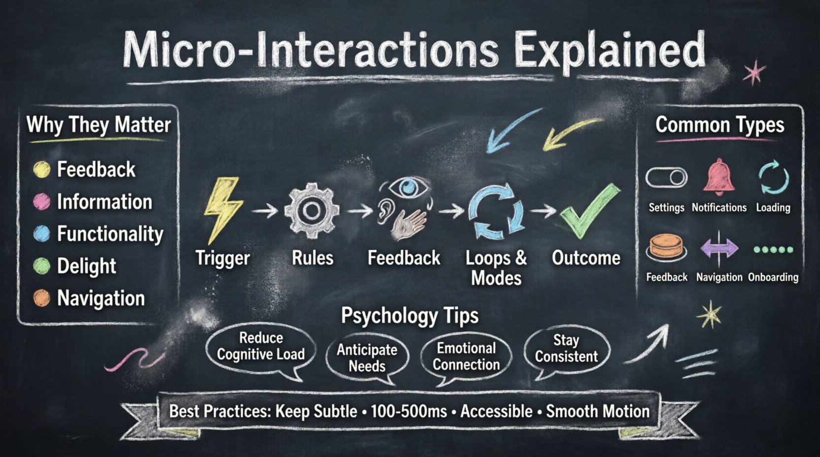
🔍 Defining the Micro-Interaction
A micro-interaction is a single, isolated moment in a user interface that serves a specific purpose. It is not a full feature, but rather a small component of the overall experience. Think of it as the digital equivalent of a nod, a smile, or a handshake in a physical conversation. These interactions happen constantly as a user navigates a site or app, responding to actions like clicking, hovering, dragging, or typing.
While a macro-interaction might be “submitting a form,” the micro-interactions surrounding it include the button changing color on hover, the loading spinner appearing, the success message fading in, and the input field border turning green upon validation. Each of these small moments contributes to the perceived quality of the product.
Why Do They Matter?
Micro-interactions serve several critical functions in a design system:
- Feedback: They confirm that an action has been recognized by the system.
- Information: They provide data about the current state or progress.
- Functionality: They allow users to adjust settings or change modes.
- Delight: They add personality and emotional connection to the interface.
- Navigation: They guide users to the next logical step in a flow.
Without these cues, users often feel uncertain. Did my click register? Is the system working? Am I on the right path? Micro-interactions answer these questions instantly, reducing cognitive load and frustration.
🧩 The Anatomy of a Micro-Interaction
To design effective micro-interactions, one must understand their internal structure. Most experts agree on five distinct components that make up a complete micro-interaction. Understanding this anatomy allows designers to build consistent, logical, and responsive systems.
1. The Trigger
The trigger initiates the micro-interaction. It is the spark that sets the mechanism in motion. Triggers can be either user-initiated or system-initiated.
- User-Initiated: The user performs an action, such as clicking a button, pulling down to refresh, or typing into a field.
- System-Initiated: The system performs an action based on a condition, such as a notification appearing when a message is received, or a battery warning when power drops below 20%.
2. The Rules
Once a trigger occurs, the rules determine what happens next. These are the logic statements that dictate the behavior of the interaction. The rules define the scope and limits of the action.
- What is the maximum number of retries allowed?
- How long should the loading spinner spin?
- Does the animation loop or stop after one cycle?
3. The Feedback
Feedback is the visible or audible response to the trigger. This is what the user perceives. It bridges the gap between the action and the system state. Feedback can be visual, auditory, or haptic.
- Visual: Color changes, animations, icons, or text updates.
- Auditory: Click sounds, chimes, or beeps.
- Haptic: Vibration patterns on mobile devices.
4. The Loops and Modes
Loops and modes describe how the interaction changes over time or under different conditions. They determine the duration and the context of the feedback.
- Loops: Does the animation repeat indefinitely? Does it loop once and stop? For example, a “pull to refresh” indicator might spin continuously until the data loads.
- Modes: Does the interaction change based on the state of the system? For instance, a toggle switch might look different when it is “on” versus when it is “off”.
5. The Outcome
The outcome is the final result of the micro-interaction. It is the closure of the loop. The user should understand what happened as a result of their action. If the outcome is not clear, the micro-interaction has failed its primary purpose.
📊 Types of Micro-Interactions
Micro-interactions vary widely depending on the context of the application. Below is a breakdown of common categories found in modern interfaces.
| Category | Purpose | Example Scenario |
|---|---|---|
| Settings | Allowing users to control preferences | Toggling a dark mode switch |
| Notifications | Alerting users to events | Badge count updating on an icon |
| Content Loading | Showing progress during data fetch | Skeleton screens replacing static text |
| Feedback | Confirming an action | Button press animation and color shift |
| Navigation | Guiding movement through pages | Tab indicator sliding under selected item |
| Onboarding | Teaching new users | Dot indicators showing progress through a tour |
🧠 The Psychology Behind the Design
Effective micro-interactions are rooted in cognitive psychology. They leverage how the human brain processes information and reacts to stimuli. Understanding these principles helps designers create interactions that feel natural rather than forced.
1. Reducing Cognitive Load
Every time a user encounters an interface, their brain processes information. Micro-interactions should reduce the mental effort required to understand the system. Clear feedback eliminates ambiguity. When a user clicks a button and sees it depress, the brain registers the action immediately, freeing up mental resources for the next task.
2. The Principle of Anticipation
Good design anticipates user needs. If a user is about to submit a form, a micro-interaction that validates the last field before submission prevents errors before they happen. This proactive approach builds confidence. Users feel supported rather than punished for mistakes.
3. Emotional Connection
Delight is a powerful motivator. Subtle animations, playful sound effects, or clever illustrations can create a positive emotional response. This is not about distraction; it is about humanizing the digital experience. A well-timed animation can make a waiting period feel shorter. A satisfying “snap” sound when completing a task releases dopamine, reinforcing the behavior.
4. Consistency and Expectation
Users develop mental models of how systems work. If a button looks clickable, it should behave like a button. If a slider moves, it should move smoothly. Breaking these expectations creates friction. Consistency across the platform ensures that users can transfer their knowledge from one section to another without relearning the interface.
🛠 Best Practices for Implementation
Designing these interactions requires precision. A poorly executed animation can be more annoying than helpful. Follow these guidelines to ensure quality and performance.
- Keep it Subtle: The interaction should not overpower the content. It is a supporting actor, not the lead. Avoid flashy effects that draw attention away from the primary task.
- Maintain Performance: Animations must run smoothly. If a micro-interaction causes frame drops or lag, it frustrates the user. Optimize assets and use hardware acceleration where possible.
- Respect Accessibility: Not all users process visual or auditory cues the same way. Provide alternatives for users with visual or hearing impairments. Ensure animations do not trigger seizures in users with photosensitive epilepsy.
- Match Context: A playful interaction might work for a game app but could feel unprofessional in a banking application. Align the tone of the interaction with the brand and the task at hand.
- Define Duration: Speed matters. Too fast, and the user misses it. Too slow, and the user feels delayed. The standard range for feedback is typically between 100ms and 500ms. Complex animations should not exceed 2 seconds.
- Use Motion Physics: Real-world objects have mass, gravity, and friction. Digital animations should mimic these properties. Easing functions should start slow, speed up, and slow down again, rather than moving at a constant linear speed.
⚠️ Common Pitfalls to Avoid
Even experienced designers can stumble when implementing these small details. Being aware of common mistakes helps you refine your process.
- Overuse: Applying animations to every single element creates visual noise. Reserve micro-interactions for moments that require feedback or guidance.
- Ignoring State: Failing to account for disabled states or loading states can lead to confusing interactions. A button should clearly indicate when it is inactive.
- Lack of Reversibility: Users should be able to undo actions if they make a mistake. If a micro-interaction confirms a deletion permanently, it creates anxiety. Provide a “toast” message with an undo option.
- Ignoring Platform Conventions: iOS and Android have different interaction standards. Users expect specific gestures on specific platforms. Deviating from these norms without a strong reason can confuse power users.
- Hardcoding Animations: Avoid hardcoding timing values. Use relative units and flexible easing curves to ensure the design scales across different devices and screen refresh rates.
📈 Measuring Effectiveness
How do you know if your micro-interactions are working? You need to look beyond vanity metrics and focus on user behavior and system performance.
1. Task Completion Rates
Do users complete their tasks faster when feedback is clear? If a form validation micro-interaction reduces errors, the task completion rate should improve. Compare completion times and error rates before and after implementation.
2. Engagement Metrics
Do users interact with specific features more when they are highlighted? For example, does a notification bell micro-interaction increase click-through rates on the notification center? Track click events associated with these interactions.
3. Error Reduction
One of the primary goals of feedback is error prevention. Monitor the frequency of user errors. If a loading spinner prevents users from double-submitting a form, the number of duplicate submissions should drop.
4. User Feedback
Direct feedback from users is invaluable. Conduct usability testing sessions where you observe how users react to your interactions. Ask them specifically about the clarity of the feedback. Do they know when an action is complete? Do they feel confused by the motion?
📋 Implementation Checklist
Before finalizing your design, run through this checklist to ensure quality and consistency.
- Define the Trigger: What exactly starts this interaction?
- Set the Rules: What conditions must be met?
- Design the Feedback: Is it visible, audible, and haptic if needed?
- Test Timing: Does the duration feel natural?
- Check Accessibility: Can it be disabled or paused?
- Verify Performance: Does it run at 60fps?
- Ensure Consistency: Does it match the design system?
- Review on Devices: Does it work on mobile, tablet, and desktop?
🚀 Moving Forward
The world of user experience design is constantly evolving. As technology advances, the expectations for digital interfaces rise. Micro-interactions are no longer optional embellishments; they are essential components of a robust design strategy. They bridge the gap between human intent and machine response.
By focusing on the anatomy, psychology, and best practices outlined in this guide, you can build interfaces that are not only functional but also intuitive and engaging. Remember that the goal is to make the technology invisible. When users stop noticing the interface and start focusing on their tasks, you have succeeded. Continuous iteration and user testing will keep your designs sharp and relevant. Prioritize clarity, respect the user’s time, and let the details speak for themselves.