


Designing digital products is not merely about aesthetics or functionality. It is fundamentally about understanding the human mind. User experience design intersects deeply with psychology, cognitive science, and behavioral economics. When we create interfaces, we are communicating with users who operate on specific mental models and cognitive limitations. Understanding these mechanisms is crucial for creating intuitive, efficient, and satisfying digital experiences.
This guide explores the core psychological principles that drive user behavior. We will examine how people process information, make decisions, and interact with digital environments. By integrating these insights, designers can build systems that align with natural human tendencies rather than fighting against them.
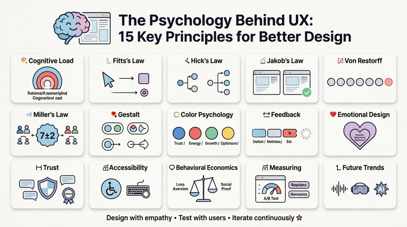
1. Understanding Cognitive Load 🧠
Cognitive load refers to the amount of working memory resources used during learning or task completion. In the context of user experience, high cognitive load can lead to frustration, errors, and abandonment. The human brain has a limited capacity for processing information at any given moment.
Types of Cognitive Load
- Intrinsic Load: The inherent difficulty of the task itself.
- Extraneous Load: The mental effort wasted on unnecessary information or poor design.
- Germane Load: The effort devoted to processing, constructing, and automating schemas.
To optimize user experience, designers must minimize extraneous load. This means removing distractions, simplifying navigation, and presenting information in digestible chunks. When a user encounters a cluttered interface, their brain struggles to filter relevant data, leading to decision fatigue.
2. Fitts’s Law and Target Acquisition 📏
Fitts’s Law predicts the time required to move to a target area as a function of the distance to the target and the size of the target. This principle is foundational for interactive design, particularly regarding buttons, links, and touch targets.
Key Takeaways for Design
- Size Matters: Larger interactive elements are easier and faster to select.
- Distance Matters: Closer elements are quicker to reach.
- Edges are Faster: Targets placed at the screen edge are infinitely accessible because the cursor cannot move beyond the boundary.
Applying this law ensures that critical actions, such as checkout buttons or navigation links, are prominent and easy to reach. This reduces physical strain and mental friction for users.
3. Hick’s Law and Decision Making ⏳
Also known as the Hick-Hyman Law, this principle states that the time it takes to make a decision increases with the number of available options. Simply put, too many choices lead to paralysis.
Managing Choices
- Limit Menu Items: Navigation menus should be concise and categorized.
- Progressive Disclosure: Show only necessary options initially, revealing more as the user progresses.
- Default Selections: Provide sensible defaults to reduce the number of decisions required.
When users face a wall of options, they often experience anxiety and may leave the site. Curating choices helps guide users toward their goals without overwhelming them.
4. Jakob’s Law and Familiarity 📜
Users spend most of their time on other sites, meaning they prefer your site to work the same way as all the other sites they already know. This concept emphasizes the value of established patterns.
Why Conformity Helps
- Reduced Learning Curve: Users do not need to relearn how to use the interface.
- Predictability: Familiar patterns create a sense of safety and control.
- Efficiency: Users can perform tasks faster when they know where to look.
While innovation is important, reinventing the wheel often creates friction. Standard conventions like the shopping cart icon or the hamburger menu are effective because they are understood universally.
5. The Von Restorff Effect 🎯
Also known as the isolation effect, this psychological phenomenon predicts that when multiple similar objects are present, the one that differs from the rest is most likely to be remembered. This is often used to highlight call-to-action buttons.
Strategic Contrast
- Color Differentiation: Use a distinct color for primary actions.
- Whitespace: Surround important elements with space to isolate them.
- Typography: Change font weight or size for emphasis.
By making specific elements stand out, designers can direct user attention effectively. However, overuse of contrast can dilute the effect, so it should be applied sparingly to key elements.
6. Miller’s Law and Chunking 📊
George Miller proposed that the number of objects an average human can hold in short-term memory is 7 plus or minus 2. This limit applies to information processing in user interfaces as well.
Chunking Strategies
- Group Related Items: Organize content into logical categories.
- Break Down Forms: Split long forms into manageable steps.
- Use Icons: Visuals can represent complex ideas more efficiently than text.
Breaking information into smaller chunks makes it easier to process and recall. This is particularly important for data-heavy applications or complex settings menus.
7. Gestalt Principles of Perception 🎨
Gestalt psychology focuses on how humans perceive visual elements as unified wholes rather than separate parts. Several principles apply directly to layout and design.
Core Gestalt Principles
- Proximity: Items close together are perceived as a group.
- Similarity: Items that look similar are perceived as related.
- Closure: The mind fills in missing parts of a shape to create a complete image.
- Continuity: The eye follows lines or curves smoothly.
Using these principles helps create visual hierarchy and organization. A well-structured layout guides the eye naturally, making the content easier to scan and understand.
8. Color Psychology and Emotion 🎨
Colors evoke emotional responses and can influence behavior. While individual experiences vary, certain associations are culturally widespread.
| Color | Common Associations | Usage Context |
|---|---|---|
| Blue | Trust, Calm, Security | Financial, Healthcare, Corporate |
| Red | Urgency, Excitement, Danger | Sales, Alerts, Stop Actions |
| Green | Growth, Success, Safety | Confirmation, Money, Eco-friendly |
| Yellow | Caution, Optimism, Energy | Warnings, Highlights, Attention |
Color choice should align with the brand identity and the desired user emotion. It is also essential to consider accessibility, ensuring sufficient contrast for users with visual impairments.
9. Feedback Loops and Affordances 🔄
Users need to know the results of their actions. Feedback confirms that a system has registered an input. Affordances suggest how an object can be used.
Effective Feedback
- Instant Response: Buttons should change state immediately upon clicking.
- Visual Cues: Loading spinners or progress bars indicate activity.
- Error Messages: Clear, constructive messages help users recover from mistakes.
Affordances are visual cues that indicate interactivity. A button should look clickable; a text field should look editable. When affordances are clear, users understand how to interact without reading instructions.
10. Emotional Design ❤️
Don Norman describes three levels of design: Visceral (appearance), Behavioral (function), and Reflective (meaning). A successful product addresses all three.
Building Emotional Connections
- Delight: Small animations or micro-interactions can create joy.
- Trust: Consistent and reliable performance builds confidence.
- Identity: Personalization makes users feel the product is tailored to them.
Emotional design transforms a functional tool into a memorable experience. Users are more likely to return to a platform that makes them feel good.
11. Trust and Credibility 🤝
Users form opinions about a site in milliseconds. Credibility is built through design quality, content accuracy, and social proof.
Building Credibility
- Professional Aesthetic: High-quality visuals signal competence.
- Transparency: Clear pricing and contact information reduce suspicion.
- Social Proof: Testimonials and reviews validate the value.
If a site looks broken or outdated, users assume the information is unreliable. Maintaining high standards is essential for establishing trust.
12. Accessibility and Empathy ♿
Designing for accessibility is not just a legal requirement; it is an ethical imperative. It ensures that people with disabilities can use the product effectively.
Accessibility Best Practices
- Keyboard Navigation: All functions should be accessible without a mouse.
- Screen Readers: Proper semantic HTML supports assistive technology.
- Color Contrast: Text must be readable against the background.
Empathy drives inclusive design. By considering diverse needs, designers create products that work for everyone, expanding the potential audience.
13. Behavioral Economics in UX 📉
Behavioral economics studies how psychological influences affect economic decisions. Concepts like loss aversion and social proof are frequently applied in UX.
Key Concepts
- Loss Aversion: People prefer avoiding losses to acquiring equivalent gains.
- Scarcity: Limited availability increases perceived value.
- Social Proof: People follow the actions of others.
Understanding these biases helps designers structure flows that encourage desired behaviors without manipulating users. Ethical application is key.
14. Measuring and Iterating 📈
Psychology informs design, but data validates it. User testing and analytics provide insight into how real people interact with the interface.
Continuous Improvement
- A/B Testing: Compare different versions to see which performs better.
- Heatmaps: Visualize where users click and scroll.
- Session Recordings: Watch real user interactions to identify pain points.
Design is never finished. Continuous iteration based on user feedback ensures the product evolves with user needs.
15. The Future of User Psychology 🚀
As technology advances, so do the ways users interact with digital products. Voice interfaces, augmented reality, and AI introduce new psychological challenges.
Emerging Trends
- Voice UX: Requires understanding natural language patterns.
- Immersive Tech: VR and AR demand spatial awareness design.
- AI Personalization: Adaptive interfaces that learn user preferences.
Staying informed about these trends ensures designers remain relevant and capable of meeting future user expectations.
Final Thoughts on User-Centric Design 🌟
Integrating psychology into UX design is a continuous process of learning and adaptation. By respecting cognitive limits, leveraging behavioral insights, and prioritizing empathy, designers can create experiences that are not just usable, but enjoyable. The goal is to facilitate human goals, not just display information. When users feel understood, they engage more deeply and return more often.