Designing complex software systems requires more than just writing code. It demands a clear understanding of how different components talk to each other. A communication diagram offers a precise way to map these interactions. This guide explores how to create these diagrams to visualize API interactions effectively. We will cover the anatomy, creation steps, and best practices for system architects and developers.
📐 What Is a Communication Diagram?
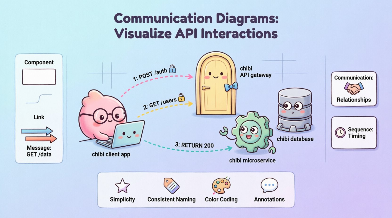
A communication diagram is a type of Unified Modeling Language (UML) diagram. It shows how objects interact within a system. Unlike other diagrams, it emphasizes the relationships between objects rather than the strict timing of messages. In the context of APIs, these objects often represent microservices, databases, or client applications. The diagram maps the flow of data and control across these boundaries.
These diagrams are particularly useful for understanding:
- System Architecture: How services connect logically.
- Data Flow: Where information moves during a request.
- Dependencies: Which components rely on others.
- API Contracts: The expected input and output between services.
By visualizing these connections, teams can identify bottlenecks early. It helps in debugging complex flows without running the full system. A well-drawn diagram serves as a single source of truth for the backend logic.
🔑 Core Components Breakdown
To build an effective diagram, you must understand its building blocks. Each element serves a specific purpose in the visual representation.
1. Objects and Classes
Objects represent the participants in the interaction. In API design, these could be:
- Client: The application requesting data.
- Gateway: The entry point for external traffic.
- Service: The business logic handler.
- Database: The storage layer.
Each object is drawn as a rectangle. Labels inside the box define the role, such as AuthenticationService or UserRepository.
2. Links
Links connect the objects. They show the structural relationship. A link indicates that one object knows about another. In API terms, this represents a direct connection or a dependency. For example, the Gateway knows about the Auth Service. Links can be directional or bidirectional.
3. Messages
Messages are the actions that travel along the links. They represent API calls. Examples include GET /users or POST /login. Messages are numbered to indicate the sequence of events. This numbering is crucial for understanding the order of operations.
🛠 Step-by-Step Creation Process
Creating a diagram involves a structured approach. Follow these steps to ensure accuracy and clarity.
Step 1: Identify the Actors
Start by listing all entities involved in the specific scenario. Do not include every service in the entire system. Focus only on those relevant to the API interaction being documented. This keeps the diagram readable.
Step 2: Define the Relationships
Draw lines between the identified objects. These lines represent the communication paths. Ensure every line corresponds to an actual API dependency. If two services do not talk directly, do not draw a link between them.
Step 3: Map the Messages
Add arrows along the links to show message flow. Label each arrow with the method and endpoint. For example, use 1: POST /api/v1/auth. The number indicates the order of execution. Use distinct colors or styles for requests versus responses.
Step 4: Review the Flow
Trace the path from start to finish. Does every request have a response? Are there any circular dependencies? Verify that the diagram matches the actual code implementation.
📊 Communication vs. Sequence Diagrams
Choosing the right diagram type is critical for documentation. Below is a comparison to help you decide when to use a communication diagram.
| Feature | Communication Diagram | Sequence Diagram |
|---|---|---|
| Focus | Object relationships and structure | Timing and order of events |
| Layout | Flexible spatial arrangement | Strict vertical timeline |
| Complexity | Better for high-level architecture | Better for detailed logic flows |
| Message Numbering | Used for sequence | Implicit via vertical position |
| Use Case | Visualizing API topology | Debugging specific method calls |
🎯 Best Practices for Clarity
Clarity is the goal of any diagram. If a stakeholder cannot understand it in seconds, it needs revision. Apply these principles to maintain high quality.
- Keep it Simple: Avoid showing every single database query. Group related operations into a single logical step.
- Consistent Naming: Use the same names for objects across all diagrams. This reduces confusion when cross-referencing documentation.
- Limit Depth: Do not nest interactions more than three levels deep. If a process is too complex, break it into sub-diagrams.
- Color Coding: Use colors to distinguish between internal services and external clients. For instance, blue for internal, green for external.
- Annotations: Add notes for exceptions or error handling. Standard flows are good, but error paths are where bugs often live.
⚙️ Handling Complex API Flows
Real-world systems often involve asynchronous events and background jobs. A standard flow does not capture this. Here is how to handle complexity.
Asynchronous Messages
When a service sends a message without waiting for a response, use a specific symbol. This indicates an event-driven architecture. For example, a payment service might publish an event to a queue. The diagram should show this as a fire-and-forget message.
Loops and Conditions
APIs often have conditional logic. If a user is not found, the system returns an error. If found, it proceeds. You can annotate messages with conditions. Write [user exists] next to the success path and [user missing] for the error path.
Parallel Processing
Some systems call multiple services simultaneously. Draw parallel arrows originating from the same point. This shows that the calls happen at the same time. This is common in microservices where aggregation happens after multiple calls complete.
❌ Common Mistakes to Avoid
Even experienced engineers make errors when modeling systems. Watch out for these common pitfalls.
- Overcrowding: Trying to fit the entire system into one image makes it unreadable. Use zooming or separate diagrams for different modules.
- Ignoring State: APIs often depend on the state of the object. Ensure the diagram reflects the necessary state transitions if they impact the flow.
- Missing Return Paths: Forgetting to draw the response arrow. Every request should have a corresponding response in the visual model.
- Unclear Object Names: Using generic names like Service1 instead of InventoryService. Specific names convey meaning instantly.
- Outdated Documentation: Failing to update the diagram when the code changes. This leads to confusion and technical debt.
🔄 Maintaining Diagram Accuracy
A diagram is a snapshot in time. As the system evolves, the diagram must evolve with it. Treat documentation as code. This means versioning it and reviewing it during pull requests.
Integration with CI/CD: You can automate the generation of diagrams from code comments. Some tools parse documentation strings to create visual representations. This ensures the diagram always matches the source code.
Review Cycles: Schedule regular reviews of your architecture diagrams. During sprint planning, verify that new features do not break the existing flow. Update the communication paths accordingly.
Stakeholder Feedback: Share these diagrams with product managers and QA teams. They may spot logical gaps that developers miss. Their feedback helps refine the accuracy of the model.
📝 Integrating into Documentation
Diagrams should not exist in isolation. They must be part of the broader technical documentation. Place them near the API specifications they describe. Use the diagram to introduce the endpoint before showing the JSON structure.
Context is Key: Always include a brief caption. Explain what the diagram shows. For example, Figure 1: Authentication Flow between Client and Auth Service.
Linking: If you have multiple diagrams, link them. A high-level overview diagram should link to detailed flow diagrams. This creates a navigation path for readers.
🔍 Deep Dive: Message Numbering
The numbering system in these diagrams is more than just decoration. It provides the temporal sequence. If you see message 1 and message 2, you know 2 happens after 1.
- Sequential: Standard flow where one call triggers the next.
- Parallel: Messages with the same number run simultaneously.
- Recursive: If a service calls itself, use a higher number or a different prefix to avoid confusion.
This numbering helps in tracing execution paths during debugging. If a request fails at step 3, you can look at the diagram to see exactly which service is involved.
🛡 Security Considerations in Diagrams
Security is a vital aspect of API design. You should indicate security mechanisms in the diagram without cluttering it.
- Authentication: Mark messages that require tokens. You might add a small lock icon next to the arrow.
- Encryption: Indicate if traffic is encrypted (HTTPS) or if data is tokenized.
- Permissions: Show which roles can access which services. This helps in defining access control lists.
By including these details, the diagram becomes a security reference guide. It ensures that security is considered during the design phase, not just in the code.
🎨 Visual Consistency
Consistency aids comprehension. If you use a specific shape for a database in one diagram, use it everywhere. Stick to a style guide for your team.
- Shapes: Rectangles for services, cylinders for databases, circles for external clients.
- Fonts: Use a single sans-serif font for labels.
- Spacing: Ensure equal spacing between objects to prevent visual bias.
This discipline makes it easier for new team members to read the diagrams. They learn the symbols quickly and can focus on the logic.
🚦 Summary of Key Takeaways
Building communication diagrams is a skill that improves system design. It forces you to think about connections before implementation. Remember these core points:
- Focus on Relationships: Show who talks to whom.
- Number Messages: Clarify the order of operations.
- Keep it Updated: Ensure diagrams match the code.
- Avoid Hype: Stick to facts and logical flows.
- Use Tables: Compare diagram types when necessary.
By following these guidelines, you create a visual language that bridges the gap between design and development. This clarity reduces errors and accelerates development cycles. Start mapping your interactions today to gain better control over your API architecture.