In the fast-paced world of software architecture, visual models often get dismissed as cosmetic exercises. Some stakeholders treat them as decoration for documentation, assuming the code tells the real story. This perspective overlooks a critical tool in the engineer’s arsenal: the Communication Diagram. While Sequence Diagrams dominate the conversation regarding time and order, Communication Diagrams offer a unique perspective on object relationships and interaction paths that are often more intuitive for understanding system topology.
This guide explores the functional value of these diagrams. We will move beyond the assumption that they are merely visual aids. Instead, we will analyze how they serve as a blueprint for system integrity, a communication bridge for cross-functional teams, and a mechanism for reducing technical debt before it accumulates. We will look at the mechanics, the benefits, and the practical applications that make them indispensable in modern development lifecycles.
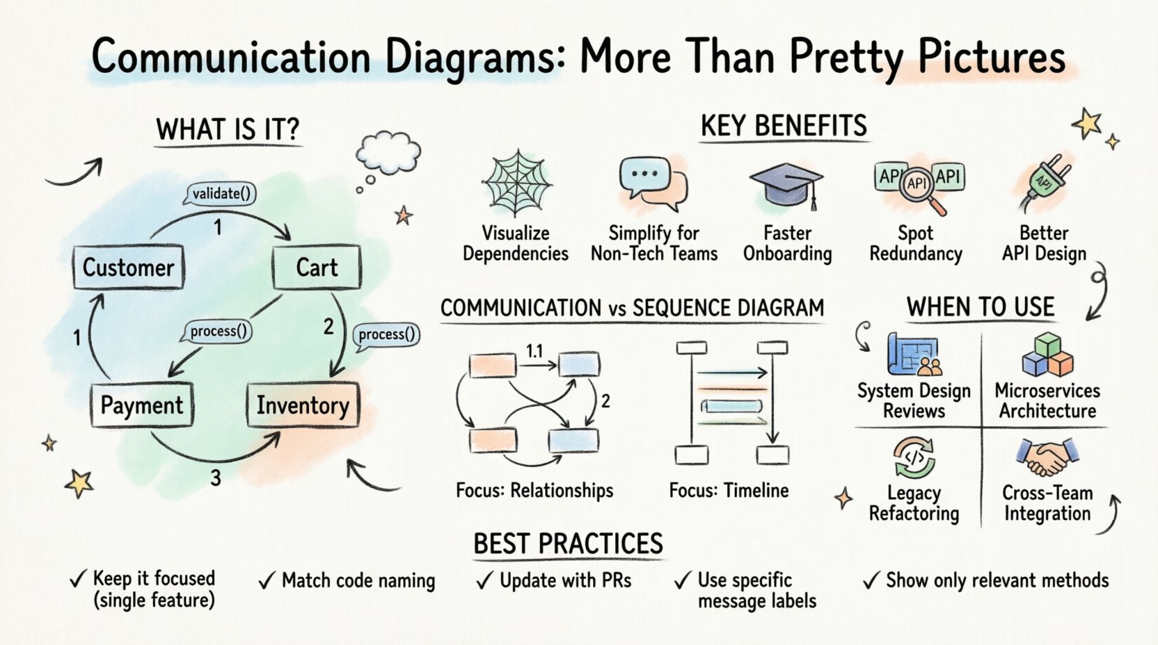
What Exactly Is a Communication Diagram? 🧩
A Communication Diagram, historically known as a Collaboration Diagram, is a type of Unified Modeling Language (UML) diagram. Its primary purpose is to show how objects or components interact with one another to achieve a specific goal. Unlike other diagrams that emphasize the timeline of events, this model focuses on the structural relationships and the messages passed between them.
Here are the core components that make up this visual language:
- Objects and Classes: Represented as rectangles, these are the active participants in the interaction. They define the context and the boundaries of the system being modeled.
- Links: These are the lines connecting objects. They represent the structural associations between instances, indicating that one object knows about another and can send it a message.
- Messages: Arrows connecting the objects indicate the flow of information. They carry the method calls, data, or signals required for the interaction to proceed.
- Sequence Numbers: Numbers placed on the arrows (1, 1.1, 1.2, 2, etc.) provide a rough ordering of events. This allows for a logical flow without strictly defining the exact timing or concurrency.
When you look at a Communication Diagram, you are seeing a map of dependencies. It answers the question: “If I need to change this service, which other services will feel the impact?” This structural clarity is where the true power lies.
The Myth: “It’s Just a Pretty Picture” 🤔
There is a pervasive belief in technical circles that documentation is a barrier to speed. The argument goes that writing code is the only “real” work, and drawing boxes and arrows is a distraction. This mindset treats diagrams as static artifacts, created once and forgotten.
However, this view ignores the cognitive load placed on developers when they try to understand complex systems through code alone. When a system grows, the web of dependencies becomes opaque. A Communication Diagram cuts through this noise.
Why this myth persists:
- Over-reliance on IDEs: Modern development environments offer powerful navigation tools. Developers feel they can trace calls instantly without external documentation.
- Lack of Maintenance: Many diagrams are outdated. When a model does not match the code, it loses credibility and becomes “pretty pictures” that no one trusts.
- Confusion with Sequence Diagrams: Because Sequence Diagrams show the timeline more clearly, people often assume they are the same thing. Communication Diagrams are often undervalued because they look less rigid.
The reality is that a well-maintained diagram serves as a source of truth. It is a contract between the architecture team and the implementation team. If the diagram says Object A talks to Object B, the code must reflect that relationship. This alignment prevents “spaghetti code” architectures where dependencies are hidden in deep nesting or global state.
Why These Diagrams Matter: The Functional Benefits 🚀
Let’s break down the specific advantages of using Communication Diagrams in a professional setting. These are not abstract benefits; they translate to saved time, reduced bugs, and clearer expectations.
1. Visualizing Dependency Chains 🕸️
One of the biggest challenges in software maintenance is understanding impact. If you modify a core function, do you break the reporting module? A Communication Diagram maps the direct links between components. This makes it easy to identify:
- Which services are tightly coupled.
- Which interfaces are critical for system stability.
- Where to insert new layers without disrupting existing flows.
When you see a cluster of messages converging on a single object, you immediately identify a potential bottleneck or a high-risk area for refactoring.
2. Simplifying Complex Logic for Non-Technical Stakeholders 🗣️
Product Managers, QA Engineers, and Business Analysts often struggle with Sequence Diagrams because they focus heavily on time and loops. Communication Diagrams focus on relationships. This is often more intuitive for business logic discussions.
For example, explaining a checkout process is easier when you show the Customer, the Cart, the Payment Gateway, and the Inventory Service interacting, rather than drawing a vertical timeline. It shifts the conversation from “When does this happen?” to “Who talks to whom?”
3. Onboarding New Team Members 🎓
When a new developer joins a project, reading the codebase can take weeks. A set of Communication Diagrams can reduce this time to days. They provide a high-level overview of the system’s topology.
Instead of diving into implementation details immediately, the new hire can review the diagrams to understand the major actors and their responsibilities. This creates a mental model of the system before they touch a single line of code.
4. Identifying Redundancy and Duplication 🔍
As systems evolve, it is common for multiple components to implement similar logic. A Communication Diagram reveals this redundancy visually. If you see two different objects performing the exact same message sequence to reach the same result, you have identified an opportunity for abstraction or shared services.
5. Facilitating API Design 📡
Before writing an API contract, you can model the interaction using these diagrams. This ensures that the interface design aligns with the actual flow of data. It helps define the input and output parameters for each message link, serving as a precursor to interface definition documents.
Communication Diagram vs. Sequence Diagram 🆚
It is common to confuse these two types of UML diagrams. While they describe the same interaction, their focus differs significantly. Understanding the distinction is crucial for choosing the right tool for the job.
| Feature | Communication Diagram | Sequence Diagram |
|---|---|---|
| Primary Focus | Object relationships and structure | Time and order of events |
| Visual Layout | Objects placed based on logical grouping | Vertical lifelines representing time |
| Message Flow | Numbered arrows indicate sequence | Horizontal arrows along the timeline |
| Best For | Understanding topology and dependencies | Understanding complex timing and concurrency |
| Complexity | Harder to read with very deep nesting | Better for long, complex chains of events |
Use a Communication Diagram when you want to explain the system’s architecture to a team or when you are designing the overall structure. Use a Sequence Diagram when you need to debug a specific race condition or verify the exact timing of a critical transaction.
When to Use Communication Diagrams in Your Workflow 📅
Not every piece of code needs a diagram. Over-documentation can be as harmful as under-documentation. Here are the specific scenarios where these diagrams add the most value.
1. System Design Reviews 🛠️
During the architecture phase, before code is written, these diagrams are essential. They allow the team to critique the design for potential coupling issues or missing dependencies. It is much cheaper to move a box on a diagram than to refactor code in production.
2. Microservices Architecture 🧱
In distributed systems, services are loosely coupled but tightly connected via networks. Communication diagrams help map the network topology. They show which service calls which other service, making it easier to manage API gateways and load balancers.
3. Legacy System Refactoring 🔄
When dealing with old codebases where documentation is missing, reverse-engineering a Communication Diagram helps document the existing behavior. This acts as a safety net before you begin modifying the legacy code.
4. Cross-Team Integration 🤝
When Team A owns the Payment Module and Team B owns the Order Module, a Communication Diagram serves as the integration contract. It defines the interface boundaries clearly, reducing friction between teams.
Best Practices for Creating Effective Diagrams 📝
To ensure these diagrams remain valuable and not just “pretty pictures,” you must follow a disciplined approach to their creation and maintenance.
1. Keep It Focused 🎯
Do not try to diagram the entire system in one image. Break it down by feature or module. A diagram showing the entire application will be unreadable. Focus on one specific use case at a time.
2. Maintain Consistency 🔄
Ensure the naming conventions in the diagram match the code. If the code uses “OrderService,” the diagram should not say “OrderManager.” Consistency builds trust. If the names don’t match, developers will assume the diagram is wrong.
3. Update During Code Reviews 🔄
Make diagram updates a part of the pull request process. If a developer adds a new dependency, they should update the diagram. This ensures the documentation stays in sync with the codebase.
4. Use Clear Message Labels 🏷️
Don’t just label messages as “Method Call.” Use specific names like “validatePayment()” or “calculateTax().” This provides immediate context about what data is being transferred.
5. Avoid Over-Engineering 🛠️
Do not include every single method in the system. Only include the methods relevant to the interaction being modeled. If a class has 50 methods, but only 2 are involved in this specific flow, show only those 2.
Common Pitfalls to Avoid ⚠️
Even with good intentions, teams often fall into traps that render diagrams useless. Being aware of these common mistakes can save significant effort.
- Ignoring Asynchronous Calls: Real-world systems often use asynchronous messaging. If your diagram only shows synchronous blocking calls, it misrepresents the system’s performance characteristics.
- Missing Error Handling: Most diagrams show the “Happy Path.” They often omit error scenarios. However, error handling is where system complexity often hides. Try to include at least the major exception flows.
- Static vs. Dynamic: Don’t confuse a static class diagram with a communication diagram. The latter must show interaction. If the objects are just sitting there without arrows, it is not a communication diagram.
- Too Many Objects: If a diagram has more than 20 objects, it is likely too complex. Split it into sub-diagrams to maintain clarity.
The Long-Term Value of Visual Modeling 📈
Investing in Communication Diagrams is an investment in the longevity of your software. It reduces the cognitive burden on your team. It creates a shared language that transcends individual coding styles. When a project spans years or is handed over to different teams, these diagrams act as the historical record of how the system was intended to work.
They are not a replacement for code, but they are a companion to it. They force you to think about the system holistically before you start building it piecemeal. In an industry where technical debt accumulates quickly, taking the time to model interactions clearly is a strategic advantage.
By treating these diagrams as functional documents rather than decorative assets, you unlock a higher level of system understanding. You create a living documentation set that evolves with the software. This approach fosters better collaboration, fewer integration errors, and a more maintainable codebase over time.
Next time you start a new feature or tackle a complex integration, pause. Sketch the Communication Diagram. It might just be the most efficient step in your development process.