Designing for a global audience requires more than just translating text. It demands a deep understanding of cultural nuances that influence how users perceive, interact with, and trust digital products. When an interface fails to align with local expectations, friction occurs. This friction can lead to abandonment, reduced engagement, and a damaged brand reputation. Successful cross-cultural design bridges the gap between functionality and cultural relevance.
In this guide, we explore the essential factors that shape user experience across different regions. From color symbolism to navigation patterns, every element carries meaning. By addressing these considerations, designers can create inclusive experiences that resonate with diverse user bases. Let us examine the core principles of international UX design.
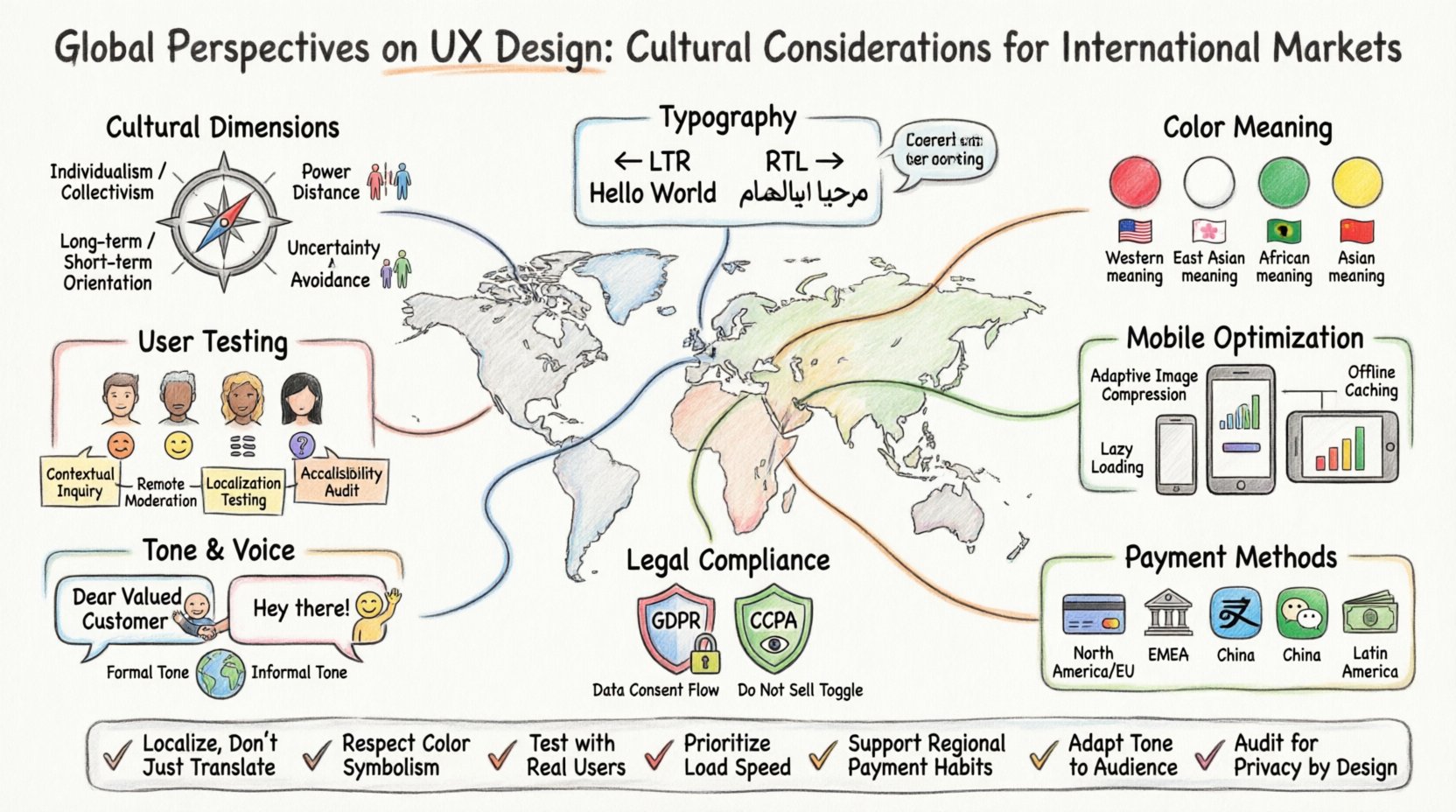
🧭 Understanding Cultural Dimensions in Design
Cultural dimensions provide a framework for understanding how values and behaviors vary across societies. These dimensions influence user expectations regarding hierarchy, uncertainty, and individualism. Ignoring these factors can result in interfaces that feel alien or uncomfortable to specific groups.
- Individualism vs. Collectivism: In individualistic cultures, users often prefer personalized content and self-expression. Collectivist cultures may value community feedback, social proof, and group consensus more highly.
- Power Distance: This refers to the extent to which less powerful members of a society accept and expect power to be distributed unequally. High power distance cultures might prefer authoritative tones and clear hierarchies in UI navigation.
- Uncertainty Avoidance: Cultures with high uncertainty avoidance prefer clear instructions, structured layouts, and risk-reduction features. Low uncertainty avoidance cultures are more comfortable with exploration and ambiguity.
- Long-term vs. Short-term Orientation: Long-term oriented cultures value persistence and future rewards. Short-term oriented cultures often focus on immediate gratification and quick wins.
When mapping these dimensions to design, consider how your information architecture supports these values. For instance, a financial application in a high uncertainty avoidance market should provide detailed security badges and clear transaction histories upfront.
🎨 Color Symbolism and Visual Perception
Colors evoke emotional responses that are deeply rooted in cultural context. A color that signifies prosperity in one region might indicate mourning or danger in another. Visual consistency is important, but cultural adaptation is necessary.
| Color | Western Context | Eastern Context | African Context |
|---|---|---|---|
| Red | Danger, Error, Sale | Good Fortune, Joy | Death, Mourning |
| White | Purity, Cleanliness | Mourning, Death | Peace, Purity |
| Green | Nature, Money, Go | Islam, Prosperity | Hope, Safety |
| Yellow | Caution, Happiness | Royalty, Wisdom | Comfort, Warmth |
Using the wrong color palette can send unintended messages. For example, using red for “success” messages in a Western app is standard, but in China, red is celebratory and might be too aggressive for a notification. Conversely, white backgrounds are standard globally for cleanliness, but using white for a primary action button might clash with a dark mode preference common in some tech-heavy regions.
- Contrast Ratios: Ensure text meets accessibility standards regardless of color meaning. High contrast aids readability.
- Background Patterns: Some patterns may hold specific cultural significance. Avoid symbols that could be offensive or distracting.
- Imagery: Photos should reflect the diversity of the target audience. Stock photos often default to Western features.
📝 Typography and Reading Patterns
Language direction and character sets fundamentally change the layout of a user interface. Designing for left-to-right (LTR) languages like English requires a different approach than right-to-left (RTL) languages like Arabic or Hebrew.
When switching to RTL, every element must be mirrored. Buttons, icons, progress bars, and navigation menus must align to the right. This is not just a translation task; it is a structural redesign.
- Font Legibility: Some fonts render poorly for non-Latin scripts. Always test typography in the target language to ensure readability.
- Character Width: Chinese and Japanese characters often require larger font sizes than Latin scripts to maintain legibility due to their complexity.
- Line Height: Adjust line height to accommodate diacritics in languages like French or Vietnamese. Tight line spacing can make text look cluttered.
- Text Expansion: German and Finnish often result in longer strings than English. Design containers with flexible widths to prevent text overflow.
Consider the cognitive load of reading. Users scanning a page expect visual cues that guide their eye. In RTL markets, this flow is reversed. If your design assumes a Z-pattern reading flow, it will fail for Arabic users who read in an inverted Z-pattern.
📱 Mobile Usage Patterns and Connectivity
Mobile adoption rates vary significantly by region. In North America and Europe, desktop usage remains strong for certain tasks. In Asia, Africa, and parts of South America, mobile devices are the primary, and sometimes only, internet access point.
- Data Constraints: In emerging markets, data plans may be expensive or limited. Optimize images and assets to reduce load times and data consumption.
- Device Diversity: Screen sizes in international markets range from small budget phones to large tablets. Test your layout on low-resolution devices.
- Network Stability: Connection speeds can be inconsistent. Implement offline modes and graceful degradation for when the network fails.
- App vs. Web: Some regions prefer lightweight Progressive Web Apps (PWAs) over native downloads due to storage limitations.
A mobile-first strategy is often the correct approach for global expansion. It ensures that the core experience is robust on the device most users will rely on. However, do not neglect the desktop experience for regions where it remains the standard for business tasks.
💳 Payment Methods and Trust Signals
The checkout process is where cultural differences become most apparent. What users expect to pay with varies wildly. A global platform cannot rely on a single payment gateway.
- Credit Cards: Dominant in the US and parts of Europe. Not universally trusted or available.
- Bank Transfers: Preferred in Germany (SEPA) and the Netherlands (iDEAL). Users trust their bank accounts over third-party processors.
- Digital Wallets: Alipay and WeChat Pay are essential for the Chinese market. Apple Pay and Google Pay work well in tech-forward regions.
- Cash on Delivery: Still common in parts of Latin America and the Middle East due to low credit card penetration.
Trust signals also differ. In some cultures, displaying a physical address and phone number builds confidence. In others, user reviews and social media links are more convincing. Security badges must be localized. A badge recognized in the US might be unknown in Southeast Asia.
🗣️ Content Localization and Tone
Localization goes beyond translation. It involves adapting the tone, style, and context of the content to fit the local culture. Direct translation often fails because idioms and humor do not cross borders.
- Tone of Voice: Formal language is preferred in parts of Asia and Europe. Informal, friendly language works better in Australia and the US.
- Imagery: Avoid gestures that have different meanings. A thumbs-up can be offensive in some Middle Eastern countries.
- Date and Time Formats: DD/MM/YYYY vs MM/DD/YYYY. 12-hour vs 24-hour clocks. Using the wrong format causes confusion.
- Currency: Display prices in the local currency with the correct symbol placement. Some languages place the symbol after the number.
Content should reflect local values. For example, emphasizing community and family in collectivist cultures can increase engagement. Emphasizing personal achievement and independence appeals to individualist cultures.
🔍 Testing with International Users
Assumptions about user behavior are dangerous. The only way to know if a design works is to test it with people from the target culture. Remote testing tools can facilitate this, but local context is key.
- Recruitment: Find participants who match your target demographic. Avoid relying solely on expatriates living in the region.
- Language: Conduct tests in the participant’s native language. Using English can skew results due to cognitive load.
- Context: Ask users about their environment. Are they using the app on a bus? At work? In a quiet room? Context impacts interaction.
- Feedback: Encourage users to explain why they made a choice. Their reasoning reveals cultural biases in the design.
Iterative testing allows you to refine the experience before a full launch. Small adjustments based on feedback can prevent major failures later. Do not wait until the product is finished to start testing.
⚖️ Legal and Privacy Considerations
Different regions have different laws regarding data and privacy. Compliance is not optional; it is a requirement for operating internationally.
- GDPR: The General Data Protection Regulation in Europe sets strict standards for data collection and user consent.
- CCPA: The California Consumer Privacy Act impacts how data is handled for US users.
- Data Residency: Some countries require user data to be stored on servers within their borders. This affects where you host your databases.
- Cookies: Cookie consent banners must be adapted to local laws. Some regions require explicit opt-in, while others allow opt-out.
Privacy policies must be written clearly and translated accurately. Users need to understand how their data is used. A complex legal jargon that works in one language may confuse users in another.
🚀 Final Thoughts on Global UX
Creating a successful international product is a continuous process. It requires empathy, research, and a willingness to adapt. There is no one-size-fits-all solution. What works in New York may not work in Mumbai.
By prioritizing cultural considerations, you build trust and loyalty. Users feel seen and understood when an interface respects their norms. This leads to higher retention and better business outcomes.
Focus on the following key takeaways for your next project:
- Research cultural dimensions before starting design.
- Test color schemes and imagery with local users.
- Adapt layouts for reading direction and character sets.
- Support local payment methods and trust signals.
- Localize content, not just text.
- Conduct usability testing in the native language.
- Ensure legal compliance for data and privacy.
Design is communication. When you communicate across cultures, clarity and respect are paramount. Start with the user, respect their context, and build experiences that connect people worldwide.