Designing robust Application Programming Interfaces (APIs) requires more than just writing code. It demands clear, precise communication between developers, architects, and stakeholders. Visual modeling plays a critical role in this process. Among the various types of diagrams available in software architecture, two stand out for representing interactions: Sequence Diagrams and Communication Diagrams. Both originate from the Unified Modeling Language (UML) standards, yet they serve distinct purposes. Choosing the right one depends on the specific context of your API design, the complexity of the flow, and the audience consuming the documentation.
This guide explores the nuances of both diagram types. We will examine their structural differences, their application in API contexts, and provide a framework for selecting the appropriate visual tool for your next project.
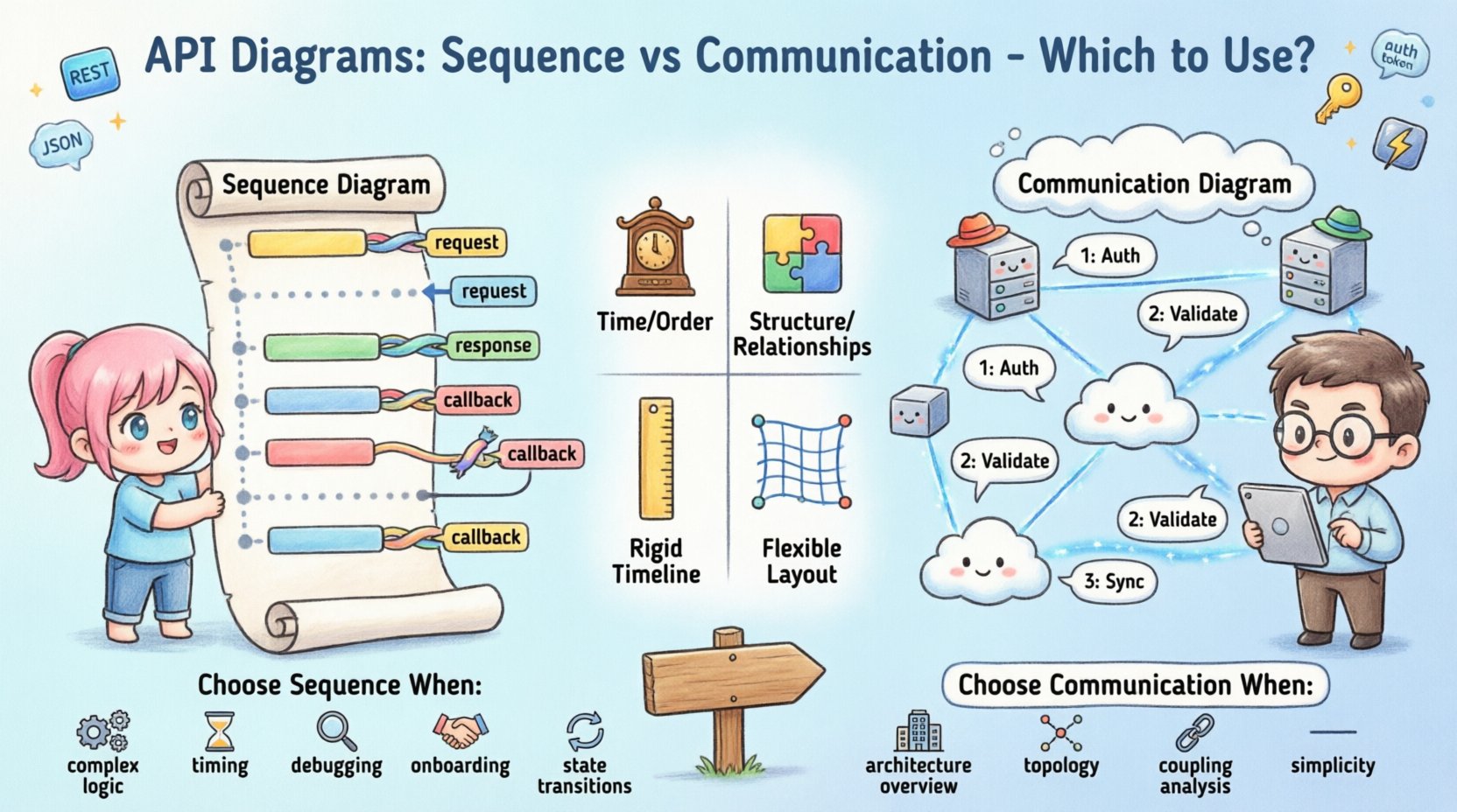
🕰️ Understanding Sequence Diagrams
A Sequence Diagram focuses on the temporal ordering of interactions. It is essentially a timeline of events. In the context of an API, this diagram visualizes how messages pass between objects or systems over a period of time. It is highly effective for detailing the step-by-step logic of a request and response cycle.
Key Characteristics
- Vertical Axis (Time): Time flows from top to bottom. The sequence of events is immediately apparent.
- Lifelines: Each participating entity (client, server, database, external service) is represented by a vertical dashed line.
- Activation Bars: Rectangular boxes on the lifeline indicate when an object is actively performing an action.
- Message Arrows: Solid arrows represent synchronous calls, while dashed arrows represent return messages.
Why Use Sequence Diagrams for APIs?
When designing an API endpoint, you often need to explain exactly what happens after a client sends a request. Sequence diagrams excel here because they map out the flow of control.
- Complex Logic Flows: If your API involves multiple internal steps (e.g., authentication, validation, database write, notification trigger), a sequence diagram clarifies the order.
- Error Handling: You can visualize exception paths. What happens if the database is unreachable? The diagram can show the error message returning up the stack.
- Latency Awareness: By showing the sequence, developers can identify potential bottlenecks where the system waits for a response.
- State Changes: They help illustrate how the state of an object changes at specific points in the interaction.
Example Scenario: User Registration API
Consider a POST /users endpoint. A sequence diagram would show:
- Client sends request.
- API Gateway validates token.
- Auth Service checks permissions.
- Database Service inserts record.
- Notification Service sends email.
- API returns
201 Created.
This vertical layout makes it impossible to miss the chronological order. If the Notification Service fails, the diagram can show a rollback or a fallback message.
🔗 Understanding Communication Diagrams
Formerly known as Collaboration Diagrams in earlier UML versions, Communication Diagrams focus on the structural relationships between objects rather than the strict timing of messages. They prioritize the network topology of the interaction over the timeline.
Key Characteristics
- Object Nodes: Entities are represented as icons or boxes placed spatially to show relationships.
- Links: Lines connect objects, representing associations or dependencies.
- Sequence Numbers: Messages are labeled with numbers (1, 1.1, 1.2) to indicate order, rather than relying on vertical position.
- Flexibility: You can arrange objects in any layout that makes the relationships clear.
Why Use Communication Diagrams for APIs?
Communication diagrams are less about the “when” and more about the “who” and “how connected.” They are often better for high-level architectural overviews.
- System Topology: They show which services talk to which other services without cluttering the view with timelines.
- Complex Associations: If multiple services interact in a web-like fashion, a communication diagram shows the connections clearly.
- Reduced Visual Noise: For simple flows, the timeline of a sequence diagram can look cluttered. A communication diagram simplifies this.
- Focus on Responsibility: They highlight which component is responsible for which part of the interaction.
Example Scenario: Payment Processing API
Consider a POST /payments endpoint involving a Gateway, a Bank, and an Internal Ledger.
- The Gateway connects to the Bank.
- The Gateway connects to the Ledger.
- The Ledger connects to the Bank (for reconciliation).
A communication diagram shows these links directly. It answers the question: “Which systems need to be available for this API to function?” rather than “What happens first?”
📊 Comparison: Key Differences
To make an informed decision, it is helpful to compare the two models directly. The following table outlines the structural and functional distinctions.
| Feature | Sequence Diagram | Communication Diagram |
|---|---|---|
| Primary Focus | Time and Order | Structure and Relationships |
| Layout | Vertical (Top to Bottom) | Flexible (Spatial Arrangement) |
| Message Order | Position on the Y-axis | Numerical Labels (1, 2, 3) |
| Best For | Complex logic, state changes | High-level overview, topology |
| Readability | High for linear flows | High for complex networks |
| Change Management | Harder to maintain if flow changes | Easier to rearrange nodes |
🔌 Applying to API Design
When modeling APIs, the choice between these diagrams impacts how developers and stakeholders understand the system. Here is how each applies to specific API concerns.
1. Authentication and Authorization
APIs often require layers of security. A Sequence Diagram is superior here.
- You can show the Token Validation step before the Request reaches the Controller.
- You can visualize the rejection flow if the token is invalid.
- The timing of the check is crucial; it must happen before data processing.
A Communication Diagram might show that the API connects to the Auth Service, but it obscures the fact that the request stops if authentication fails.
2. Asynchronous Processing
Modern APIs often use async patterns (e.g., Webhooks, Background Jobs).
- Sequence Diagrams: Can show the initial request, the immediate response (e.g.,
202 Accepted), and a separate path for the callback. - Communication Diagrams: Can show the relationship between the Job Queue and the Worker Service without getting bogged down in the timing of the callback.
3. Data Payloads and Schema
Neither diagram type is ideal for defining JSON schemas. However, they can reference them.
- Sequence Diagrams often list the payload content on the message arrow (e.g.,
send(userData)). - Communication Diagrams are less likely to clutter the message labels with payload details, keeping the focus on the link.
4. Versioning and Deprecation
APIs evolve. You need to document what changes.
- If an endpoint changes its internal logic significantly, a Sequence Diagram update highlights the new steps.
- If a service is removed from the architecture, a Communication Diagram update clearly shows the broken link or the new connection path.
🧭 Decision Framework: Which One to Choose?
Choosing the right diagram is not about which is better, but which fits the current need. Use the following criteria to guide your selection.
Choose Sequence Diagrams When:
- Logic Complexity: The interaction involves nested loops, conditionals, or complex branching logic.
- Timing is Critical: You need to demonstrate timeouts, retries, or specific ordering constraints.
- Debugging: Developers need to trace a specific bug through the call stack.
- Onboarding: New hires need to understand the exact lifecycle of a request.
- State Transitions: The API moves resources through specific states (e.g.,
PENDING→SHIPPED→DELIVERED).
Choose Communication Diagrams When:
- System Architecture: You need to show how microservices interact within the broader ecosystem.
- High-Level Overview: Stakeholders need a quick view of connectivity without technical detail.
- Coupling Analysis: You want to identify tightly coupled components that might need decoupling.
- Simplicity: The interaction flow is linear and simple; a timeline adds unnecessary visual weight.
- Scalability Planning: You are designing how multiple instances of a service communicate.
🛠️ Maintenance and Best Practices
Diagrams are not static assets. They degrade over time if not maintained. This is a common pain point in API documentation workflows.
Keeping Diagrams in Sync
- Single Source of Truth: Do not draw diagrams manually in a drawing tool if you can avoid it. Use code-based diagramming where possible to keep them version-controlled with your API specifications.
- Review Process: Treat diagram updates as part of the Pull Request process. If the code flow changes, the diagram must change.
- Abstraction Levels: Do not diagram every single method call. Focus on the public contract and critical internal paths.
Avoiding Common Pitfalls
- Over-Engineering: Creating a diagram for a simple
GETrequest that does nothing but return data is wasteful. Reserve diagrams for complex flows. - Inconsistent Notation: Ensure all team members use the same symbols for errors, loops, and alternate flows.
- Ignoring Error Paths: A diagram showing only the happy path is misleading. Always include at least one failure scenario.
- Too Much Detail: Do not label every byte of data transferred. Focus on the logical message (e.g.,
RequestOrdervs.{"id": 123}).
🔄 Integrating with Documentation Workflows
Incorporating these diagrams into your API documentation strategy requires a systematic approach. It is not enough to generate them; they must be accessible and relevant.
1. Contextual Placement
- Place Sequence Diagrams near the specific endpoint documentation. If an endpoint has complex logic, show the flow right there.
- Place Communication Diagrams in the Architecture section or the System Overview page.
2. Interactive Elements
- If your documentation platform supports it, allow users to click on parts of the diagram to see the corresponding API definition.
- Ensure the diagram scales well on mobile devices, as many developers consume docs on tablets or phones.
3. Automated Generation
- Whenever possible, generate diagrams from your API specification (e.g., OpenAPI/Swagger) or code annotations.
- This reduces the manual effort and prevents the diagrams from becoming stale.
- Even if you cannot automate the whole thing, use the spec to verify the diagram accuracy.
🚦 Summary of Strategic Choices
Both Sequence and Communication diagrams offer value. The goal is to reduce cognitive load for the reader. If the reader needs to understand how the system works step-by-step, choose Sequence. If they need to understand what connects to what, choose Communication.
In the lifecycle of an API, you might use both. Start with a Communication Diagram to define the scope of the system. Then, drill down into specific endpoints using Sequence Diagrams. This layered approach provides clarity without overwhelming the audience.
Remember that documentation is a communication tool. Its primary metric of success is not how accurate it is, but how easily the intended audience can understand the system. Whether you choose the timeline of a Sequence Diagram or the network map of a Communication Diagram, ensure it serves the developer’s need to build, integrate, and maintain your API efficiently.
By applying these principles, you create a documentation environment that supports development velocity and system reliability. The choice of diagram is a small technical decision with a large impact on team efficiency and system clarity.