Agile methodologies emphasize iterative progress, collaboration, and adaptability. However, as application architectures become more distributed, the complexity of API interactions grows exponentially. Developers often find themselves navigating a maze of endpoints, payloads, and state changes without a clear visual map. This is where communication diagrams come into play. These visual tools provide a structured way to represent interactions between objects or system components, offering clarity where text-based specifications often fall short.
When integrated into agile API development workflows, communication diagrams serve as a bridge between abstract requirements and concrete implementation. They facilitate discussions during sprint planning, help identify potential integration issues early, and ensure that all team members share a common understanding of how data flows through the system. This guide explores the practical application of these diagrams, their specific benefits in an API context, and how to maintain them without creating documentation overhead.
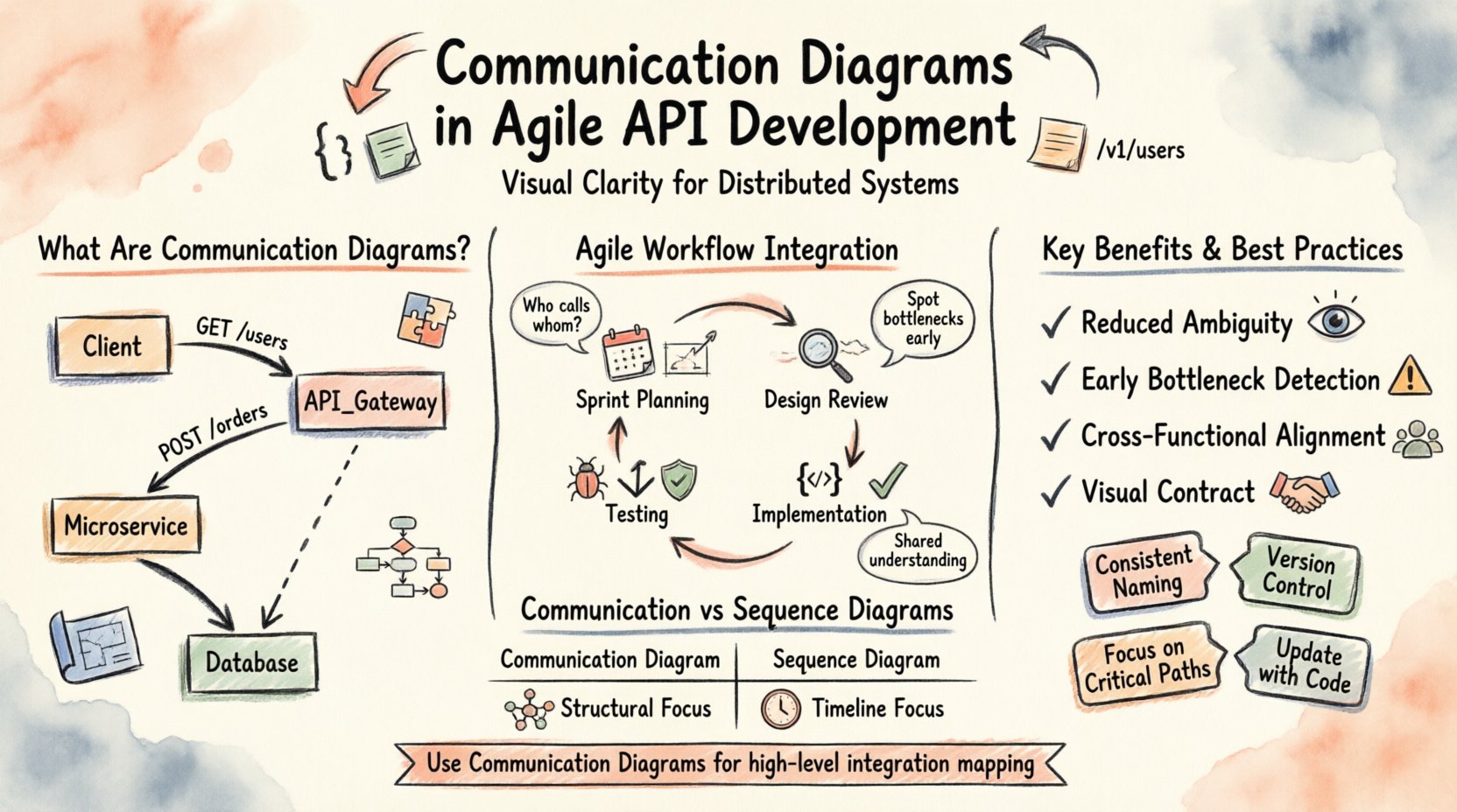
Understanding Communication Diagrams in System Design 📐
A communication diagram is a type of UML (Unified Modeling Language) diagram that emphasizes the structural organization of objects and the messages exchanged between them. Unlike sequence diagrams, which focus on the timeline of events, communication diagrams prioritize the relationships between objects. This distinction is crucial when designing APIs, where the interaction between clients and servers, or between microservices, is defined by the connections and data exchange rather than just the order of operations.
The core components of a communication diagram include:
- Objects: Represented as boxes containing the name and type of the component (e.g.,
Client,API_Gateway,Database). - Links: Lines connecting objects that represent structural relationships or paths for communication.
- Messages: Arrows indicating the flow of data or control signals between objects.
- Message Labels: Text on the arrows describing the specific action or payload being transmitted (e.g.,
GET /users,POST /orders). - Return Messages: Dashed arrows indicating a response or data return from the recipient to the sender.
In the context of API development, these elements translate directly to endpoints, services, and HTTP methods. An object might represent a microservice, and a message represents an API call. By mapping these out, teams can visualize the topology of their integration layer before writing a single line of code.
Why Agile API Development Needs Visual Clarity 🧩
Agile workflows rely on frequent feedback loops and rapid iteration. In this environment, documentation can easily become outdated if not maintained with the same velocity as the code. Communication diagrams offer a middle ground. They are abstract enough to be created quickly during sprint planning but detailed enough to prevent ambiguity during implementation.
Traditional documentation often fails in agile settings because it is static. A 50-page requirements document rarely changes as quickly as the product backlog. Communication diagrams, however, are lightweight. They can be sketched on a whiteboard during a story refinement session and digitized later. This flexibility allows them to evolve alongside the product.
Key reasons for their adoption include:
- Reduced Ambiguity: Visual representations clarify who calls whom. Text descriptions can be misinterpreted regarding directionality or timing.
- Early Detection of Bottlenecks: Complex chains of dependencies become visible. Teams can spot potential latency issues or single points of failure before deployment.
- Cross-Functional Alignment: QA engineers, developers, and product owners can all look at the same diagram and understand the expected behavior of the API.
- Contract Definition: The diagram acts as a visual contract between the consumer and the producer of the API.
Integrating Diagrams into Sprint Workflows 🔄
Incorporating communication diagrams into an agile process requires a shift in how user stories are defined and validated. The diagram is not an artifact to be created once at the beginning of a project; it is a living component of the development lifecycle.
1. Sprint Planning and Story Refinement
During refinement sessions, the team should draft high-level communication diagrams for new features. This ensures that the scope of the work includes all necessary integrations. For example, if a new feature requires data from a third-party service, the diagram should explicitly show the connection between the internal API and the external provider.
Questions to ask during this phase:
- Which components need to interact for this story to function?
- Are there any existing services that will be affected by this change?
- What are the expected input and output formats for each message?
2. Design Reviews
Before implementation begins, the diagram serves as a review artifact. Senior architects or team leads can inspect the connections to ensure they align with architectural standards. This is the point where circular dependencies or unnecessary coupling can be identified and resolved.
3. Implementation
Developers use the diagram as a reference guide. When coding an endpoint, they refer to the diagram to ensure the message signature matches the design. This reduces the likelihood of breaking changes in the API contract.
4. Testing and Validation
QA teams can derive test cases directly from the diagram. Each message arrow represents a potential test scenario. If the diagram shows a message flowing from A to B and back, the test suite should cover both the request and the response states.
Communication Diagrams vs. Sequence Diagrams ⚖️
It is common to confuse communication diagrams with sequence diagrams. Both depict interactions, but they serve different purposes. Understanding when to use which is vital for efficient documentation.
| Feature | Communication Diagram | Sequence Diagram |
|---|---|---|
| Focus | Structural relationships and organization | Temporal order of events |
| Best For | Understanding how components connect | Understanding complex timing and logic flows |
| Layout | Objects placed logically based on relationships | Objects arranged vertically with time flowing down |
| Message Count | Can show many messages without cluttering | Can become crowded with many parallel messages |
| API Context | High-level integration mapping | Specific request/response logic per endpoint |
In agile API development, communication diagrams are often preferred for high-level integration mapping. They allow the team to see the “big picture” of how services interact without getting bogged down in the exact millisecond timing of each request. Sequence diagrams remain valuable for complex logic within a single service, but for inter-service communication, the structural view of communication diagrams is often more practical.
Best Practices for API-Centric Diagrams 🛠️
To ensure communication diagrams remain useful, they must follow specific conventions. Poorly maintained diagrams can become noise rather than signal. The following practices help maintain clarity and utility.
1. Consistent Naming Conventions
Object names should reflect their functional role. Instead of Object_1, use Auth_Service or Payment_Gateway. Message labels should use standard HTTP verbs and paths (e.g., POST /v1/transactions). This ensures that the diagram can be read by developers familiar with the codebase without needing a legend.
2. Avoid Over-Engineering
Not every API call needs to be diagrammed. Focus on the critical paths. If a feature adds a minor validation step within a single service, a high-level diagram is sufficient. Reserve detailed diagrams for cross-service interactions or complex data transformations.
3. Version Control Diagrams
Treat diagrams as code. Store them in the same repository as the source code. This ensures that changes to the API trigger updates to the diagram. When a new version of the API is released, the diagram should be reviewed and updated to reflect the new state.
4. Use Color and Shapes Wisely
While keeping it simple, use visual cues to denote status. For example, red links might indicate deprecated endpoints, while green links indicate active production traffic. This helps teams quickly identify technical debt or security risks.
5. Keep it Updated
An outdated diagram is worse than no diagram. If the diagram does not match the code, developers will stop looking at it. Assign ownership of the diagram to the team leads responsible for the specific microservice. During code reviews, the diagram should be one of the items checked for consistency.
Handling Complexity and Scale 📈
As systems grow, communication diagrams can become complex. A single diagram covering an entire ecosystem may become unreadable. To manage this, adopt a hierarchical approach.
- System Overview Diagram: Shows major components and their high-level connections. Used for onboarding and architectural reviews.
- Service Domain Diagram: Focuses on a specific domain (e.g., Billing, User Management). Shows detailed interactions within that domain.
- Interaction Specific Diagram: Zooms in on a specific flow (e.g., User Login Flow). Details the specific message exchanges.
This decomposition allows teams to focus on the level of detail required for their current task without being overwhelmed by the entire system architecture.
Common Pitfalls and Mitigation Strategies 🚫
Even with best practices, teams often encounter challenges when introducing visual modeling into agile workflows. Recognizing these pitfalls early can save significant time.
Pitfall 1: Diagrams Become Static Artifacts
Problem: The diagram is created once and never updated.
Solution: Link diagram updates to pull requests. If a developer changes an endpoint, they must update the diagram. This can be enforced through CI/CD checks that verify diagram consistency or simply by making it a requirement for code review approval.
Pitfall 2: Excessive Detail
Problem: The diagram includes every parameter and error code, making it cluttered.
Solution: Focus on the structural flow. Keep parameter details in the API specification documentation (such as OpenAPI/Swagger definitions) and reference them in the diagram. The diagram shows the path; the spec defines the payload.
Pitfall 3: Ignoring Error Flows
Problem: Diagrams only show happy paths (successful requests).
Solution: Explicitly map error flows. Include arrows for 4xx and 5xx responses. This helps QA teams design negative test cases and helps developers understand how to handle failures gracefully.
Pitfall 4: Lack of Tooling Support
Problem: Creating diagrams is too time-consuming without the right tools.
Solution: Use tools that support text-to-diagram generation or integration with code repositories. While no specific software should be named, the principle is to automate the generation of diagrams from code annotations where possible.
Measuring the Effectiveness of Diagrams 📊
How do you know if communication diagrams are adding value? Rely on metrics that reflect team efficiency and code quality.
- Defect Rate Reduction: Track the number of integration bugs reported after deployment. A drop in these bugs suggests that the diagrams helped identify issues early.
- Onboarding Time: Measure how long it takes a new developer to understand the API interactions. Clear diagrams should reduce this time.
- Documentation Consistency: Check the frequency of discrepancies between the diagram and the actual code. Lower discrepancies indicate better maintenance.
- Review Cycle Time: Monitor how quickly code reviews are completed. If diagrams clarify expectations, review discussions should be more focused.
Future Considerations and Automation 🤖
The landscape of software development is evolving. As artificial intelligence and automated testing become more prevalent, the role of communication diagrams will shift. Instead of being manually drawn, diagrams may be generated automatically from the API specifications.
This automation does not eliminate the need for human review. The architect still needs to validate the logical flow and ensure the structure makes sense. However, the maintenance burden will decrease. Teams will spend less time drawing boxes and arrows and more time analyzing the implications of the design.
Additionally, as API governance becomes stricter, diagrams may serve as compliance artifacts. Regulated industries often require visual proof of data flow for security audits. Having up-to-date communication diagrams can streamline these processes significantly.
Conclusion on Integration and Value
Communication diagrams offer a structured, visual approach to managing the complexity of API development in agile environments. They bridge the gap between abstract requirements and concrete code, ensuring that all stakeholders understand how the system functions. By following best practices, maintaining version control, and focusing on critical paths, teams can leverage these diagrams to reduce errors and improve collaboration.
The goal is not to create perfect documentation, but to create a living reference that supports the development process. When integrated correctly, communication diagrams become an essential tool for building robust, scalable, and maintainable API architectures.