In the landscape of digital product design, data serves as the compass guiding strategic decisions. However, not all data points hold equal weight. Many teams fall into the trap of obsessing over numbers that look impressive on a dashboard but offer little insight into actual user satisfaction or business value. To build products that truly resonate, designers and stakeholders must shift their focus from vanity metrics to actionable UX metrics. This guide explores the specific measurements that reveal the truth about user experience and how to leverage them for sustainable growth. 🚀
Understanding the difference between what users do and what users feel is the cornerstone of effective analytics. While traffic counts tell you how many people arrived, they do not tell you if those people found what they needed. True success lies in the quality of the interaction, the efficiency of the task completion, and the likelihood of a user returning. By prioritizing the right indicators, teams can make informed design choices that enhance usability and drive meaningful outcomes.
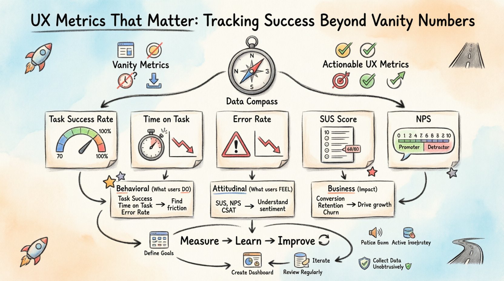
Understanding the Vanity Metric Trap 🎣
Vanity metrics are data points that make you feel good but do not necessarily correlate with success. They are often superficial and easy to manipulate without delivering real value. In the context of user experience, these numbers can create a false sense of security. A team might celebrate a 20% increase in page views, only to discover later that users are bouncing immediately because the content is confusing.
Common examples of vanity metrics include:
- Page Views: High numbers can indicate interest, but they do not measure engagement depth.
- Raw Click Counts: A button might be clicked frequently, but if it leads nowhere useful, the click is noise.
- Session Duration: Long sessions can mean users are engaged, or they might indicate users are struggling to find what they need.
- Downloads: A high number of downloads does not guarantee active usage of the feature.
When teams rely solely on these figures, they risk optimizing for the wrong behaviors. For instance, a design change might increase clicks but decrease task completion rates. This is why it is critical to define success criteria before looking at the data. What is the specific goal of the user journey? Is it to purchase a product? To find support? To learn a new skill? The metric must align with that goal.
Core UX Metrics That Drive Real Insight 🎯
To move beyond surface-level data, we need to look at metrics that measure efficiency, effectiveness, and satisfaction. These indicators provide a clearer picture of how users interact with the interface. Below is a breakdown of the essential metrics that every design team should consider tracking.
1. Task Success Rate ✅
This is perhaps the most direct measure of usability. It calculates the percentage of users who successfully complete a specific task without assistance. If 100 users try to reset their password and only 70 succeed, the success rate is 70%. A low rate immediately flags friction points in the flow.
- Why it matters: It directly impacts conversion and user frustration.
- How to measure: Observe users performing tasks or analyze backend logs for task completion events.
- Target: Varies by complexity, but generally above 80% is a strong benchmark for established products.
2. Time on Task ⏱️
While session duration can be a vanity metric, time on task is a measure of efficiency. It records how long it takes a user to complete a specific action. A shorter time usually indicates a more intuitive design, provided the success rate is high.
- Why it matters: Efficiency reduces cognitive load and increases throughput for users.
- How to measure: Use timing tools during usability testing or track start and end events in the application.
- Target: Consistent reduction over time indicates successful optimization.
3. Error Rate 🛑
Errors are inevitable in digital interactions, but the rate at which they occur is a critical signal. This metric tracks the number of mistakes users make, such as form validation failures, navigation errors, or accidental deletions.
- Why it matters: High error rates suggest confusing terminology, poor layout, or unclear feedback mechanisms.
- How to measure: Monitor error messages triggered by the system and observe user correction attempts.
- Target: Aim for a downward trend as design iterations improve clarity.
4. System Usability Scale (SUS) 📏
SUS is a standardized questionnaire that provides a reliable, reliable measure of perceived usability. It consists of 10 questions rated on a scale of 1 to 5. It is widely recognized in the industry for comparing usability across different products or time periods.
- Why it matters: It captures subjective satisfaction which behavioral data cannot.
- How to measure: Send the survey after key interactions or at the end of a testing session.
- Target: An average score of 68 is considered acceptable; scores above 80 are excellent.
5. Net Promoter Score (NPS) 🌟
NPS measures user loyalty and the likelihood of recommending the product to others. It is a single-question metric asking users to rate their experience on a scale of 0 to 10.
- Why it matters: It correlates strongly with business growth and user retention.
- How to measure: Trigger the question at natural pause points, such as after a purchase or support interaction.
- Target: A positive score (above 0) is good; above 50 is considered excellent.
Comparing Metric Types 📊
Different metrics serve different purposes. Some reveal how the product functions technically, while others reveal how humans perceive the experience. The following table outlines the distinction between behavioral and attitudinal metrics.
| Metric Category | Primary Focus | Examples | Best Used For |
|---|---|---|---|
| Behavioral | What users actually do | Task Success Rate, Time on Task, Error Rate | Identifying friction and optimization opportunities |
| Attitudinal | What users say they feel | SUS, NPS, Customer Satisfaction (CSAT) | Understanding sentiment and brand perception |
| Business | Impact on goals | Conversion Rate, Retention Rate, Churn | Aligning design with revenue and growth targets |
Using a mix of these categories provides a holistic view. Relying only on behavioral data might miss the emotional connection users have with the brand. Relying only on surveys might miss critical usability blockers that users simply do not report.
Collecting Data Without Disrupting Experience 🛡️
How data is gathered is just as important as the data itself. Aggressive tracking can annoy users and lead to inaccurate results. The goal is to be unobtrusive while gathering meaningful signals.
1. Contextual Inquiry
Instead of asking users to fill out a form immediately after an action, gather feedback when they are naturally inclined to share thoughts. This reduces survey fatigue and increases the quality of the responses.
2. Passive vs. Active Tracking
- Passive: Analytics tools that record clicks and navigation automatically. This is best for large-scale patterns.
- Active: Surveys or interviews that require user participation. This is best for deep qualitative insights.
3. Segmentation
Average metrics can hide important details. A 50% success rate might mean everyone succeeds half the time, or that 100% of users succeed 50% of the time. Segmenting data by user type, device, or location reveals these nuances.
- New vs. Returning: New users may struggle more due to learning curves.
- Device Type: Mobile users often face different constraints than desktop users.
- Traffic Source: Users from social media may have different expectations than those from search engines.
Interpreting the Data: Beyond the Numbers 🔍
Collecting data is only the first step. The real value lies in interpretation. Numbers often tell a “what” story, but rarely the “why” story. To bridge this gap, designers must combine quantitative data with qualitative research.
For example, if the task success rate drops for a specific feature, the data tells you there is a problem. It does not tell you if the problem is a confusing label, a broken button, or a lack of understanding of the feature’s purpose. To find out, you must conduct usability testing or user interviews.
1. Correlation vs. Causation
Just because two metrics move together does not mean one caused the other. A drop in time on task might coincide with a drop in success rate, but it could also be due to a server outage slowing down the interface. Always investigate the context before making design changes.
2. Establishing Benchmarks
Without a baseline, it is impossible to know if a metric is good or bad. Compare current performance against historical data or industry standards. If the industry average for checkout completion is 60%, and you are at 50%, you have a clear target for improvement.
3. Prioritizing Changes
Not all metrics require immediate attention. Use a framework to prioritize fixes based on impact and effort. Focus on metrics that affect the highest value users or the most critical business goals first.
Common Pitfalls in UX Measurement 🚫
Even with the best intentions, teams can stumble when measuring user experience. Being aware of common mistakes helps avoid wasting time on ineffective strategies.
- Ignoring Negative Feedback: It is tempting to focus on positive trends. However, analyzing why users failed is often more valuable than celebrating why they succeeded.
- Tracking Too Much: Collecting hundreds of metrics leads to analysis paralysis. Focus on the vital few that align with your current objectives.
- Setting Impossible Targets: Aiming for 100% success rates is rarely realistic. Set ambitious but achievable goals that drive progress without demoralizing the team.
- Forgetting the Human Element: Metrics are a tool, not a master. Do not let data override user empathy. Sometimes the best decision is to listen to a user story rather than a number.
Building a Sustainable Measurement Strategy 🔄
To make UX metrics a permanent part of the workflow, they must be integrated into the design process, not treated as an afterthought. This involves creating a culture where data informs creativity rather than restricting it.
1. Define Goals Early
Before a single pixel is placed, define what success looks like. What does the user need to achieve? What does the business need to gain? These goals determine which metrics will be tracked.
2. Create a Dashboard
Consolidate key metrics into a single view for the team. A shared dashboard ensures everyone is aligned on performance. Keep it simple and update it regularly so it remains relevant.
3. Review Regularly
Schedule time to review metrics with stakeholders. Discuss trends, anomalies, and upcoming experiments. Regular reviews keep the team focused on continuous improvement.
4. Iterate Based on Evidence
Use the data to inform the next design iteration. If a metric indicates friction, propose a change, test it, and measure the impact. This cycle of measure, learn, and improve is the engine of product evolution.
The Future of UX Analytics 🔮
As technology evolves, the way we measure experience will also change. Emerging tools are beginning to capture biometric data, such as eye tracking and facial expressions, to provide deeper insights into emotional responses. While these technologies offer new possibilities, the core principles remain the same: focus on the user, respect their time, and measure what truly matters.
The shift from vanity to value is not just about changing numbers; it is about changing the conversation. When teams discuss task success rates instead of page views, the conversation shifts from “how many people came” to “did we help them?”. This shift in focus is the true driver of successful user experiences.
By grounding your design decisions in robust, actionable metrics, you build products that are not just visually appealing, but functionally indispensable. The path forward is clear: measure the journey, not just the destination. 🛣️