Creating a digital product that people actually want to use begins with a fundamental shift in perspective. It is not about what you can build; it is about what the user needs. This guide outlines the essential phases of building a user-centric interface. We will move from abstract ideas to tangible screens, ensuring every decision is grounded in research and validation.
Good user experience (UX) design is invisible. When it works well, users flow through tasks without friction. When it fails, confusion arises. The goal is to create an interface that feels intuitive, efficient, and accessible to everyone. This process requires discipline, empathy, and a willingness to iterate.
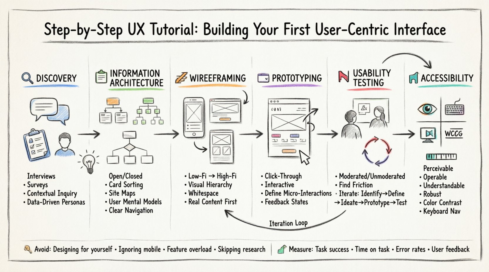
🔍 Phase 1: Discovery and User Research
Before drawing a single line or sketching a layout, you must understand who you are designing for. Skipping this step often leads to assumptions that invalidate the entire project. Research provides the evidence needed to make confident design decisions.
Understanding User Needs
User needs vary significantly based on context, capabilities, and goals. To capture this, you should employ qualitative and quantitative methods. Qualitative data helps you understand the why behind user behavior, while quantitative data reveals the what and how often.
- Interviews: One-on-one conversations that dive deep into motivations and pain points.
- Surveys: Broad data collection to identify patterns across a larger audience.
- Contextual Inquiry: Observing users in their natural environment to see real-world interactions.
Creating Personas
Personas are fictional characters that represent your target user groups. They help keep the team focused on human goals rather than technical constraints. A good persona includes demographics, goals, frustrations, and technical proficiency.
When developing personas, avoid stereotypes. Base them on actual data collected during the research phase. This ensures the interface serves real people, not idealized versions.
🗂️ Phase 2: Information Architecture
Once you understand the user, you must organize the content. Information Architecture (IA) is the structural blueprint of your product. It dictates how content is grouped, labeled, and navigated.
Card Sorting
Card sorting is a technique used to discover how users expect information to be organized. You provide users with content cards and ask them to group them into categories. This reveals mental models that may differ from your initial assumptions.
- Open Card Sorting: Users create their own category names.
- Closed Card Sorting: Users place cards into predefined categories.
Site Maps and Flowcharts
Translate the results of your card sorting into a visual hierarchy. A site map shows the hierarchy of pages, while a flowchart illustrates the paths users take to complete tasks. These documents serve as the foundation for wireframing.
Ensure navigation is consistent. Users should always know where they are and how to get back. Breadcrumbs and clear headers are essential for this orientation.
| Research Method | Best Used For | Data Type |
|---|---|---|
| Interviews | Deep motivations | Qualitative |
| Analytics Review | Behavior patterns | Quantitative |
| Card Sorting | Content organization | Qualitative |
| Surveys | Validation of assumptions | Quantitative |
✏️ Phase 3: Wireframing
Wireframing is the process of creating low-fidelity sketches of your interface. These are structural guides, not final designs. They focus on layout, content placement, and functionality without getting distracted by colors or typography.
Low-Fidelity vs. High-Fidelity
Start with low-fidelity wireframes. These can be hand-drawn sketches or simple digital blocks. The goal is speed and iteration. As the design stabilizes, move to high-fidelity wireframes which include more detail, but still lack the final visual polish.
Key principles to follow during wireframing include:
- Visual Hierarchy: Guide the eye using size, contrast, and placement.
- Whitespace: Use negative space to separate elements and reduce cognitive load.
- Consistency: Maintain uniform spacing and alignment across screens.
Focus on Content
Wireframes should reflect the actual content that will exist in the product. Placeholder text like “lorem ipsum” can hide layout issues. Use real headlines and body copy to ensure the design supports the message.
Consider the hierarchy of information. What is the most important action? It should be prominent. Secondary actions should be less intrusive. This helps users prioritize their tasks.
🖥️ Phase 4: Prototyping
A prototype is an interactive model of the product. It simulates the experience before development begins. Prototypes allow you to test navigation flows and interactions without writing code.
Types of Prototypes
- Click-Through: Basic links between screens to demonstrate flow.
- Interactive: Includes animations, transitions, and dynamic elements.
- Functional: Replicates specific logic or backend processes.
Defining Interactions
Define how elements behave when touched or hovered. Buttons should provide feedback. Forms should indicate validation errors clearly. Loading states should inform users that work is in progress.
Avoid overcomplicating interactions. Animation should serve a purpose, such as guiding attention or indicating state changes. Excessive motion can distract users and slow down performance.
🧪 Phase 5: Usability Testing
Testing is where you validate your design choices. You observe users attempting to complete tasks with your prototype. The goal is to find friction points, not to prove your design is perfect.
Testing Methods
There are several ways to conduct usability testing:
- Moderated Testing: A facilitator guides the user through tasks in real-time.
- Unmoderated Testing: Users complete tasks independently using remote tools.
- Remote vs. In-Person: Remote offers scale; in-person offers observation of non-verbal cues.
Analyzing Feedback
When observing tests, listen to the user’s thought process. If they hesitate, ask them what they are thinking. Do not lead them to the answer.
Look for patterns in errors. If multiple users struggle with the same button, the design is likely unclear. Document these issues and prioritize them for the next iteration.
The Iteration Loop
Design is not a linear path. It is a cycle. After testing, you return to wireframing or prototyping to fix issues. This loop continues until the product meets usability standards.
- Identify: Find the problem.
- Define: Clarify the scope of the issue.
- Ideate: Brainstorm solutions.
- Prototype: Build a new version.
- Test: Validate the solution.
♿ Phase 6: Accessibility and Inclusion
A user-centric interface must be accessible to people with disabilities. This is not just a compliance requirement; it is a design necessity. Inclusive design benefits everyone.
Core Principles
- Perceivable: Information must be presentable in ways users can perceive (e.g., text alternatives for images).
- Operable: Interface components must be operable by all users (e.g., keyboard navigation).
- Understandable: Content must be readable and predictable.
- Robust: Content must be compatible with current and future tools.
Common Accessibility Checks
Ensure color contrast ratios meet standards. Text should be resizable without breaking the layout. Focus states must be visible for keyboard users. Screen reader compatibility is essential for content structure.
Test with assistive technologies. Tools that simulate visual impairments can reveal issues you might miss. Remember that accessibility is a spectrum, not a binary state.
🛠️ Common Pitfalls to Avoid
Even experienced designers encounter hurdles. Being aware of common mistakes can save time and resources.
- Designing for Yourself: Your experience is not the user’s experience.
- Ignoring Mobile Context: Interfaces must work on small screens with touch inputs.
- Overloading Features: Simplicity often trumps complexity. Remove unnecessary elements.
- Skipping Research: Building without data is guessing.
- Ignoring Performance: A beautiful design that loads slowly frustrates users.
📈 Measuring Success
After launch, the work continues. You need to measure how the interface performs in the real world. Key metrics include task success rates, time on task, and error rates.
Analytics tools can track user behavior. Heatmaps show where users click and scroll. This data informs future updates and refinements.
Listen to user feedback continuously. Support tickets and reviews often highlight issues that testing missed. Continuous improvement is the hallmark of a mature product.
🎯 Final Thoughts
Building a user-centric interface is a journey of constant learning. It requires balancing business goals with user needs. By following a structured process, you reduce risk and increase the likelihood of success.
Remember that technology changes, but human behavior remains relatively stable. Focus on the fundamentals: clarity, efficiency, and empathy. When you prioritize the user, the product naturally follows.
Keep your tools ready, your research deep, and your designs clean. The interface is the bridge between the user and their goal. Make that bridge sturdy, clear, and welcoming.