Designing complex systems requires a clear map of how data moves between components. Data Flow Diagrams (DFDs) provide this map, illustrating the flow of information rather than the control flow. However, when processes do not happen instantly, the diagram becomes more intricate. Asynchronous operations introduce time delays, background tasks, and event triggers that standard linear models often struggle to represent. Understanding how to visualize these non-blocking interactions is essential for accurate system architecture.
When a task is asynchronous, the initiating process continues without waiting for a response. This decoupling allows for better resource utilization and responsiveness, but it complicates the visual representation. A flat diagram might suggest immediate completion where none exists. To maintain clarity, modelers must adopt specific conventions that highlight timing gaps without cluttering the diagram with implementation details.
Understanding the Timing Gap 🕒
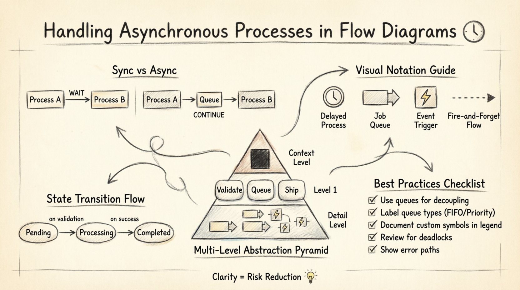
The core distinction in these diagrams lies in the timing of execution. Synchronous processes wait for a signal to proceed. If Process A sends data to Process B, Process A halts until Process B finishes and returns a result. In contrast, asynchronous processes send data and move on. The receiving component handles the work independently, often storing the data in a buffer until it is ready.
Visualizing this gap is the first step. Without explicit markers, a viewer assumes immediate handoff. This assumption leads to errors during implementation. Developers might build blocking logic where non-blocking logic is required, or vice versa. To prevent this, the diagram must explicitly show where the flow pauses or diverts. This involves identifying points of decoupling where the system state changes from “requesting” to “processing”.
Consider a user submitting a form. If the system processes this immediately, the user sees a result on the same screen. If the system processes this asynchronously, the user might receive a confirmation message and see the final result later. The DFD needs to reflect this separation. The input goes into a storage mechanism, and the output comes from a different trigger. This separation ensures that the diagram reflects reality, not just logical intent.
Visualizing Non-Blocking Flows 🔄
Standard DFD symbols focus on processes, data stores, and external entities. They do not inherently specify time. To convey asynchrony, additional notation is often required. While strict adherence to traditional rules suggests keeping symbols simple, practical modeling often demands extensions to capture temporal nuances.
- Queues as Data Stores: Use data stores to represent message queues. Instead of a direct arrow from Process A to Process B, route the data through a storage element. This implies the data is held until a consumer picks it up.
- Event Arrows: Use distinct arrow styles for events that trigger background tasks. A dashed line or a specific icon can denote an event that fires independently of the current thread.
- Time Delays: Add labels to processes indicating estimated processing times or intervals. This helps stakeholders understand latency expectations.
It is important not to confuse control flow with data flow. In a control flow diagram, a signal might wait. In a data flow diagram, the focus is on the movement of information. The asynchronous nature is inferred by the presence of intermediate storage or the separation of input and output processes. A clear label on the data store, such as “Job Queue” or “Pending Events,” immediately signals that the process is not immediate.
Standard Notations vs. Custom Extensions 🛠️
There is a balance between standardization and clarity. Strictly following a specific methodology might limit the ability to express complex timing behaviors. However, deviating too far creates confusion for anyone reading the diagram who expects standard symbols. The goal is to communicate the architecture effectively to engineers and stakeholders.
Some teams adopt custom shapes for asynchronous triggers. A hexagon might represent an external event, while a cylinder represents a persistent queue. These shapes add visual weight to specific elements, making the diagram easier to scan. The key is documentation. A legend must explain every custom shape used. Without a legend, the diagram becomes a puzzle rather than a guide.
| Element |
Standard Symbol |
Asynchronous Representation |
Purpose |
| Process |
Circle or Rounded Rectangle |
Circle with a clock icon |
Indicates delayed execution |
| Data Store |
Open Rectangle |
Open Rectangle labeled “Queue” |
Implies buffering and decoupling |
| External Entity |
Square |
Square with a lightning bolt |
Denotes an event trigger |
| Data Flow |
Solid Arrow |
Dashed Arrow |
Suggests fire-and-forget communication |
Using a table like this in documentation helps align the team. It ensures that when a developer sees a dashed arrow, they understand it does not imply a synchronous return value. Consistency across all diagrams in a project is vital. If one team uses dashed lines for async, they must do so everywhere.
Managing Data Consistency 📊
When processes run in parallel or with delays, data consistency becomes a primary concern. The diagram should show where data is written and where it is read. In asynchronous systems, a read might happen before a write is fully committed. This is known as a race condition.
To model this, clearly define the state of the data at each stage. If a process updates a record and then moves to the next step, the diagram should show the intermediate state. Does the next process see the update immediately? Or does it wait for a confirmation event? DFDs typically show the flow of data, but adding notes about state locks or versioning helps clarify the constraints.
Consider a scenario where a notification is sent after a transaction completes. The transaction process writes to the database. The notification process reads from a separate log or queue. The diagram must show the connection between these two. If the notification relies on the transaction data, there must be a data store connecting them. If the notification relies on an event, there must be a signal path. Missing this link suggests data loss or incorrect logic.
Multi-Level Abstraction 📄
Complexity grows quickly when dealing with asynchronous logic. A high-level context diagram might show a single process for “Order Processing.” However, drilling down to Level 1 reveals that this process splits into “Validate,” “Queue,” and “Ship.” The asynchronous nature might only exist in the “Queue” step.
Using different levels of abstraction helps manage this complexity. The top level shows the system as a black box. The middle level shows the major components. The detailed level shows the specific queues and triggers. This hierarchy prevents the main diagram from becoming unreadable. Stakeholders looking at the high level do not need to see every background task. Developers looking at the detailed level need to see the queues.
When linking levels, ensure that the asynchronous points are preserved. If a process is asynchronous at Level 1, it should not be simplified to a synchronous step at Level 2 without explanation. The detail should reveal the timing mechanism. This could mean adding a sub-process that explicitly handles the waiting period.
Documenting State Changes 📝
Asynchronous flows often rely on state machines. A task might move from “Pending” to “Processing” to “Completed.” These states are crucial for debugging. If a task gets stuck, knowing the current state helps identify the bottleneck. The diagram should reflect these states, either within the process bubbles or in accompanying text.
One effective method is to annotate the data flows with state transitions. A label on the arrow can indicate “Status: Pending.” This makes the flow of information about the state as visible as the flow of the data itself. It clarifies that the system tracks progress even when the main process is idle.
Documentation should also cover error handling. What happens if the asynchronous process fails? Is the data returned to the queue? Is it moved to a dead-letter store? Including these paths in the diagram ensures that the failure modes are understood. It prevents the assumption that a process always succeeds.
Avoiding Ambiguity in Queues 📥
Queues are the most common representation of asynchrony, but they are also the most ambiguous. A queue can be a simple list, a priority stack, or a distributed cluster. The diagram should specify the nature of the queue if it affects the logic. For example, a FIFO queue ensures order, while a priority queue does not.
If order matters, label the data store with “FIFO Queue.” If the system allows out-of-order processing, label it “Priority Queue.” This distinction impacts how downstream processes handle the data. It also affects how the system is designed. A FIFO queue might require more locking mechanisms than a priority queue.
Furthermore, consider the capacity of the queue. Does it have a limit? What happens when it is full? These are architectural decisions that belong in the diagram or its notes. A bounded queue prevents system crashes but introduces backpressure. An unbounded queue prevents backpressure but risks memory exhaustion. The diagram should hint at these constraints.
Reviewing for Logical Integrity 🔍
Once the diagram is complete, a rigorous review is necessary. The goal is to verify that the flow makes sense logically. Does every input have an output? Are there orphaned processes that do not receive data? Are there cycles that could cause infinite loops?
In asynchronous systems, check for circular dependencies. Process A waits for Process B, and Process B waits for Process A. This is a deadlock. The diagram should not show this. If the system is designed to handle it, the diagram must show the timeout or retry mechanism. A simple line from A to B and back to A is insufficient.
Another check is for data integrity. Does the asynchronous process modify data that another process is reading? If so, there should be a mechanism to prevent corruption. The diagram should show a versioned data store or a locking mechanism. This ensures that the visual model matches the technical requirements.
Iterative Refinement 🔄
Modeling is rarely a one-time task. As the system evolves, the diagram must evolve. New features might introduce new asynchronous paths. Old queues might be removed. Regular updates keep the documentation accurate. This is especially important for asynchronous flows, which are prone to drift between design and implementation.
When making changes, update the legend and the notes. If a new symbol is added, ensure the whole team knows what it means. Consistency is the foundation of a useful diagram. If the diagram is confusing, it fails its primary purpose: communication. A diagram that requires a long explanation defeats the purpose of visual modeling.
Regular reviews with the development team help identify gaps. Developers often find edge cases that the initial design missed. They might point out a scenario where the queue blocks. They might suggest a different pattern for handling timeouts. Incorporating this feedback improves the model and the final system.
Final Thoughts on Clarity 🌟
Handling asynchronous processes in flow diagrams is about managing expectations. It is about making the invisible visible. By using queues, events, and clear labels, you create a map that guides the team through complex timing scenarios. The goal is not to capture every millisecond of execution, but to capture the logical structure of the delay.
When done correctly, the diagram becomes a tool for risk reduction. It highlights where data might get stuck. It shows where performance bottlenecks could occur. It ensures that everyone understands the timing requirements. This shared understanding is the key to building robust, responsive systems.