Academic research relies heavily on clarity, precision, and the ability to communicate complex systems effectively. One of the most powerful tools available to researchers for visualizing the movement of information is the Data Flow Diagram (DFD). While often associated with software engineering and systems analysis, the utility of DFDs extends far beyond technical development. In the realm of scholarly inquiry, these diagrams serve as a blueprint for understanding how data is collected, processed, stored, and disseminated within a study. Whether you are conducting a quantitative analysis, a qualitative case study, or a mixed-methods investigation, a well-constructed DFD can illuminate the architecture of your research design.
The application of DFDs in academic writing bridges the gap between abstract methodology and concrete execution. By mapping out the flow of data, researchers can identify bottlenecks, ensure data integrity, and provide reviewers with a clear roadmap of their analytical processes. This guide explores the theoretical foundations, structural components, and practical applications of Data Flow Diagrams specifically within the context of academic research.
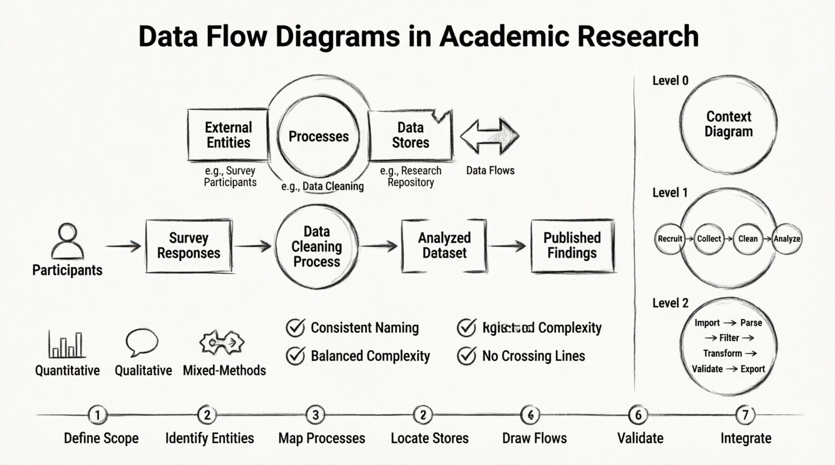
Understanding the Fundamentals of Data Flow Diagrams 🧠
A Data Flow Diagram is a graphical representation of the flow of data through an information system. Unlike flowcharts, which focus on the logic and sequence of operations, DFDs focus on the data itself. They illustrate where data originates, how it is transformed, where it is stored, and where it exits the system. In an academic context, the “system” is often the research project itself.
The primary purpose of a DFD is to provide a high-level view of the system without getting bogged down in implementation details. This abstraction is particularly valuable in research papers, where the focus should be on the methodology and data handling rather than the specific software or algorithms used. By stripping away the technical specifics, a DFD allows the reader to grasp the logic of the data movement quickly.
Core Components of a Research DFD 🔗
To construct a meaningful diagram, one must understand the four fundamental symbols used in standard DFD notation. These components remain consistent regardless of the domain, whether it is engineering or social science research.
External Entities: These represent sources or destinations of data outside the system boundary. In research, this could be participants in a survey, a government database, or a sensor array. They are typically depicted as rectangles.
Processes: These are actions that transform input data into output data. In a research context, a process might be data cleaning, statistical analysis, coding qualitative responses, or filtering experimental results. They are usually shown as circles or rounded rectangles.
Data Stores: These represent places where data is held for later use. In a thesis, this could be a physical archive, a digital repository, or a database file. They are often drawn as open-ended rectangles.
Data Flows: These indicate the movement of data between entities, processes, and stores. Arrows are used to show direction. Every flow must have a name that describes the information being transferred, such as “Survey Responses” or “Processed Dataset”.
When designing these components for a research paper, it is crucial to maintain consistency. If a specific variable is labeled as “Participant ID” in the data store, it must be labeled identically in the data flows connecting to it. This precision ensures that the methodology section of your paper remains logically sound.
Levels of Abstraction in Research Diagrams 📉
Complex research projects often require multiple levels of detail to be fully understood. DFDs accommodate this through a hierarchy of diagrams, ranging from the high-level overview to detailed breakdowns. Understanding these levels helps researchers decide how much detail to include in their final publication.
Level
Description
Academic Use Case
Level 0 (Context Diagram)
The highest level view. Shows the entire system as one process and its interaction with external entities.
Providing a summary of the research scope in the introduction.
Level 1
Breaks the main process into major sub-processes. Shows major data paths.
Detailing the main phases of the methodology section.
Level 2
Further decomposes Level 1 processes into specific steps.
Appendix material for complex data transformation logic.
In many academic journals, a Level 0 or Level 1 diagram is sufficient. The goal is clarity, not exhaustive technical documentation. Overly detailed diagrams can clutter the manuscript and distract from the core findings. However, for technical theses or dissertations where the system architecture is the subject of study, Level 2 diagrams may be necessary to demonstrate rigorous planning.
Applying DFDs to Research Methodologies 🔬
The versatility of DFDs allows them to be adapted to various research paradigms. How a diagram is constructed depends on whether the study is quantitative, qualitative, or mixed-methods.
Quantitative Research
In quantitative studies, the focus is often on data aggregation and statistical manipulation. A DFD here helps visualize the pipeline from raw data collection to final statistical output. For example, in a study analyzing economic trends, the diagram might show data flowing from government databases into a central storage, being cleaned by a specific process, and then flowing into a statistical analysis engine.
This visualization is particularly useful for demonstrating data cleaning procedures. Peer reviewers often question how raw data was handled. A DFD explicitly shows the steps taken to remove outliers or handle missing values, adding a layer of transparency to the quantitative analysis.
Qualitative Research
Qualitative research deals with non-numerical data, such as interview transcripts or field notes. While less structured than quantitative data, the flow still exists. A DFD can map the journey of a transcript from recording to coding.
The processes in this context might include “Transcription,” “De-identification,” “Thematic Coding,” and “Category Synthesis.” Data stores would represent folders containing raw audio, cleaned text, and coded themes. This helps researchers justify their coding framework and ensures that the path from raw observation to final theory is traceable.
Mixed-Methods Research
Mixed-methods studies combine both quantitative and qualitative approaches. These projects often involve complex data integration points. A DFD is invaluable here for showing where and how the two datasets meet. For instance, it can illustrate how survey results (quantitative) inform the selection of interview participants (qualitative), and how the findings from both streams converge to form a final conclusion.
Best Practices for Visualizing Research Data 🎨
Creating a professional-grade diagram requires adherence to specific design principles. These practices ensure that the visual aid supports the text rather than confusing the reader.
Consistency in Naming: Every data flow, process, and entity must be named clearly. Avoid abbreviations unless they are standard in your field. Use nouns for data stores and verbs for processes.
Balanced Complexity: A single diagram should not contain too many elements. If a Level 1 diagram becomes cluttered with more than 7 to 9 processes, consider breaking it down into multiple sub-diagrams.
No Crossings: Try to arrange the diagram so that data flow lines do not cross unnecessarily. This improves readability significantly. If crossings are unavoidable, use overpassing symbols.
Logical Flow: Ensure the diagram generally reads from left to right or top to bottom. This aligns with standard reading patterns and reduces cognitive load.
Reference to Text: Every diagram must be referenced in the text. Do not include a DFD without explaining what it represents. The caption should be descriptive, such as “Figure 1: Data Flow Diagram of the Experimental Protocol”.
Common Pitfalls to Avoid ⚠️
Even experienced researchers can make mistakes when visualizing their methodology. Being aware of these common errors can save time during the revision process.
Black Holes: This occurs when a process has inputs but no outputs. In a research context, this implies data is being collected and then disappearing without being analyzed or stored. Every process must produce some result.
Fireflies: This is the opposite of a black hole. It happens when a process has outputs but no inputs. This suggests data is being generated out of thin air, which is logically impossible in a data-driven study.
Inconsistent Granularity: Mixing high-level concepts with low-level details in the same diagram can be confusing. If one process is “Data Collection,” do not make another process “Enter Date into Field A.” Keep the level of detail uniform.
Missing Data Stores: Sometimes researchers forget to show where data is saved between processes. In longitudinal studies, data storage is critical. Ensure there is a clear path from collection to storage to analysis.
Integrating DFDs into the Manuscript 📝
Where should the diagram appear in your paper? The placement depends on the journal guidelines and the nature of the research. Typically, the methodology section is the most appropriate location.
If the diagram is central to understanding the study, it may appear early in the methodology section, followed by a detailed textual explanation. If the diagram supports a specific subsection, such as data preprocessing, it should be embedded within that subsection.
When describing the diagram in the text, do not simply repeat what is visible. Instead, explain the why. Why was this specific process chosen? Why does the data flow in this direction? This adds analytical depth to the visual representation. For example, “Data is routed to the validation store before analysis to ensure integrity, as shown in Figure 1. This step prevents corrupted records from influencing the statistical model.”
Ensuring Data Privacy and Ethics in Diagrams 🔒
Academic research is bound by ethical guidelines, particularly regarding participant data. When creating a DFD for a study involving human subjects, care must be taken not to expose sensitive information.
Do not label data stores with specific identifiers like “Patient_Name_DB.” Instead, use generic terms like “Anonymized Records.” If the diagram is intended for public dissemination, ensure that it does not inadvertently reveal the structure of proprietary databases or the specific pathways of sensitive information.
Furthermore, the diagram itself can serve as an ethical checklist. If a data flow shows participant information moving to a public repository without a de-identification process, the researcher can identify this ethical gap before submission. The visual nature of the DFD makes it easier to spot potential compliance issues with data protection regulations.
Tools for Creation (Generic Approaches) 🛠️
Creating these diagrams requires a graphical editor. There are many options available that do not require proprietary software licenses. Researchers often use vector-based drawing tools to ensure the images remain crisp when printed in journals.
Focus on tools that support standard shapes and allow for easy export in high-resolution formats like PNG or SVG. The specific software used is less important than the accuracy of the diagram. However, ensure that the tool allows for version control, as research methodologies often evolve during the study. Keeping a history of changes helps in documenting the evolution of the research design.
The Role of DFDs in Peer Review and Replication 🔍
One of the biggest challenges in modern science is reproducibility. A peer reviewer cannot replicate a study if the data processing steps are vague. A DFD provides a standardized way to document these steps.
When a reviewer examines your manuscript, they can trace the data path on the diagram. If the text claims that data was normalized, but the diagram shows raw data flowing directly to the analysis process, the reviewer can spot the discrepancy immediately. This transparency builds trust between the researcher and the scientific community.
In fields like data science and computer science, this is standard practice. In social sciences and humanities, the adoption is growing but remains underutilized. Incorporating a DFD can give your research a distinct advantage by signaling a high level of methodological rigor.
Future Trends in Research Visualization 🚀
As research becomes more interdisciplinary, the need for clear visualization grows. Interactive diagrams are becoming more common in digital journals. While static images are still the norm, the potential for dynamic DFDs that link to data dictionaries or code repositories is emerging.
Even in static publications, the principles of clear data visualization apply. Researchers should stay updated on the latest conventions for diagramming. Some journals now have specific style guides for figures and diagrams. Adhering to these guidelines ensures that your work is accepted and presented professionally.
Summary of Implementation Steps ✅
To successfully integrate a Data Flow Diagram into your academic work, follow this logical sequence:
Define the Scope: Determine the boundaries of your research system. What is included and what is external?
Identify Entities: List all sources and destinations of data.
Map Processes: Outline the transformation steps data undergoes.
Locate Stores: Decide where data rests between steps.
Draw Flows: Connect the elements with labeled arrows.
Validate: Check for black holes, fireflies, and consistency.
Integrate: Place the diagram in the manuscript with appropriate captions and references.
By following this structured approach, you ensure that your methodology is not only sound but also communicable. The effort invested in creating a precise diagram pays dividends in the clarity of your final report. It transforms a complex narrative into a digestible visual format that enhances understanding for all readers.
Final Thoughts on Methodological Clarity 🌟
Research is fundamentally about the discovery and communication of knowledge. The way we present our methods influences how our findings are received. Data Flow Diagrams offer a robust framework for presenting the mechanics of your study. They move beyond text descriptions to offer a spatial understanding of data movement.
Adopting this practice does not require advanced technical skills, but it does require a disciplined approach to thinking about your data. It forces the researcher to consider every input and output, ensuring nothing is overlooked. In an era where data integrity is paramount, the DFD stands as a testament to rigorous research design.
Whether you are writing a dissertation, a journal article, or a grant proposal, consider the value of a visual methodology map. It adds a layer of professionalism and clarity that text alone cannot achieve. By making your data flows explicit, you invite scrutiny, foster trust, and contribute to the collective reliability of your field.