In the modern digital landscape, intuition alone is insufficient for creating successful user experiences. The shift toward evidence-based design has transformed how teams approach user interface development. By integrating analytics into the workflow, designers can move beyond assumptions and ground their decisions in actual user behavior. This approach reduces risk and increases the likelihood of achieving business goals while satisfying user needs.
Design is no longer a solitary act of creativity; it is a collaborative process informed by signals from the market. When teams rely solely on personal preference or stakeholder opinion, they risk building features that do not solve real problems. Data acts as the compass, pointing toward areas where users struggle, where they engage deeply, and where they drop off. This guide explores how to utilize metrics effectively to refine the design process without losing the human element.
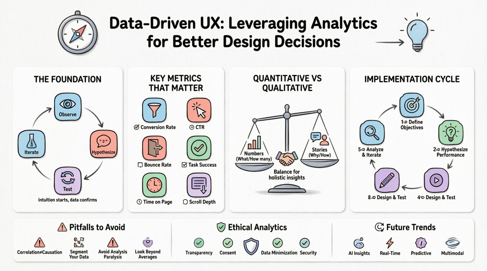
🧠 The Foundation of Evidence-Based Design
The core philosophy behind data-driven design is simple: observe, hypothesize, test, and iterate. It is not about replacing creativity with numbers, but rather using numbers to validate creative choices. When a designer proposes a layout change, they should be able to articulate why that change will work based on past behavior or industry standards.
- Intuition is the starting point, not the finish line. Gut feelings help generate ideas, but data confirms them.
- Context matters. A number without context is often misleading. High traffic does not always mean high engagement.
- Continuous improvement. Design is never truly finished. Data provides the feedback loop necessary for ongoing refinement.
Understanding the difference between what users do and why they do it is critical. Analytics reveal the “what” through quantitative measures, while qualitative research explains the “why”. A successful strategy balances both perspectives to create a holistic view of the user journey.
📈 Key Metrics That Matter
Not every number is worth tracking. Vanity metrics, such as total page views, can look impressive but offer little actionable insight. To make better design decisions, teams must focus on metrics that directly correlate with user satisfaction and business objectives. The following table outlines the most impactful indicators for UX analysis.
| Metric | What It Measures | Why It Matters |
|---|---|---|
| Conversion Rate | Percentage of users completing a goal | Directly reflects the effectiveness of the design funnel. |
| Bounce Rate | Sessions with only one page view | Indicates if the entry page meets immediate user expectations. |
| Time on Page | Duration a user stays on a specific page | Suggests content relevance or potential engagement issues. |
| Click-Through Rate (CTR) | Ratio of clicks to impressions | Measures the appeal and clarity of calls to action. |
| Task Success Rate | Completion of specific user tasks | Highlights usability friction points in workflows. |
| Scroll Depth | How far down a page users scroll | Shows if critical content is being seen or ignored. |
⚖️ Quantitative vs. Qualitative Data
To truly understand user behavior, one must look at the two sides of the coin. Quantitative data provides the scale, while qualitative data provides the meaning. Relying exclusively on one often leads to incomplete strategies.
Quantitative Data: The Numbers
This category includes hard statistics gathered from tracking systems. It answers questions like “how many” and “how often”.
- Session Duration: Indicates how long a visitor stays on the site.
- Exit Pages: Shows where users leave the experience.
- A/B Test Results: Compares performance between two design variations.
- Device Usage: Reveals whether users prefer mobile or desktop interfaces.
While these figures are precise, they lack emotional context. A user might spend a lot of time on a page because they are reading, but they might also be stuck because they cannot find the button to proceed. Quantitative data flags the problem; it does not always explain it.
Qualitative Data: The Story
This category captures the human element behind the clicks. It answers questions like “why” and “how”.
- User Interviews: Direct conversations about needs and frustrations.
- Usability Testing: Observing real users navigating the interface.
- Heatmaps: Visual representations of clicks and attention spans.
- Feedback Forms: Voluntary input from the user base.
Qualitative insights humanize the data. They explain why a high bounce rate exists—perhaps the page loads slowly, or the headline is confusing. Combining these data sources creates a narrative that guides design improvements with clarity.
🔄 Implementing Analytics into the Design Process
Integrating data collection into the design lifecycle requires a shift in workflow. It is not enough to analyze data after a launch; insights should inform every stage of creation. The following steps outline a robust process for embedding analytics into daily operations.
1. Define Objectives Before Designing
Before sketching a single wireframe, establish what success looks like. Is the goal to increase sign-ups? Reduce support tickets? Improve content consumption? Without a clear target, data analysis becomes aimless.
- Set specific Key Performance Indicators (KPIs).
- Align metrics with business goals.
- Ensure stakeholders agree on what constitutes a win.
2. Baseline Current Performance
Understand the current state of the product. If the conversion rate is 2%, a 4% increase is significant. If it is 20%, the same increase is negligible. Establishing a baseline allows for meaningful comparison over time.
3. Hypothesize Based on Data
Use existing data to form a hypothesis. If the data shows users drop off at the checkout form, hypothesize that the form is too long. This turns data into an actionable design brief.
4. Design and Test Solutions
Create variations that address the identified issues. Run tests to see if the changes improve the metrics. Ensure that testing is conducted in a controlled environment to isolate variables.
5. Analyze Results and Iterate
Review the outcomes of the tests. Did the metric move in the desired direction? If yes, roll out the change. If no, return to the hypothesis stage. This cycle ensures continuous evolution of the product.
🚫 Common Pitfalls to Avoid
Even with the best intentions, teams can misinterpret data or apply it incorrectly. Recognizing these common traps helps maintain the integrity of the design process.
1. Correlation Does Not Equal Causation
Just because two metrics move together does not mean one causes the other. For example, traffic might increase while conversion decreases. This could be due to a change in audience demographics, not a design flaw. Always investigate the underlying factors before making sweeping changes.
2. Ignoring Segmentation
Aggregated data often hides important details. A high bounce rate overall might be driven by a specific device type or a specific traffic source. Segmenting data by user type, location, or device reveals nuanced behaviors that require tailored design solutions.
3. Analysis Paralysis
Collecting too much data can stall progress. Teams may spend weeks analyzing every possible variable without ever implementing a change. Focus on the metrics that directly impact the primary goal. Less data, when relevant, is often better than more data that is irrelevant.
4. Over-Reliance on Averages
Average metrics can mask extreme behaviors. If the average time on page is 3 minutes, it might mean 90% of users leave in 10 seconds while 10% stay for 30 minutes. Look at median values and distribution to get a truer picture of user behavior.
🛡️ Ethical Considerations and Privacy
As data collection becomes more sophisticated, ethical considerations must remain at the forefront. Users are increasingly aware of how their information is tracked. Trust is a critical component of the user experience; violating that trust can damage the brand permanently.
- Transparency: Clearly state what data is being collected and why. Privacy policies should be accessible and easy to understand.
- Consent: Ensure users have the option to opt out of tracking where applicable.
- Data Minimization: Collect only the data necessary for the specific design goal. Avoid hoarding information that serves no purpose.
- Security: Protect user data with robust security measures to prevent breaches.
Respecting user privacy does not prevent effective analytics. It simply requires careful planning and adherence to regulations. A design that respects privacy often builds stronger loyalty than one that feels invasive.
🔮 Future Trends in UX Analytics
The landscape of user measurement is evolving. New technologies are offering deeper insights into how people interact with digital products. Staying aware of these trends ensures the design process remains competitive.
- AI-Driven Insights: Artificial intelligence is beginning to automate the interpretation of data, identifying patterns humans might miss.
- Real-Time Analytics: The ability to react to user behavior as it happens allows for dynamic content adjustments.
- Predictive Modeling: Using historical data to forecast future user actions helps in proactive design adjustments.
- Multimodal Interaction: As voice and gesture become more common, analytics must adapt to measure these new input methods.
📝 Final Thoughts on Measuring Success
The ultimate goal of leveraging analytics is not just to report numbers, but to facilitate better human experiences. When data is used correctly, it empowers designers to create interfaces that are intuitive, efficient, and enjoyable. It bridges the gap between business objectives and user satisfaction.
Success in data-driven design is not a one-time achievement. It is a commitment to learning. Every click, scroll, and hover provides an opportunity to understand the user better. By maintaining a balance between empirical evidence and human empathy, teams can build products that stand the test of time. The journey of optimization is endless, and the data is the map that guides the way forward.
Start small. Pick one metric. Observe the behavior. Make one change. Measure the result. Repeat. This steady approach builds confidence and delivers tangible results over time.