


如果你曾尝试创建专业的信息图,很可能熟悉在空白画布和固定模板之间选择的困扰。传统的设计流程常常迫使创作者在完全的创作自由(这需要大量时间和技能)与严格限制表达的约束之间做出选择。Visual Paradigm的AI信息图生成器通过将重点从手动的“像素调整”转移到高层次的想法生成,彻底改变了这一局面。
本全面指南探讨了如何使用此工具,通过其解决传统设计痛点的具体方式来展开。
传统瓶颈:为何旧方法会失败
在深入AI工作流程之前,了解传统信息图创作中的常见“陷阱”很有帮助。这些障碍常常使专业人士难以有效地可视化数据。
“空白页面”综合征
在专业矢量工具(如Adobe Illustrator甚至PowerPoint)中从零开始,需要你手动规划设计的每一个方面。你需要负责布局、配色方案、排版和层级结构。这一过程极其耗时并且需要高水平的设计技能才能实现精致的效果。

静态模板的僵化性
虽然像Canva这样的工具提供美观的模板,但它们通常被锁定在预设数量的元素中这在数据与设计之间造成了显著的逻辑脱节。
布局“崩溃”
也许传统设计中最令人沮丧的问题是可扩展性问题。如果你有一个五步流程,但所选模板只包含四个框,就会遇到重大障碍。手动添加第五个元素通常破坏布局当你试图“塞入”信息时,会导致间距不均、部分重叠或比例失真。这通常需要完全重新设计,或在内容上做出妥协。
奠定基础:选择你的AI模板
Visual Paradigm中的AI旅程始于一个模板库与传统的静态模板不同,这些模板提供的是灵活的基础,而非僵化的框架。
专业提示:将模板与你的数据逻辑相匹配。如果你展示的是一个流程,比如“太阳能过程的步骤”,请选择一个时间线或进展式布局这确保了视觉结构从一开始就与你的信息本质相匹配,从而提供连贯的叙事流程。
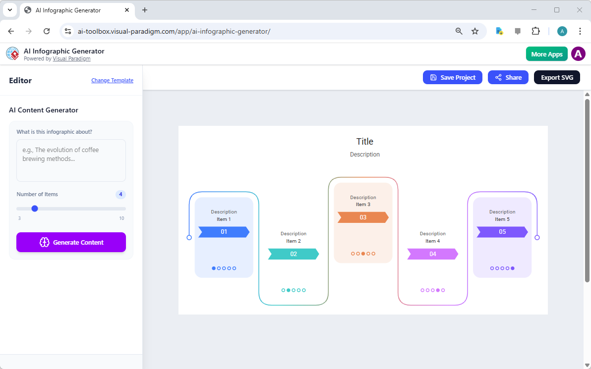
提示与“魔法”滑块
进入编辑器后,你使用输入面板来引导AI。这正是该工具与普通图形编辑器的区别所在。
- 提示: 输入一个明确的主题(例如:“太阳能过程的步骤”)。AI将使用此输入来研究并组织内容为您服务,实际上充当了文案撰写者和研究者。
- 动态项目处理: 这是之前提到的“僵化”问题的具体技术解决方案。无需手动调整框体大小或组合元素,您只需使用“项目数量”滑块。如果您的流程需要六个阶段,只需将滑块设置为六。AI自动调整布局以完美适配,确保没有元素重叠或不自然的空隙。
让AI完成“繁重工作”
当您点击“生成内容”,该工具消除了手动研究和数据整理的需要。几秒钟内,它就能生成一个完整渲染的视觉故事。这一功能将工作流程从数小时的手动劳动转变为短短几秒的处理时间。
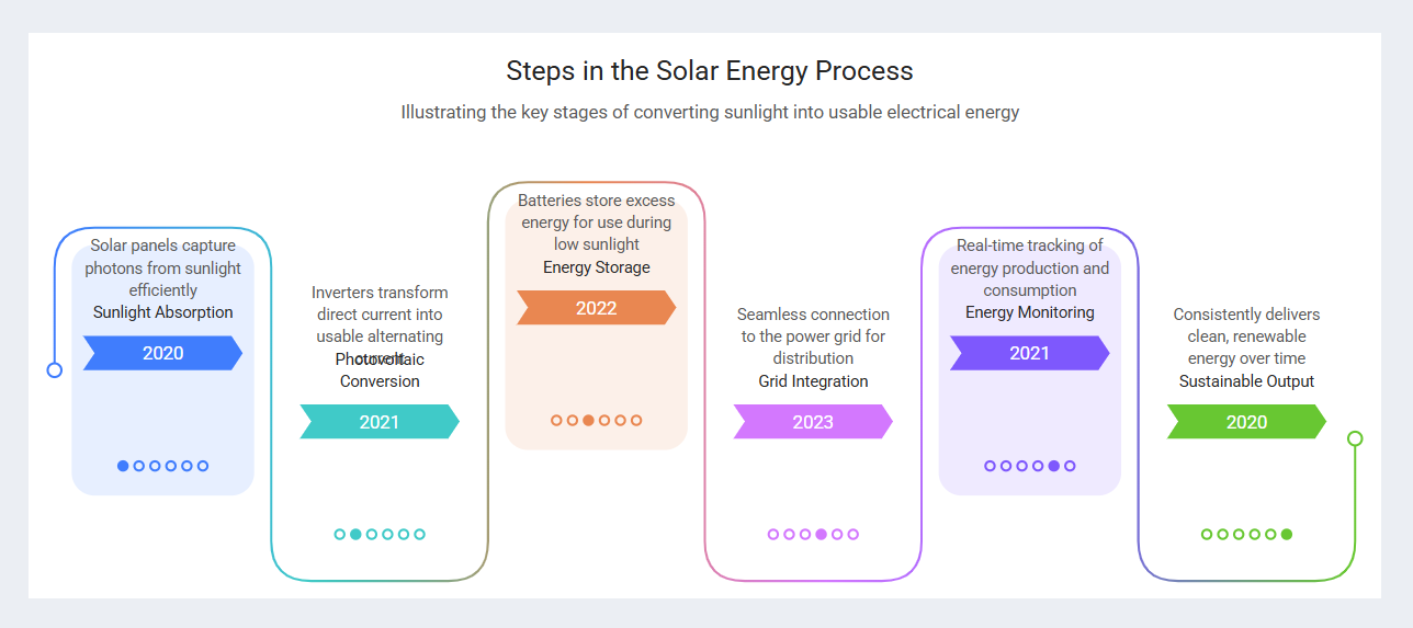
案例研究示例:太阳能时间线
为了展示此引擎的强大功能,设想一个用户需要解释可再生能源技术的情境。
| 操作 | 输入详情 | 结果 |
|---|---|---|
| 输入 | 提示:“太阳能过程的步骤” + 滑块设置为6个项目。 | 系统同时解析提示和布局约束。 |
| 结果 | 一个完全渲染的视觉内容。 | AI生成了一个六阶段时间线,包含鲜明的颜色、标题、技术说明,甚至相关年份。 |
这种自动化生成取代了绘制图形、对齐文本框和搜集内容等繁琐任务。
最终润色与可扩展导出
尽管AI负责结构和内容生成,用户仍可进行微调,以确保内容清晰易读并符合品牌定位。
优化
用户可以调整文本标签大小、移动元素或更改颜色如果AI生成的文本略有重叠,或需要特定的品牌颜色。这里的关键是,布局构建的大部分工作已经完成。
SVG导出
满意后,您可以将作品导出为高质量的SVG文件。由于SVG(可缩放矢量图形)是数学定义的,因此可以无限缩放且可编辑。这使其非常适合从响应式网页发布到高分辨率打印,而不会出现像素化问题。
总结:工作流程升级
Visual Paradigm AI方法最大的优势在于其内容演变的灵活性。在传统方法中,添加一个新的数据点可能需要完全重新设计画布。使用此AI工具,您只需调整滑块并重新生成即可。这确保无论您的故事需要多少步骤,信息图始终保持专业、平衡且准确。
-
Visual Paradigm推出的AI驱动视觉建模与设计解决方案:用于视觉建模、绘图和软件设计的AI驱动工具,可加速开发工作流程。
-
Visual Paradigm——一体化视觉开发平台:一个统一的平台,用于视觉建模、软件与业务流程设计,以及AI驱动的开发工具。
-
AI聊天机器人功能——为Visual Paradigm用户提供智能协助:AI驱动的聊天机器人,可提供即时指导、自动化任务,并提升Visual Paradigm中的工作效率。
-
Visual Paradigm聊天——AI驱动的互动设计助手:一个交互式AI界面,可实时生成图表、编写代码并解决设计难题。
-
AI文本分析——自动将文本转换为视觉模型:AI分析文本文档,自动生成UML、BPMN和ERD图表,以加快建模和文档编制速度。
-
Visual Paradigm AI聊天机器人提升多语言支持……:AI聊天机器人支持多种语言,可实现西班牙语、法语、中文等多种语言的无缝图表生成。