Understanding how information traverses a system is fundamental to building reliable software architectures. When we map out a system using a Data Flow Diagram (DFD), we are not merely drawing boxes and lines; we are charting the lifecycle of data itself. Analyzing data movement paths requires a rigorous examination of where data originates, how it transforms, where it rests, and how it exits the environment. This process ensures integrity, performance, and security across the entire architecture.
Without a clear map, data can become lost, duplicated, or exposed to unauthorized access. A thorough analysis reveals bottlenecks, hidden dependencies, and potential failure points before they impact production. This guide explores the methodology for dissecting these paths with precision and clarity.
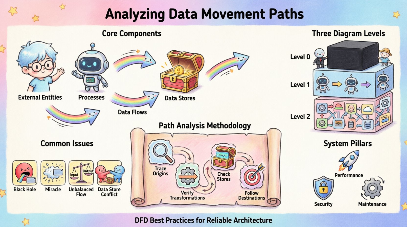
Core Components of Data Movement 🧩
To analyze movement effectively, one must first recognize the distinct elements that facilitate it. Every DFD relies on a consistent vocabulary to describe the flow. Ignoring these definitions leads to ambiguity in the model.
- External Entities: These represent sources or destinations outside the system boundary. They initiate data requests or receive processed output. Examples include human users, other systems, or third-party services.
- Processes: These are the transformations. A process takes input data, applies logic or rules, and produces output. It is the engine of change within the system.
- Data Stores: These are repositories where information is held for later retrieval. They provide persistence, allowing data to survive beyond the immediate execution of a process.
- Data Flows: These are the arrows connecting the components. They represent the actual movement of data packets or records between entities, processes, and stores.
Each arrow must have a descriptive label indicating exactly what information is traveling. Vague labels like “info” or “data” obscure the specific nature of the transfer, making analysis difficult.
Levels of Detail in Diagramming 📊
Data movement is rarely static; it exists at various levels of abstraction. A single diagram cannot capture every byte of information. Instead, we use a hierarchical approach to decompose the system.
1. Context Diagram (Level 0)
The highest level view treats the entire system as a single black box. It shows the system interacting with external entities. This is crucial for understanding the boundaries. It answers the question: What does the system exchange with the outside world?
2. Level 1 Diagram
Here, the black box is exploded into major processes. This level reveals the primary sub-systems and how high-level data moves between them. It provides a macro view of the internal architecture without getting bogged down in minute logic.
3. Level 2 Diagrams and Below
Further decomposition occurs for complex processes. These detailed views show specific transformations and the granular flow of data. This level is essential for identifying specific validation steps and error handling mechanisms.
When analyzing paths, consistency between levels is paramount. Data entering a Level 1 process must match the data leaving it. Discrepancies between levels indicate gaps in the design.
Methodology for Path Analysis 🔍
Tracing a data path is a systematic exercise. It involves following the trail from source to sink. This process helps identify logical errors and missing connections.
Step 1: Trace Input Origins
Start at an external entity. Follow the arrow into the system. Ask where this data goes next. Does it go to a process or a store? If it goes to a process, does that process have enough information to function? Every process must have at least one input and one output.
Step 2: Verify Transformations
Once data enters a process, analyze the change. Is the output logically derived from the input? Sometimes, data appears in a process output that was not present in the input. This is known as a “miracle” and indicates a missing input or a hardcoded constant that should be documented.
Step 3: Check Data Stores
Identify every read and write operation. A data store should not be a dead end. If data flows into a store, there must be a corresponding flow out of it at some point, unless the data is permanently archived. Verify that the schema implied by the diagram matches the physical storage requirements.
Step 4: Follow Output Destinations
Where does the processed data go? Does it return to the user? Does it trigger another process? Does it leave the system boundary? Ensure that every output path is accounted for. Orphaned processes that produce data with no destination are a sign of incomplete design.
Common Structural Issues ⚠️
During analysis, specific patterns emerge that signal design flaws. Recognizing these early prevents costly refactoring later.
| Issue |
Description |
Impact |
| Black Hole |
A process has inputs but no outputs. |
Data is consumed and disappears. Logic is incomplete. |
| Miracle |
A process has outputs but no inputs. |
Data appears from nowhere. Logic is undefined. |
| Unbalanced Flow |
Input and output data do not match across levels. |
Loss of data integrity during decomposition. |
| Data Store Conflict |
Multiple processes write to the same store without locking. |
Concurrency issues and data corruption. |
Security and Compliance Considerations 🔒
Security is not an add-on; it is a property of the data movement itself. Analyzing paths allows us to identify where sensitive information resides and travels.
Identifying Sensitive Data
Trace Personally Identifiable Information (PII) or financial records. If sensitive data moves between processes, does it require encryption? If it rests in a store, is the access controlled? The diagram should highlight these sensitive flows, perhaps using distinct line styles or labels.
Access Control Points
Every process acts as a potential gatekeeper. Analyze the authentication requirements for each process. Does the data flow diagram imply that any process can access any store? This often indicates a need for stricter role-based access controls.
Regulatory Compliance
Regulations often dictate where data can reside. For example, some jurisdictions require data to stay within specific geographic boundaries. A data movement path that crosses these boundaries must be flagged for legal review. The diagram serves as evidence of compliance architecture.
Performance and Optimization 🚀
Data movement is not free. It consumes bandwidth, processing power, and time. Analyzing the paths helps optimize these resources.
Identifying Bottlenecks
Look for processes with multiple high-volume inputs and outputs. These are likely to become performance bottlenecks. If a single process aggregates data from five different sources before passing it on, it may struggle under load. Consider splitting this into parallel processes.
Latency Analysis
Count the number of hops data must take to reach its destination. Each hop introduces latency. If a user request requires passing through ten processes before a result is returned, the system will feel slow. Reducing the number of transformations can improve responsiveness.
Redundancy Reduction
Check for duplicate data flows. If the same information is sent to three different processes, consider if they can share a common data store. This reduces network traffic and ensures consistency.
Maintaining Diagram Accuracy 🔄
A diagram is a living document. As the system evolves, the paths change. Maintaining accuracy requires a disciplined approach.
Version Control
Every change to the data flow structure should be versioned. This allows teams to trace when a specific path was altered. It is essential for debugging and impact analysis.
Impact Analysis
Before modifying a process, trace all connected flows. Changing one process might break a downstream consumer. The diagram helps visualize these dependencies. If a data format changes in a store, all processes reading from it must be updated.
Documentation Standards
Establish rules for naming and labeling. Consistent naming conventions make the diagram readable for new team members. A clear legend should explain any special symbols or line types used for security or performance markers.
Integration with Other Models 🤝
Data Flow Diagrams do not exist in isolation. They complement other modeling techniques.
Entity Relationship Diagrams (ERD)
While DFDs focus on movement, ERDs focus on structure. Cross-referencing them ensures that the data flowing through processes matches the schema defined in the database. If a process expects a “CustomerID” but the ERD defines “ClientNum”, a mismatch exists.
State Transition Diagrams
DFDs show what moves, but state diagrams show when. Combining these helps understand how data movement triggers state changes. For example, a “PaymentReceived” flow might trigger a state change from “Pending” to “Shipped”.
Conclusion on Analysis Practices ✅
The discipline of analyzing data movement paths is about clarity and control. It transforms abstract requirements into concrete architectural decisions. By rigorously tracing every arrow and verifying every transformation, architects build systems that are resilient and understandable.
This practice demands attention to detail. It requires questioning every assumption about where data comes from and where it goes. When done correctly, the resulting diagram serves as a blueprint for development, testing, and maintenance. It becomes a shared language between business stakeholders and technical teams, ensuring that everyone understands the journey of the data.
As systems grow in complexity, the need for clear mapping increases. A well-analyzed data flow diagram is an investment in the long-term stability of the software. It reduces the risk of data loss, security breaches, and performance degradation. By adhering to these analytical standards, teams ensure that their systems remain robust as they scale.